Archive | Link Analysis

27 August 2024 ~ 2 Comments

The Glass Door of Wikipedia’s Notable People

I think Wikipedia is great. I spend tons of time on it. I especially like to read about history, because it allows me to quickly jump into obscure details about anything, without the need to scout for specialized literature that might be super hard to find. But one question always creeps in the back of my mind: am I reading something as fair as it can be? How much are the editors’ biases driving my discovery process? These are testable questions! And the subject of this blog post, and a paper I recently published.
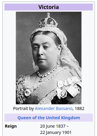
I don’t need this judgemental look when I’m deep in a clicking rabbit hole that started wondering why Brown Noise is called that way…

The paper is “Traces Of Unequal Entry Requirement For Illustrious People On Wikipedia Based On Their Gender” recently published in the Advances in Complex Systems journal. This is mostly the product of brilliant Lea Krivaa‘s master thesis. In the paper, we decided to focus on a specific bias: the role gender plays in the inclusion criteria of notable people on Wikipedia.

The hypothesis is that women need to do more than men to “deserve” a Wikipedia page. The are a few problems with this hypothesis. For starters, we can’t really prove it by simply saying that there are way more men than women on Wikipedia. That can happen and still be fair, because Wikipedia is just working with whatever it can collect from the notoriously male-centric historiography. Moreover, a true fairness test is hard to make: it’s not feasible to collect from the already-biased archives every person’s CV and see that there are discarded CVs from women that are as good as some of the included men on Wikipedia. Good luck checking the Roman Empire CVs after the Visigoths sacked the capital in 410AD.
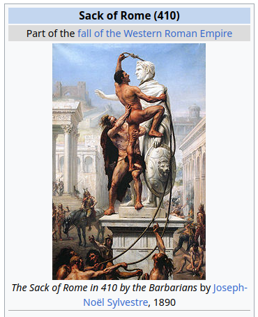
Gosh darn it, I’m doing the rabbit hole clicking thing again, am I? I’ll never be done writing this article…

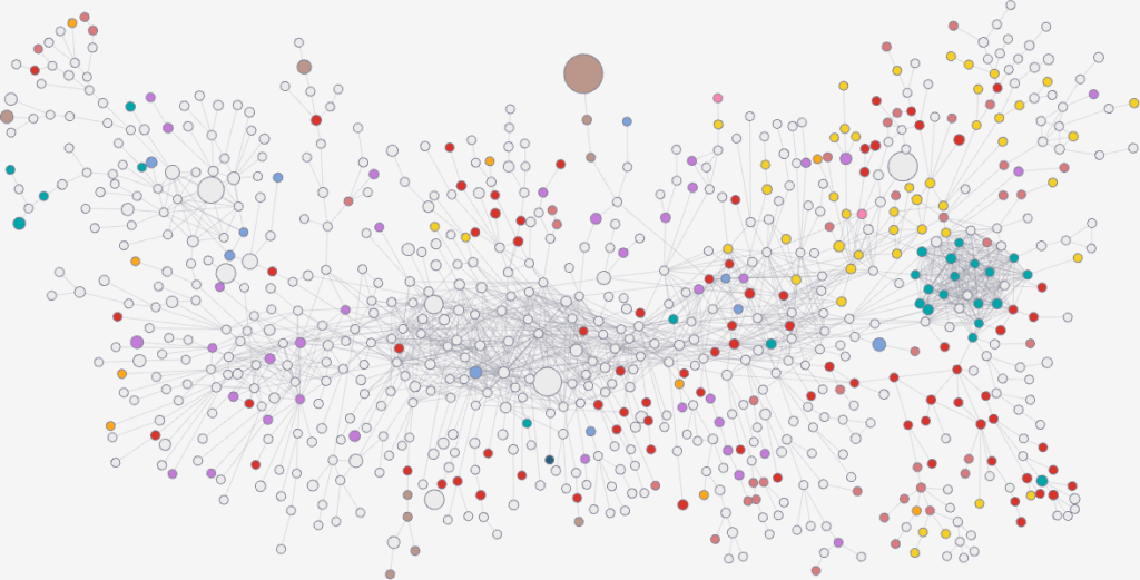
However, it turns out that we can find traces of this glass entrance door by using some unexpected network science techniques. We built a network of notable people: we took the set of people from Pantheon, because it’s a curated list of people that are on multiple language Wikipedia editions — this ensures they’re not just a pet peeve of some local editor. Then we connected them with an edge if the page of one person has a hyperlink connecting it to the page of another.

Crucially, we’re able to estimate the weight of the edge with some natural language processing: we count the number of times the target of this hyperlink is mentioned in the page containing the link. Knowing the edge weight is fundamental, because then we can use my backboning method to know the significance of this weight: how likely is it to be a noisy link?

I don’t mean to brag (I do), but I’m quite big in the network backboning industry. Wait, am I on Wikipedia again? Please send help.

Backboning is done to sparsify a network, by dropping the least significant edges. But here we’re just interested in looking at the significance values themselves. By looking at them we discover something odd: the edges involving women are on average more significant. If we were to establish a high significance threshold, we would end up isolating (and dropping) way more men than women. This shouldn’t happen if there was no bias.
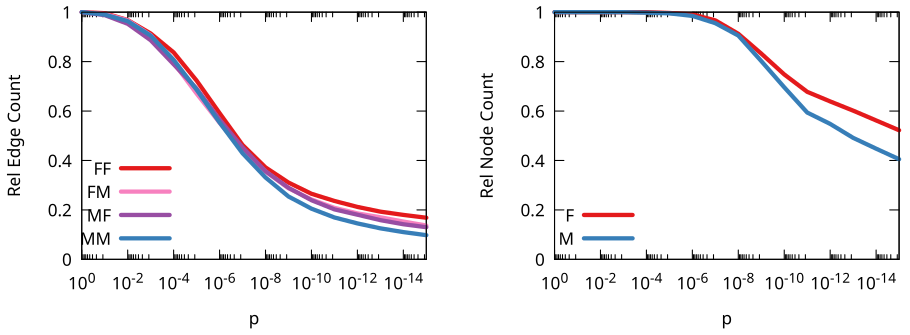
On the left we have the distribution of significance for all four types of edges (since it’s a directed network). On the right we have the share of nodes we isolate with a given edge significance threshold. In both cases, you can see women’s edges and nodes are more impervious to harsher significance thresholds.

Our interpretation is that this is a hint that the glass entrance door exist: to be included in multiple language Wikipedias, a woman needs to have more significant ties with other notable people than a man.

This might seem a stretch or a bit abstract, but there’s a neat way to test this interpretation. On March, Wikipedia has a tradition of celebrating the month by improving its coverage of notable women. This means that, in March, it is “easier” for a woman to get added to Wikipedia than normal. And we can confirm this with our analysis! If we only look at pages created in March, the gap we observe is noticeably smaller.

The dark lines (March pages) are closer to each other than the faded ones (all other months).

Of course all of this should be taken with a grain of salt. Since we rely on Pantheon’s curation of profiles, we inherit all of their biases. Moreover, we only focus on the 1750-1950 time period, for various data quality reasons. And there are other factors affecting how much we can read in this analysis. For instance it might be that we simply do not have enough women to include in Wikipedia, because of the male bias in historiography I already mentioned. However, we think this is an interesting question to ask, because we can do better to improve inclusivity. If the gap can shrink in March, we ask: why can’t it shrink the whole year around?

Continue Reading

31 January 2024 ~ 0 Comments

Predictability, Home Advantage, and Fairness in Team Sports

There was a nice paper published a while ago by the excellent Taha Yasseri showing that soccer is becoming more predictable over time: from the early 90s to now, models trying to guess who would win a game had grown in accuracy. I got curious and asked myself: does this hold only for soccer, or is it a general phenomenon across different team sports? The result of this question was the paper: “Which sport is becoming more predictable? A cross-discipline analysis of predictability in team sports,” which just appeared on EPJ Data Science.

My idea was that, as there is more and more money and professionalism in sport, those who are richer will become stronger over time, and dominate for a season, which will make them more rich, and therefore more dominant, and more rich, until you get Juventus, which came in first or second in almost 50% of the 119 soccer league seasons played in Italy.

My first step was to get data about 300,000 matches played across 49 leagues in nine disciplines (baseball, basket, cricket, football, handball, hockey, rugby, soccer, and volleyball). My second step was to blatantly steal the entire methodology from Taha’s paper because, hey, why innovate when you can just copy the best? (Besides, this way I could reproduce and confirm their finding, at least that’s the story I tell myself to fall asleep at night)

Predictability (y axis, higher means more predictable) over time (x axis) across all disciplines. No clear trend here!

The first answer I got was that Taha was right, but mostly only about soccer. Along with volleyball (and maybe baseball) it is one of the few disciplines that is getting more predictable over time. The rest of the disciplines are a mixed bag of non-significant results and actual decreases in predictability.

One factor that could influence these results is home advantage. Normally, the team playing home has slighter higher odds of winning. And, sometimes, not so slight. In the elite rugby tournament in France, home advantage is something like 80%. To give an idea, 2014 French champions Toulon only won 4 out of their 13 away games, and two of them were against the bottom two teams of the league that got relegated that season.

It’s all in the pilou pilou. Would you really go to Toulon and tell this guy you expect to win? Didn’t think so.

Well, this is something that actually changed almost universally across disciplines: home advantage has been shrinking across the board — from an average of 64% probability of home win in 2011 to 55% post-pandemic. The home advantage did shrink during Covid, but this trend started almost a decade before the pandemic. The little bugger did nothing to help — having matches played behind closed doors altered the dynamics of the games –, but it only sped up the trend, it didn’t create it.

What about my original hypothesis? Is it true that the rich-get-richer effect is behind predictability? This can be tested, because most American sports are managed under a socialist regime: players have unions, the worst performing teams in one season can pick the best rookies for the next, etc. In Europe, players don’t have unions and if you have enough money you can buy whomever you want.

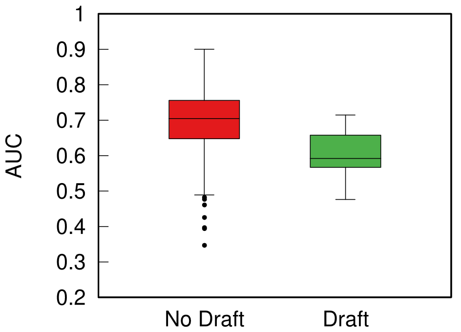
Boxplot with the distributions of predictability for European sports (red) and American ones (green). The higher the box, the more predictable the results.

When I split leagues by the management system they follow, I can clearly see that indeed those under the European capitalistic system tend to be more predictable. So next time you’re talking with somebody preaching laissez-faire anarcho-capitalism tell them that, at least, under socialism you don’t get bored at the stadium by knowing in advance who’ll win.

Continue Reading

08 March 2023 ~ 0 Comments

Quantifying Ideological Polarization on Social Media

Ideological polarization is the tendency of people to hold more extreme political opinions over time while being isolated from opposing points of view. It is not a situation we would like to get out of hand in our society: if people adopt mutually incompatible worldviews and cannot have a dialogue with those who disagree with them, bad things might happen — violence, for instance. Common wisdom among scientists and laymen alike is that, at least in the US, polarization is on the rise and social media is to blame. There’s a problem with this stance, though: we don’t really have a good measure to quantify ideological polarization.

This motivated Marilena Hohmann and Karel Devriendt to write a paper with me to provide such a measure. The result is “Quantifying ideological polarization on a network using generalized Euclidean distance,” which appeared on Science Advances earlier this month.

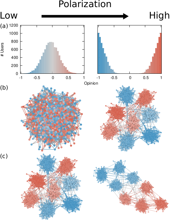
The components of our polarization definition, from top to bottom: (a) ideology, (b) dialogue, and (c) ideology-dialogue interplay. The color hue shows the opinion of a node, and its intensity is how strongly the opinion is held.

Our starting point was to stare really hard at the definition of ideological polarization I provided at the beginning of this post. The definition has two parts: stronger separation between opinions held by people and lower level of dialogue between them. If we look at the picture above we can see how these two parts might look. In the first row (a) we show how to quantify a divergence of opinion. Suppose each of us has an opinion from -1 (maximally liberal) to +1 (maximally conservative). The more people cluster in the middle the less polarization there is. But if everyone is at -1 or +1, then we’re in trouble.

The dialogue between parts can be represented as a network (second row, b). A network with no echo chambers has a high level of dialogue. As soon as communities of uniform opinions arise, it is more difficult for a person of a given opinion to hear the other side. This dialogue is doubly difficult if the communities themselves organize in the network as larger echo chambers (third row, c): if all communities talk to each other we have less polarization than if communities only engage with other communities that hold more similar opinions.

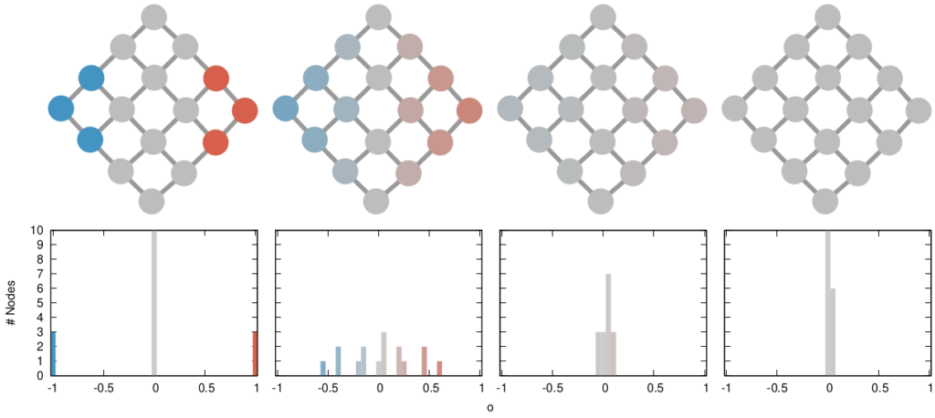
In this image, time flows from left to right: the first column is the initial condition with the node color proportional to its temperature, then we let heat flow through the edges. The plot on the second row shows the temperature distribution of the nodes.

The way we decided to approach the problem was to rely on the dark art spells of Karel, the Linear Algebra Wizard to simulate the process of opinion spreading. In practice, you can think the opinion value of each person to be a certain temperature, as the image above shows. Heat can flow through the connections of the network: if two nodes are at different temperatures they can exchange some heat per unit of time, until they reach an equilibrium. Eventually all nodes converge to the average temperature of the network and no heat can flow any longer.

The amount of time it takes to reach equilibrium is the level of polarization of the network. If we start from more similar opinions and no communities, it takes little to converge because there is no big temperature difference and heat can flow freely. If we have homogeneous communities at very different temperature levels it takes a lot to converge, because only a little heat can flow through the sparse connections between these groups. What I describe is a measure called “generalized Euclidean distance”, something I already wrote about.

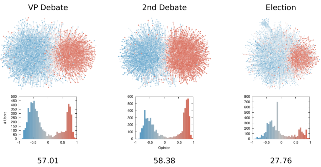
Each node is a Twitter user reacting to debates and the election night. Networks on the top row, opinion distributions in the middle, polarization values at the bottom.

There are many measures scientists have used to quantify polarization. Approaches range from calculating homophily — the tendency of people to connect to the individuals who are most similar to them –, to using random walks, to simulating the spread of opinions as if they were infectious diseases. We find that all methods used so far are blind and/or insensitive to at least one of the parts of the definition of ideological polarization. We did… a lot of tests. The details are in the paper and I will skip them here so as not to transform this blog post into a snoozefest.

Once we were happy with a measure of ideological polarization, we could put it to work. The image above shows the levels of polarization on Twitter during the 2020 US presidential election. We can see that during the debates we had pretty high levels of polarization, with extreme opinions and clear communities. Election night was a bit calmer, due to the fact that a lot of users engaged with the factual information put out by the Associated Press about the results as they were coming out.

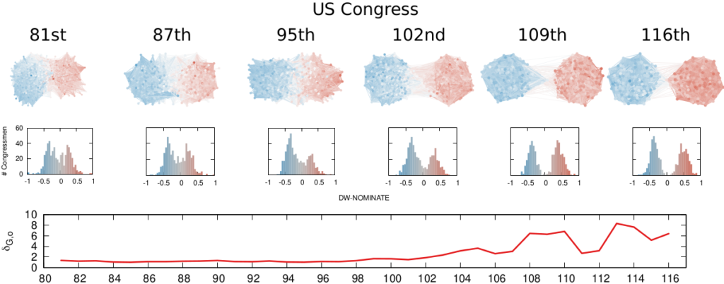
Each node is a congressman. One network per US Congress in the top row, DW-NOMINATE scores distributions in the middle row, and timeline of polarization levels in the bottom.

We are not limited to social media: we can apply our method to any scenario in which we can record the opinions of a set of people and their interactions. The image above shows the result for the US House of Representatives. Over time, congresspeople have drifted farther away in ideology and started voting across party lines less and less. The network connects two congresspeople if they co-voted on the same bill a significant number of times. The most polarized House in US history (until the 116th Congress) was the 113th, characterized by a debt-ceiling crisis following the full application of the Affordable Care Act (Obamacare), the 2014 Russo-Ukrainian conflict, strong debates about immigration reforms, and a controversial escalation of US military action in Syria and Iraq against ISIS.

Of course, our approach has its limitations. In general, it is difficult to compare two polarization scores from two systems if the networks are not built in the same way and the opinions are estimated using different measures. For instance, in our work, we cannot say that Twitter is more polarized than the US Congress (even though it has higher scores), because the edges represent different types of relations (interacting on Twitter vs co-voting on a bill) and the measures of opinions are different.

We feel that having this measure is a step in the right direction, because at least it is more accurate than anything we had so far. All the data and code necessary to verify our claims is available. Most importantly, the method to estimate ideological polarization is included. This means you can use it on your own networks to quantify just how fu**ed we are the healthiness of our current political debates.

Continue Reading

17 May 2022 ~ 0 Comments

Node Attribute Distances, Now Available on Multilayer Networks! (Until Supplies Last)

I’ve been a longtime fan of measuring distances between node attributes on networks: I’ve reviewed the methods to do it and even proposed new ones. One of the things bothering me was that no one had so far tried to extend these methods to multilayer networks — networks with more than one type of relationships. Well, it bothers me no more, because I just made the extension myself! It is the basis of my new paper: “Generalized Euclidean Measure to Estimate Distances on Multilayer Networks,” which has been published on the TKDD journal this month.

Image from https://atlas.cid.harvard.edu/

You might be wondering: what does it mean to “measure the distance between node attributes on networks”? Why is it useful? Let’s make a use case. The Product Space is a super handy network connecting products on the global trade network based on their similarity. You can have attributes saying how much of a product a country exported in a given year — in the image above you see what Egypt exported in 2018. This is super interesting, because the ability of a country to spread over all the products in the Product Space is a good predictor of their future growth. The question is: how can we tell how much the country moved in the last ten years? Can we say that country A moved more or less than country B? Yes, we can! Exactly by measuring the distance between the node attributes on the network!

The Product Space is but an example of many. One can estimate distances between node attributes when they tell you something about:

  • When and how much people were affected by a disease in a social network;
  • Which customers purchased how many products in a co-purchase network (à la Amazon);
  • Which country an airport belongs to in a flight network;
  • etc…
Image from https://manliodedomenico.com/

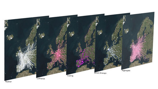
Let’s focus on that last example. In this scenario, each airport has an attribute per country: the attribute is equal to 1 if the airport is located in that country, and 0 otherwise. The network connects airports if there is at least a flight planned between them. In this way, you could calculate the network distance between two countries. But wait: it’s not a given that you can fly seamlessly between two countries even if they are connected by flights across airports. You could get from airport A to airport B using flight company X, but it’s not a given than X provides also a flight to airport C, which might be your desired final destination. You might need to switch to airline Y — the image above shows the routes of four different companies: they can be quite different! Switching between airlines might be far from trivial — as every annoyed traveler will confirm to you –, and it is essentially invisible to the measure.

It becomes visible if, instead of using the simple network I just described, you use a multilayer network. In a multilayer network, you can say that each airline is a layer of the network. The layer only contains the flight routes provided by that company. In this scenario, to go from airport A to airport C, you pay the additional cost of switching between layers X and Y. This cost can be embedded in my Generalized Euclidean measure, and I show how in the paper — I’ll spare you the linear algebra lingo.

Image from yours truly

One thing I’ll say — though — is that there are easy ways to embed such layer-switching costs in other measures, such as the Earth’s Mover Distance. However, these measures all consider edge weights as costs — e.g., how long does it take to fly from A to B. My measure, instead, sees edge weights as capacities — e.g. how many flights the airline has between A and B. This is not splitting hairs, it has practical repercussions: edge weights as costs are ambiguous in linear algebra, because they can be confused with the zeros in the adjacency matrices. The zeros encode absent edges, which are effectively infinite costs. Thus there is an ambiguity* in measures using this approach: as edges get cheaper and cheaper they look more and more like infinitely costly. No such ambiguity exists in my approach. The image above shows you how to translate between weights-as-costs and weights-as-capacities, and you can see how you can get in trouble in one direction but not in the other.

In the paper, I show one useful case study for this multilayer node distance measure. For instance, I am able to quantify how important the national flagship airline company is for the connectivity of its country. It’s usually extremely important for small countries like Belgium, Czechia, or Ireland, and less crucial for large ones like France, the UK, or Italy.

The code I developed to estimate node attribute distances on multilayer networks is freely available as a Python library — along with data and code necessary to replicate the results. So you have no more excuses now: go and calculate distances on your super complex super interesting networks!


* This is not completely unsolvable. I show in the paper how one could get around this. But I’d argue it’s still better not to have this problem at all 🙂

Continue Reading

27 October 2021 ~ 1 Comment

Pearson Correlations for Networks

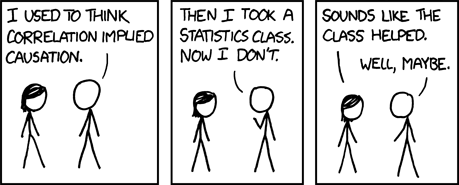
We all know that correlation doesn’t imply causation:

And yet, we calculate correlations all the time. Because knowing when two things correlate is still pretty darn useful. Even if there is no causation link at all. For instance, it’d be great to know whether reading makes you love reading more. Part of the answer could start by correlating the number of books you read with the number of books you want to read.

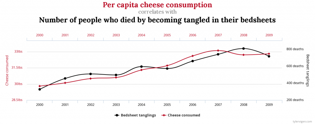
The very important questions the Pearson correlation coefficient allows you to ask: will consuming cheese bring upon you the doom of dying by suffocating in your bedsheets? source: https://www.tylervigen.com/spurious-correlations

As a network scientist, you might think that you could calculate correlations of variables attached to the nodes of your network. Unfortunately, you cannot do this, because normal correlation measures assume that nodes do not influence each other — the measures are basically assuming the network doesn’t exist. Well, you couldn’t, until I decided to make a correlation coefficient that works on networks. I describe it in the paper “Pearson Correlations on Complex Networks,” which appeared in the Journal of Complex Networks earlier this week.

The formula you normally use to calculate the correlation between two variables is the Pearson correlation coefficient. What I realized is that this formula is the special case of a more general formula that can be applied to networks.

In Pearson, you compare two vectors, which are just two sequences of numbers. One could be the all the numbers of books that the people in our sample have read, and the other one is all of their ages. In the example, you might expect that older people had more time to read more books. To do so, you check each entry in the two vectors in order: every time you consider a new person, if their age is higher than the average person’s, then also the number of books they read should be higher.

If you are in a network, each entry of these vectors is the value of a node. In our book-reading case, you might have a social network: for each person you know who their friends are. Now you shouldn’t look at each person in isolation, because the numbers of books and the ages of people also correlate in different parts of the network — this is known as homophily. Some older people might be pressured into reading more books by their book-addicted older friends. Thus, leaving out the network might cause us to miss something: that a person’s age tells us not just about the number of books they have read, but it also allows us to predict the number of books their friends have read.

This is the type of networks you are forced to work with when you use the Pearson correlation. That’s just silly, isn’t it?

To put it simply, the classical Pearson correlation coefficient assumes that there is a very special network behind the data: a network in which each node is isolated and only connects to itself — see the image above. When we slightly modify the math behind its formula, it can take into account how close two nodes are in the network — for instance, by calculating their shortest path length.

You can interpret the results from this network correlation coefficient the same way you do with the Pearson one. The maximum value of +1 means that there is a perfect positive relation: for every extra year of age you read a certain amount of new books. The minimum of -1 means that there is a perfect negative relationship: a weird world where the oldest people have not read much. The midpoint of 0 means that the two variables have no relation at all.

Is the network correlation coefficient useful? Two answers. First: how dare you, asking me if the stuff I do has any practical application. The nerve of some people. Second: Yes! To begin with, in the paper I build a bunch of artificial cases in which I show how the Pearson coefficient would miss correlations that are actually present in a network. But you’re not here for synthetic data: you’re a data science connoisseur, you want the real deal, actual real world data. Above you can see a line chart, showing the vanilla Pearson (in blue) and the network-flavored (in red) correlations for a social network of book readers as they evolve over time.

The data comes from Anobii, a social network for bibliophiles. The plot is a correlation between number of books read and number of books in the wishlist of a user. These two variables are positively correlated: the more you have read, the more you want to read. However, the Pearson correlation coefficient greatly underestimates the true correlation, at 0.25, while the network correlation is beyond 0.6. This is because bookworms like each other and connect with each other, thus the number of books you have read also correlates with the wishlist size of your friends.

This other beauty of a plot, instead, shows the correlation between the age of a user and the number of tags they used to tag books. What is interesting here is that, for Pearson, there practically isn’t a correlation: the coefficient is almost zero and not statistically significant. Instead, when we consider the network, there is a strong and significant negative correlation at around -0.11. Older users are less inclined to tag the books they read — it’s just a fad kids do these days –, and they are even less inclined if their older friends do not tag either. If you were to hypothesize a link between age and tag activity and all you had was lousy Pearson, you’d miss this relationship. Luckily, you know good ol’ Michele.

If this makes you want to mess around with network correlations, you can do it because all the code I wrote for the paper is open and free to use. Don’t forget to like and subscrib… I mean, cite my paper if you are fed up with the Pearson correlation coefficient and you find it useful to estimate network correlations properly.

Continue Reading

15 April 2021 ~ 0 Comments

A Bayesian Framework for Online Social Network Sampling

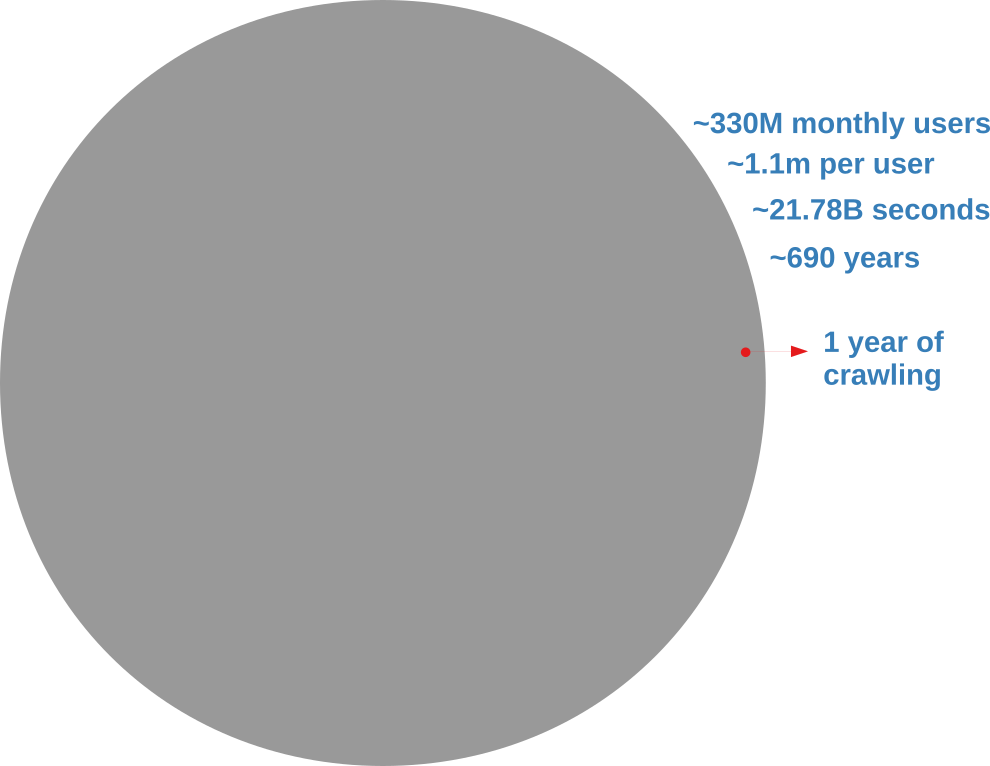
Analyzing an online social network is hard because there’s no “download” button to get the data. In the best case scenario, you have to query an API (Application Program Interface) system. You have to tell the API which user you want to see the connections of, and you can’t just ask for all users at the same time. With the current API rate limits, downloading the Twitter graph would take seven centuries, as the picture below explains.

The gray circle represents the totality of Twitter’s users. The red one is what you’d get with a continuous crawl of one year.

I don’t know about you, but I don’t have seven centuries to publish my papers. I want to become a famous scientist now. If you’re like me, you’re forced to extract only a sample. In this post, I’ll describe a network sampling algorithm that works with social media APIs to maximize the amount of information you get from your sample. The method has been published in the paper “Noise Corrected Sampling of Online Social Networks“, which recently appeared in the journal Transactions on Knowledge Discovery from Data.

My Noise Corrected sampling (NC) is a topological method. This means that you start from one (or more) user IDs that are known, and then you gather new user IDs from their friends, then you move on to the friends’ friends and so on, following the connections in the graph you’re sampling. This is the usual approach, because there is no way to know the user IDs beforehand — unless you have inside knowledge about how the social media platform works.

The underlying common question behind a topological sampler is: how do we pick the best user to explore next? Different samplers answer this question differently. A Random Walk sampler says: “Screw it! Thinking is too hard! I’m gonna get a random node from the friends of the currently explored node! Then, with the time I saved, I’m gonna get some ice cream.” The Metropolis-Hastings Random Walk — the nerd’s answer to the jock’s Random Walk — wants to preserve the degree distribution, so it penalizes high-degree nodes — since they’re more likely to be oversampled. Alternatively, we could use classical graph exploration techniques such as Depth-First and Breadth-First Search — and, again, you can enhance them so that you can preserve some properties of the network, for instance its clustering coefficient.

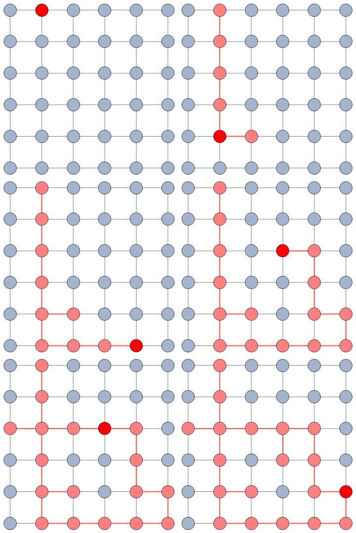
A random walk on a graph. It looks like a drunk going around. I don’t drink and sample, and neither should you.

My NC departs from all these approaches in a fundamental way. The thing they all have in common is that they don’t use information from the sample they have currently gathered. They only look at the potential next users and make a decision on whom to explore based on their characteristics alone. For instance Metropolis-Hastings Random Walk checks the user’s popularity in number of connections. NC, instead, looks at the entire collected sample and asks a straightforward question: “which of these next users is most likely to give me the most information about the whole structure, given what I explored so far?”

It does so with a Bayesian framework. The gory math is in the paper, but the underlying philosophy is that you can calculate a z-score for each edge of the network. It tells you how surprising it is that this edge is there. In probability theory, “surprise” is a good thing: it is directly related to how much information something gives you. Probability theorists are a bunch of jolly folks, always happy to discover jacks-in-a-box. If you always pick the most surprising edge in the network to explore the next user, you’re maximizing the amount of information you’re going to get back. The picture below unravels what this entails on a simple example.

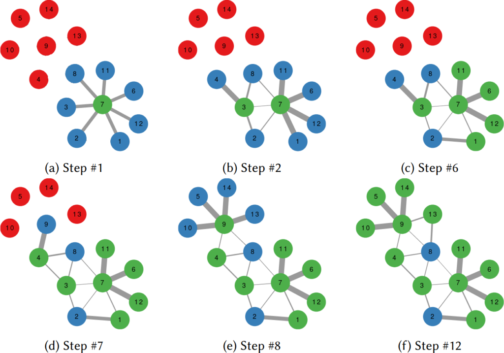
In this example, the green nodes are explored, the blue nodes are known — because they’re friends of an explored node — but not explored yet. The red nodes are unknown.

The first figure (a) is the start of the process, where we have a network and we pick a random starting point, node 7. I use the edge thickness to show its z-score: we always follow the widest edge. Initially, you only pick a random edge, because all edges have the same z-score in a star. However, once I pick node 3, all z-scores change as we discover new edges (b). In this case, first we prioritize the star around node 7 (c), then we start following the path from node 3 until node 9 (d-e), then we explore the star around node 9 until there are no more nodes nor edges to discover in this toy network (f). Note how edges exhaust their surprise as you learn more about the neighborhoods of the nodes they connect.

Our toy example is an unweighted network, where all edges have the same weight, but this method thrives if you have information about how strong a connection is. The edge weight is additional information that can be taken into account to measure its surprise value. Under the hood, NC estimates the expected weight of an edge given the average edge weights of the two nodes it connects. In an unweighted network this is equivalent to the degree, because all edges have the same weight. But in a weighted network you actually have meaningful differences between nodes that tend to have strong/weak connections.

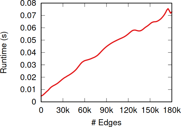
So, the million dollar question: how does NC fare when tested against the alternatives I presented before? The first worry you might have is that it takes too much time to calculate the z-scores. After all, to do so you need to look at the entire sampled network so far, while the other methods only look at a local neighborhood. NC is indeed slower than them—it has to be. But it doesn’t matter. The figure above shows how much time it takes to calculate the z-scores for more and more edges. Those runtimes (less than a tenth of a second) are puny when compared to the multi-second wait times due to the APIs’ rate limits — or even to simple network latency. After all, NC is a simplification of the Noise-Corrected Backbone algorithm I developed with Frank Neffke, and we showed in the original paper that it was pretty darn fast.

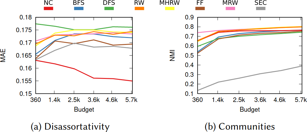
What about the quality of the samples? This is a question with a million answers, because it depends on what you want to do with the sample, besides what are the characteristics of the original graph and of the API system you’re wrestling against, and how much time you have to gather your sample. For instance, in the figure below we see that NC is the best method when you want to estimate the assortativity value of a disassortative attribute (think gender in a dating network), but it is a boring middle-of-the-pack method when you want to reconstruct the original communities of a network.

Left: the Mean Absolute Error between the sample’s and the original graph’s assortativity values (lower is better). Right: the Normalized Mutual Information between the sample’s and the original graph’s communities (higher is better). NC in red.

NC ranks between the 3rd and 4th position on average across a wide range of applications, network topologies, API systems, and budget levels. This is good because I test eight alternatives, thus the expectation is that NC will practically always be better than average. Among all eight methods tested, in fact, no other method has a better rank average. The second best method is Depth-First Search, which ranks 4th three out of four times, against NC’s one out of two.

I have shared some code allowing to replicate my results. If you speak Python better than you speak academiquese, you could use that code to infer how to implement an NC sampling strategy next time you need to download Twitter.

Continue Reading

09 December 2020 ~ 0 Comments

Speed-Check your Diseases on a Social Network

Back in March I wrote a blog post — and a paper — showing a technique to estimate the distance covered by a propagation event on a network between two moments in time. A propagation event could be the failure of a power grid, a word-of-mouth campaign on social media, or — more topically these days — a disease infecting people in a social network. The limitation of that paper was in taking only a single perspective. However, this problem could be solved in at least a dozen different ways. To give justice to such complexity, I recently co-authored the paper “The Node Vector Distance Problem in Complex Networks” with Andres Gomez, James McNerney, and Frank Neffke. The paper was published this month in the ACM Computing Surveys journal and it’s the main focus of this blog post.

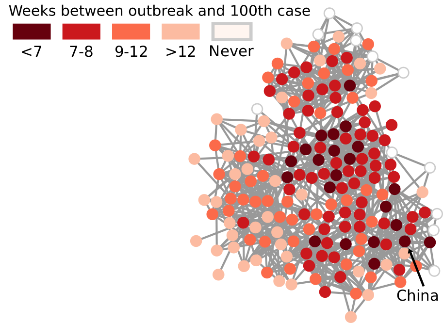
Estimating the spreading speed of something in our normal geographical space is important, but relatively trivial. However, networks are complex spaces. You cannot estimate the speed of COVID by looking at the geographical areas it has covered, because what really connects places is not our physical space, but a complex network of relations among regions. In other words, the places closest to China are not necessarily countries like Mongolia or Nepal — both of which share a border with China — but Iran and Italy, because of the many direct flights connecting them.

My paper in March found a way to transform our notion of Euclidean distance — a straight line in physical space — to networks. It basically defined what a “straight line” means when all you have is nodes and edges. In the figure above, I connect countries if they have a significant number of direct flights between their airports. Darker nodes represent countries that were hit earlier, and nodes get progressively lighter the later they were first hit. My generalized Euclidean measure allows you to calculate a number describing how fast this process went. This means you could compare it with other pandemics, or you could use it to estimate the moment when a still-developing pandemic will cover a given fraction of the world.

Was mine the only way to translate the concept of “straight line”? No. For starters, it uses an indirect metaphor to define “straightness”. In my generalized Euclidean, every node is a “dimension” of a multidimensional space and, when COVID infects it, it means that the virus had traveled a certain amount of distance in that dimension. If you’re staring dumbfounded at the previous sentence, yeah, that’s pretty much what I expected. A more intuitive way of defining the distance covered in a network would be simply to count how many edges the disease crossed via the calculation of shortest paths.

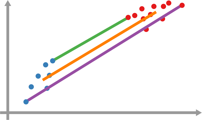
However, it’s still not that easy: how far is each newly infected node from the set of previous infected nodes? And how do we combine all those path lengths into one new measure? In the paper, we explain various ways to do so. One option is to apply linking strategies from hierarchical clustering, as I show in the figure above. The distance between the group of red points from the blue points can be the distance of their closest pair — green line, called single linkage –; the distance of their centers of mass — orange line, average linkage –; or the distance between their farthest pair — purple line, complete linkage. Another option is to simulate an agent optimizing the movement of “packets” from the nodes in the origin to the nodes in the destination — the popular Earth Mover’s Distance measure.

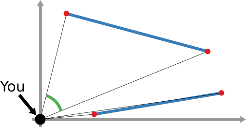
And that still doesn’t cover the space of possibilities! Even in our simple geographical world, we can have different perspectives on what “distance” means. For instance, a popular distance measure is cosine distance. In it, it doesn’t matter how far two points are in the space: if they are on the same line from your point of view, you consider them close together. Now, “distance” becomes the angle by which you have to turn to go from looking straight at one point, to looking at the other. In the figure below, the Euclidean (straight line) distance between two red points is in blue. The cosine distance is the thick green line, showing in the point pair below that it could be quite small even for points that Euclid would say are very far away in the plane. Many measures adopt this distance philosophy for networks, for instance the Mean Markov Chain and the Graph Fourier Transform approaches.

That is more or less where we stop in the paper. I think that there are plenty more network distance measures to be discovered, but the work still needs to be done.

As a companion for the paper, I have developed an open source Python library implementing the majority of network distance measures that we discuss. You can use it to calculate network distances in your data, or to better understand how these measures work. Hopefully, you’ll make my job harder by discovering new measures and forcing me to publish an updated paper on the topic.

Continue Reading

16 October 2020 ~ 0 Comments

Ruling your Network

When you’re studying complex systems, one of the most important questions you might have is: how will this system evolve in the future? If you’re modeling your system as a network — as I like to do in my spare time — this boils down to predicting the arrival of new nodes and links. This is the realm of link prediction. In this post, I’ll describe one advancement in the field that I developed with fellow NERD Michael Szell in the paper “Multiplex Graph Association Rules for Link Prediction“, to appear next year at the ICWSM conference.

A graph evolving: the green nodes and non-gray links are added over time.

There are many ways to predict new links in a network, but most of these methods have a disadvantage: they can only give you a score for potential future connections between two nodes that are already in the network when you observe it. In other words, they cannot predict new incoming nodes. But with a technique called “graph association rules”, used by the GERM algorithm published in 2009, we can predict new nodes. How is that possible?

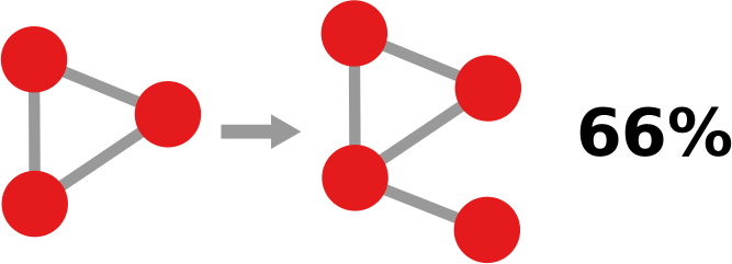
In simple terms, a “graph association rule” is a rule that tells you: every time you see in your network a pattern A, it will turn into pattern B, with a certain degree of confidence. The rule is extracted by counting how many times patterns A and B appear. For instance, in the image below, if pattern A (the triangle) appears 9 times and pattern B (the triangle with a dangling node) appears 6 times, the confidence of the rule is 2/3. 66% of the time, a triangle has attracted a dangling node. Note that pattern B must include pattern A, otherwise it’s difficult to hypothesize that A evolved into B.

GERM has a problem of its own, which Michael and I set out to solve: it can predict incoming nodes and links, but it cannot distinguish between different link types. In other words, every predicted link is the same to GERM. However, many real world networks have link types: nodes can connect in different ways. For instance, on social media, you connect to the people you know in different ways: via Facebook, Twitter, Linkedin, etc.

You’d model such system with a multiplex network, which allows for link types. If you have a multiplex network, you need multiplex graph association rules for link prediction. Which is exactly the title of our paper! What a crazy coincidence!

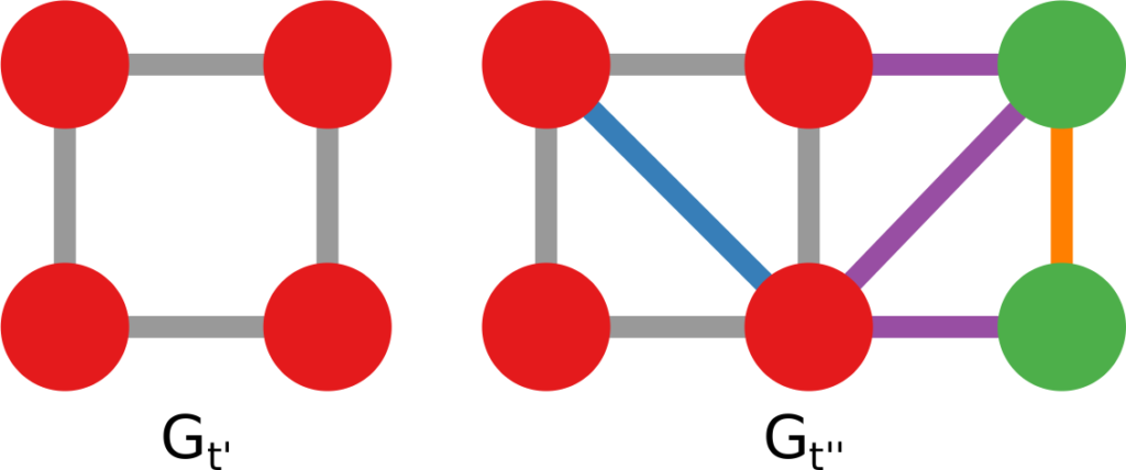
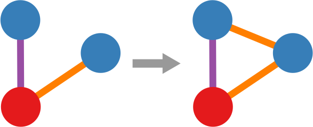
In the paper we re-purpose Moss, a graph pattern miner that can extract multiplex patterns, to build such rules. We created a pre- and post-processor of Moss that can construct the rules based on the patterns it finds. Now we can give colors to the links that are featured in our rules, as the figure below shows. This is a generalization of the signed link predictor I already wrote about a long time ago (the second ever post on this blog. I feel old).

Doing so isn’t painless though. We made sacrifices. For instance, our rule extractor doesn’t really understand the passage of time. It knows that the input network is in the past and spits out the rules to predict its evolution, but it doesn’t know how long a rule will take to complete. Unlike GERM, which can tell you that a rule will take n timesteps to complete.

This downside is minor though. Our link predictor performs well, as witnessed by the ROC curves below (our method in red). The comparisons are other multiplex link predictors. Not only are they worse at predicting links, but they have the added disadvantage of being unable to predict the arrival of new nodes. They also have issues with memory consumption, because they generate a score for each pair of nodes that is not connected in the training data — which, for sparse networks, is a lot of scores. Our predictor, instead, only gives scores to the links that are valid consequences of the rules that we found, usually way fewer than all unconnected node pairs.

If you want to play with our link predictor, you can do so by downloading the code I made public for the replication of the paper’s results. The code is very academic — meaning: badly written, unreasonably fragile, and horribly inefficient. I have in the works an extension with more efficient and robust code, and a generalization from multiplex to fully multilayer networks. Stay tuned!

Continue Reading

25 March 2020 ~ 0 Comments

How Quickly is COVID Really Spreading?

I don’t need to introduce to you what the corona virus is: COVID-19 has had a tremendous impact on everyone’s life in the past weeks and months. All of a sudden, our social media feeds have been invaded with new terminology: social distancing, R0, infection rate, exponential growth. Overnight, we turned ourselves into avid consumers of epidemics literature. We learned what the key to prevent the infection from becoming a larger problem is: slow the bugger down. That is why knowing how fast corona is actually moving is such a crucial piece of information. You have seen the pictures many times, they look something like this:

Image courtesy of my data science students: Astrid Machholm, Jacob Kristoffer Hessels, Marie-Louise Tommerup, Simon Breum, Zainab Ali Shaker Khudoir. If anything, it warms my heart knowing that, even during a pandemic, many journalists take their weekends off 🙂

What you’re seeing is the evolution in number of infected people — and how much non-infected people like me blabber about them online. Epidemiologists try to estimate the speed of infection by fitting the real data you see on an SI model. In it, people turn from Susceptible to Infected at a certain rate. These models are usually precise at estimating the number of infected over time, but they lack a key component: they assume that each individual is interchangeable and that anyone has a chance to be infected by anyone in their close proximity. In other words, they ignore the fact that we are embedded in a social network: some people are more central than others, and some have more friends than others.

To properly estimate how fast a disease moves, you need to take the network into account. And this is the focus of a paper of mine: “Generalized Euclidean Measure to Estimate Network Distances“. The paper has been accepted for publication at the 2020 ICWSM conference. The idea of the paper is to create a new measure that estimates the distance between the state of the disease at two moments in time, taking the underlying network topology into account.

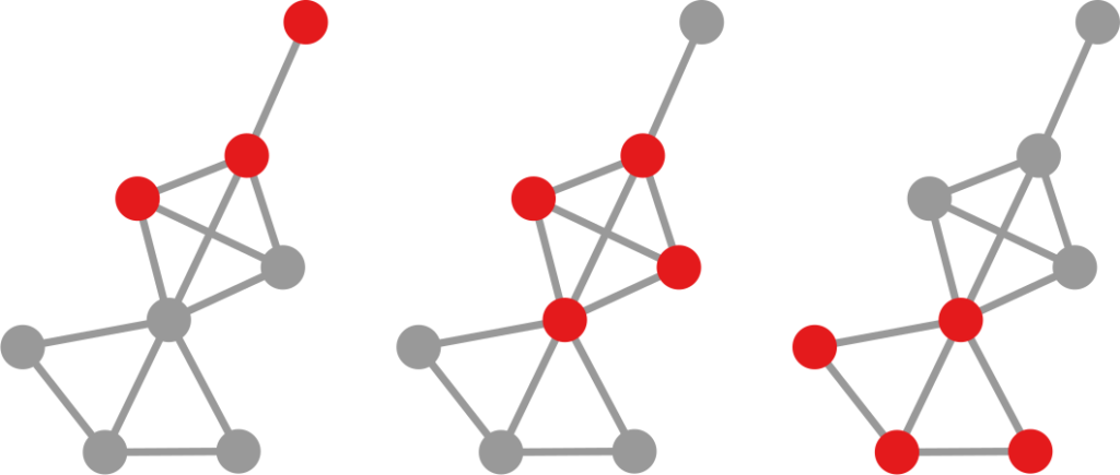
The question here is deceptively simple. Suppose you have a set of infected individuals. In the picture above, they are the nodes in red in the leftmost social network. After a while, some people recover, while others catch the disease. You might end up with the set of infected from the network in the middle, or the one in the right. In which case did the disease spread more quickly?

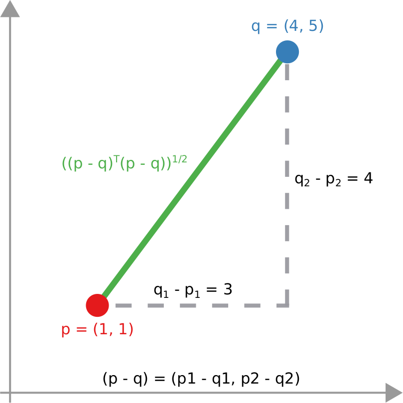
We have a clear intuitive answer: the rightmost network experienced a faster spread, because the infected nodes are farther from the original ones. We need to find a measure that matches this intuition. How do we normally estimate distances in the real world? We use a ruler: we draw a straight line between two points and we measure how long that line is. This is the Euclidean distance. Mathematically, that means representing the two points as vectors of coordinates (p and q), calculating their difference, and then using Pythagoras’ theorem to calculate the length of the straight line between them:
We cannot apply this directly to our network problem. This is because, for silly Euclid, every dimension has the same importance in estimating the distance between points. However, in our case, the points are the states of the disease. They do not live on the plane of Euclidean geometry, but on a network. Some moves in this network space are short and easy: moving between two connected nodes. But other moves are long and hard: between two nodes that are far apart. In other words, nodes that are connected to each other contribute less than unconnected nodes to the distance. The simplest example I can make is:

In the figure, each vector — for instance (1,0,0) — is the representation of the state of the disease of the graph beneath it: the entries equal to one identify the currently infected node. Clearly, the infection closer to the left graph is the middle one, not the right one. However, the Euclidean distance between the three vectors is the same: the square root of two. So how do we fix this problem? There is a distance measure that allows you to weigh dimensions differently. It is my favorite distance metric (yes, I am the kind of person who has a favorite distance metric): the Mahalanobis distance. Mahalanobis simply says that correlated variables should count less in estimating the distance: taller people tend to be heavier — because there’s more person to weigh — so we shouldn’t be surprised if someone taller than me is also heavier. But, if they weigh less, we would find it remarkable.

Now we’re just left with the problem of figuring out how to estimate, mathematically, what “correlated” means in a network. The paper has the full details. For here, suffice to say we augment Pythagoras’ theorem with the pseudoinverted graph Laplacian — a sentence I’m writing only to pretend I’m smart (it’s actually not sophisticated at all, and a super easy thing to calculate). The reason we use the graph Laplacian is because it is a standard instrument to estimate how fast things spread in a network.

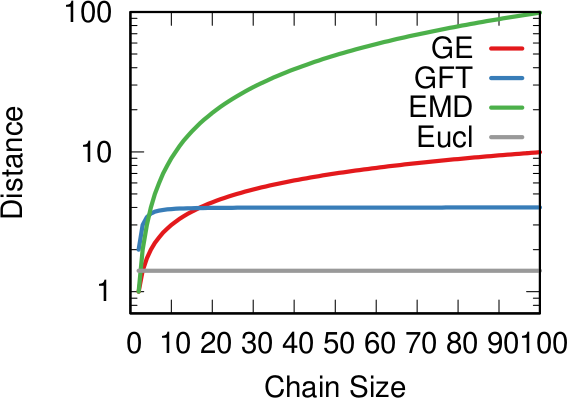
In the paper I run a bunch of tests to show that this measure matches our intuition. For instance, as shown above, if we have infected people at the endpoints of a chain graph, the longer the chain (x axis) the higher the estimated distance should be (y axis). GE (= Generalized Euclidean, in red) is my measure, and it behaves as it should: a constantly growing function (the actual values don’t really matter as long as they constantly grow as we move left to right). I compare the measure with few alternatives. The Euclidean (gray) obviously fails because it doesn’t know what a network is. EMD (green) is the Earth-Mover Distance, which is as good as my measure, but computationally more expensive. GFT (blue) is the Graph Fourier Transform, which is less sensitive to longer distances.

More topically, I can simulate different diseases with a SI model on a network. I can randomly change their infectiousness: how likely you (S) are to contract the disease if you’re in contact with an infected (I) individual. By looking at the beginning and at the end of an infection event, my measure can recover that infectiousness parameter, meaning it can distinguish between slow- and fast-moving diseases.

I’m obviously not pretending to be smarter than the thousands of epidemiologists that are doing a terrific job in fighting — and spreading awareness about — the disease. Their models at a global, national, and regional level for sure work extremely well and do not need this little paper of mine. However, this tool might find its use, when you have detailed data about a specific social network, for instance by using phone data to reconstruct a network of physical contacts. It also has a wider applicability to anything you can model as a diffusion process on a network, being a marketing campaign, the exploration of the Product Space by a country, or even computer vision. If you want to play with the code, I implemented a few network distance methods in a Python library.

Continue Reading

22 August 2019 ~ 0 Comments

Deriving Networks isn’t as Easy as it Looks

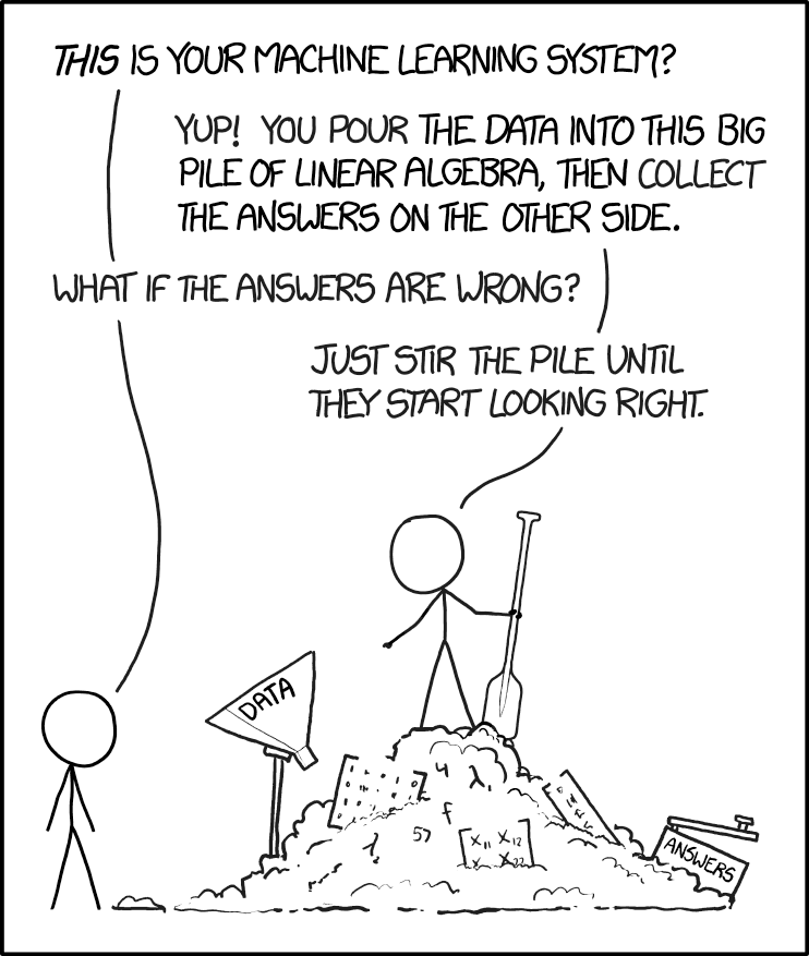
Networks are cool because they’re a relatively simple model that allows you to understand complex systems. The problem is that they’re too cool: sometimes they make you want to do network analysis on something that isn’t really a network. For instance, consider Netflix. Here you have people watching movies. You want to know which movies are similar to each other so that you can suggest them to similar users. On the wings of Maslow’s Lawwhen you’re holding a hammer everything starts looking like a nail –, the network scientist would want to build a movie-movie network.

Of course XKCD has something about this.

The problem is that there are many different ways to make a movie-movie network from Netflix data. Each of these different ways will alter the shape of your network in dramatic ways, which will affect the results you’re going to get once you use it for your aims. With Luca Rossi, I started exploring this space. This resulted in the paper “The Impact of Projection and Backboning on Network Topologies“, which I will present next week at the ASONAM conference.

In the paper we take some real-world data and we apply all possible combinations of network building techniques on it. We systematically explore the key topological properties of the resulting networks, and see that they dramatically change depending on which strategy you picked. Meaning that you’re going to get completely different results from the same analysis later on.

Good network analysis is like good art: if you gaze long at the hairball, the hairball will gaze back at you. Image property of the Albright-Knox Art Gallery, Buffalo, NY.

The first thing we need to understand is that, to get to the movie-movie network, we need to perform two major steps. Each movie is a vector, containing information about each user. It could simply be a one if the user watched the movie, or a zero if they didn’t. Thus first we need to apply a similarity measure quantifying how similar two movies are to each other (what I call “projection”). Then we’ll realize that all we got is a hairball. Every movie has a non-zero similarity with any other movie. After all, there are millions of users, but just a handful of movies, so the probability that any two movies were watched by at least one user is pretty high. So you need to filter out your movie-movie similarity, otherwise your resulting network will be too dense.

Comparing two vectors is the oldest profession in the world, assuming your world is completely made up of linear algebra — mine, sadly, is. Thus you can pick and choose dozens of similarity metrics — Euclidean, cosine, I have a soft spot for the Mahalanobis distance myself. However, you’d be better served by the measures that were developed with complex networks in mind. You see, the binary movie-user vectors will have typical broad degree distributions: some movies are very popular — everybody watches them –, some people like me are pathological movie buffs and will watch everything — my watchlist has ~6,500 entries. Thus for this paper we focus on a few of those “bipartite projection” techniques: hyperbolic, resource allocation (ProbS), and my beloved YCN method.

Since I already jumped on the XKCD wagon, I see no harm in continuing down this path…

Then, to filter out connections, you have to have an idea of what’s a “strong, significant” connection and what isn’t. If you’re naive and just think that you should only keep connections with higher weights (what I call “naive thresholding”), boy do I have news for you. Also in this case, we’re going to consider a couple of ways to filter out noisy connections: the disparity filter and my noise corrected backbone.

Ok, the stage is set. If you were paying attention, you’ll figure out what’s coming next: a total mess.

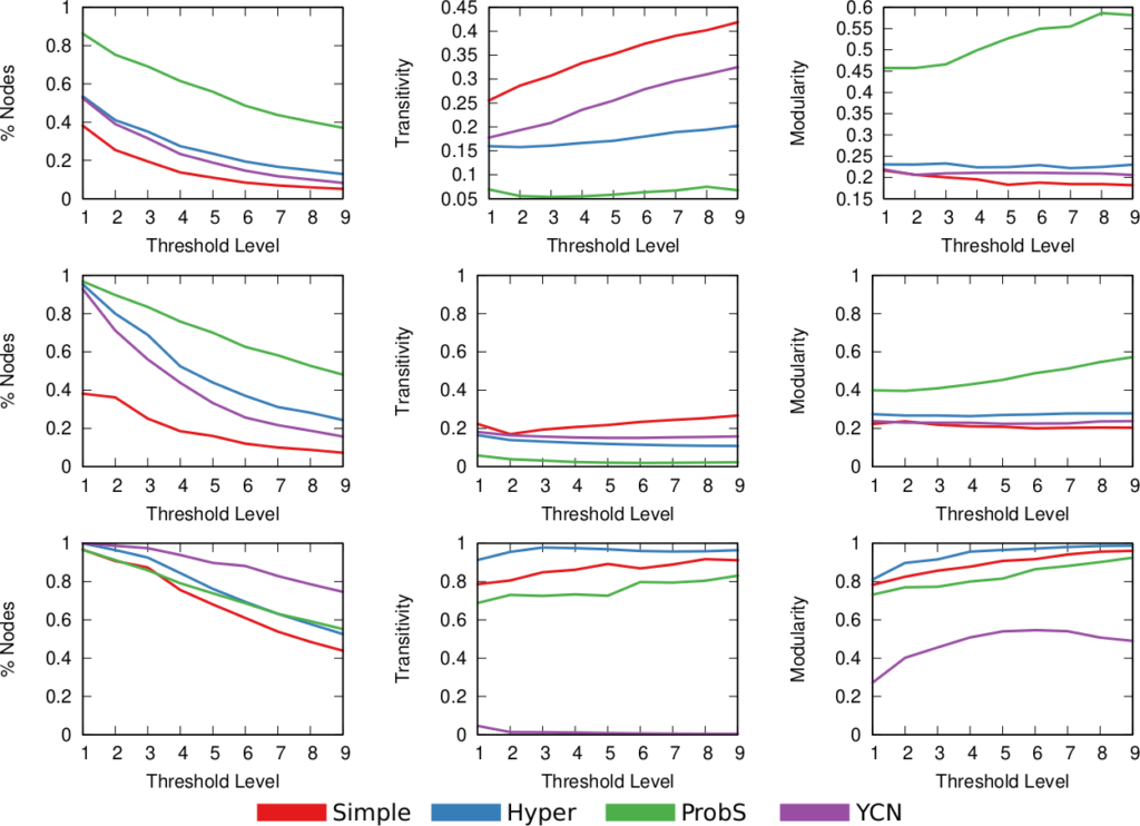
Above (click to enlarge) you see the filtering techniques — top to bottom: naive threshold, disparity filter, noise corrected –, for each projection — line color –, on different network properties. From left to right we see: how many nodes survive the filter step, how much clustered the network is, and how well separated its communities are. The threshold levels (x-axis) attempt to preserve a comparable number of edges for each technique combination.

Yeah, it doesn’t look good. Look at the middle column: there are some versions of this network with perfect clustering, meaning that every common neighbor of a movie is connected to every other; while networks have a transitivity of zero; with almost every possible other values in between. The same holds for modularity, which can span from ~0.2 to practically 1. So there’s no way of saying whether these are properties of the system or just properties of the cleaning procedures you used. Keep in mind that the original data is the same. We could conclude anything by stirring our pile of linear algebra. Want to argue that the movie space doesn’t cluster? Project with YCN and filter with noise corrected method. Want to find strong communities instead? No biggie: project with resource allocation and do a simple threshold of the result.

Famous network scientist and two-time “world’s best mustache” winner Nietzsche once said: “He who fights with hairballs should look to it that he himself does not become a hairball.”

I wish I had a wise message to wrap up this blog post. Something about how to choose the best projection-filtering pair best fitting a specific analysis — one that you cannot tune to obtain the results you want. However, that will have to wait for further research. For now, I just want you to grow suspicious about specific results you see out there from networks that really aren’t network. If your nodes aren’t really connecting directly — like physical connections would do, for instance between neurons –, pretending they do so might lead you down a catastrophic over-confident path.

Continue Reading