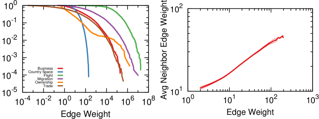
Mapping the International Aid Community
A few years ago (2013, God I’m old), I was talking to you on how to give a “2.0” flavor to international aid: at CID we created an Aid Explorer to better coordinate the provision of humanitarian work. I’m happy to report that “Aid Explorer” has been adopted — directly or indirectly — by multiple international organizations, for instance USAID and the European Union. The World Bank’s Independent Evaluation Group contacted me to make an updated version, focused on estimating the World Bank’s position in the global health arena. The result is a paper, “Mapping the international health aid community using web data“, recently published in EPJ Data Science, and the product of a great collaboration with Katsumasa Hamaguchi, Maria Elena Pinglo, and Antonio Giuffrida.
The idea is to collect all the webpages of a hundred international aid organizations, looking for specific keywords and for hyperlinks to the other organizations — differently from the old Aid Explorer in which we relied on the index from Google. The aim is to create different networks of co-occurrences connecting:
- Aid organizations co-mentioned in the same page;
- Aid organizations mentioned or linked by another;
- Issues co-mentioned in the same page;
- Countries co-mentioned in the same page.
We then analyze these structures to learn something about the community as a whole.
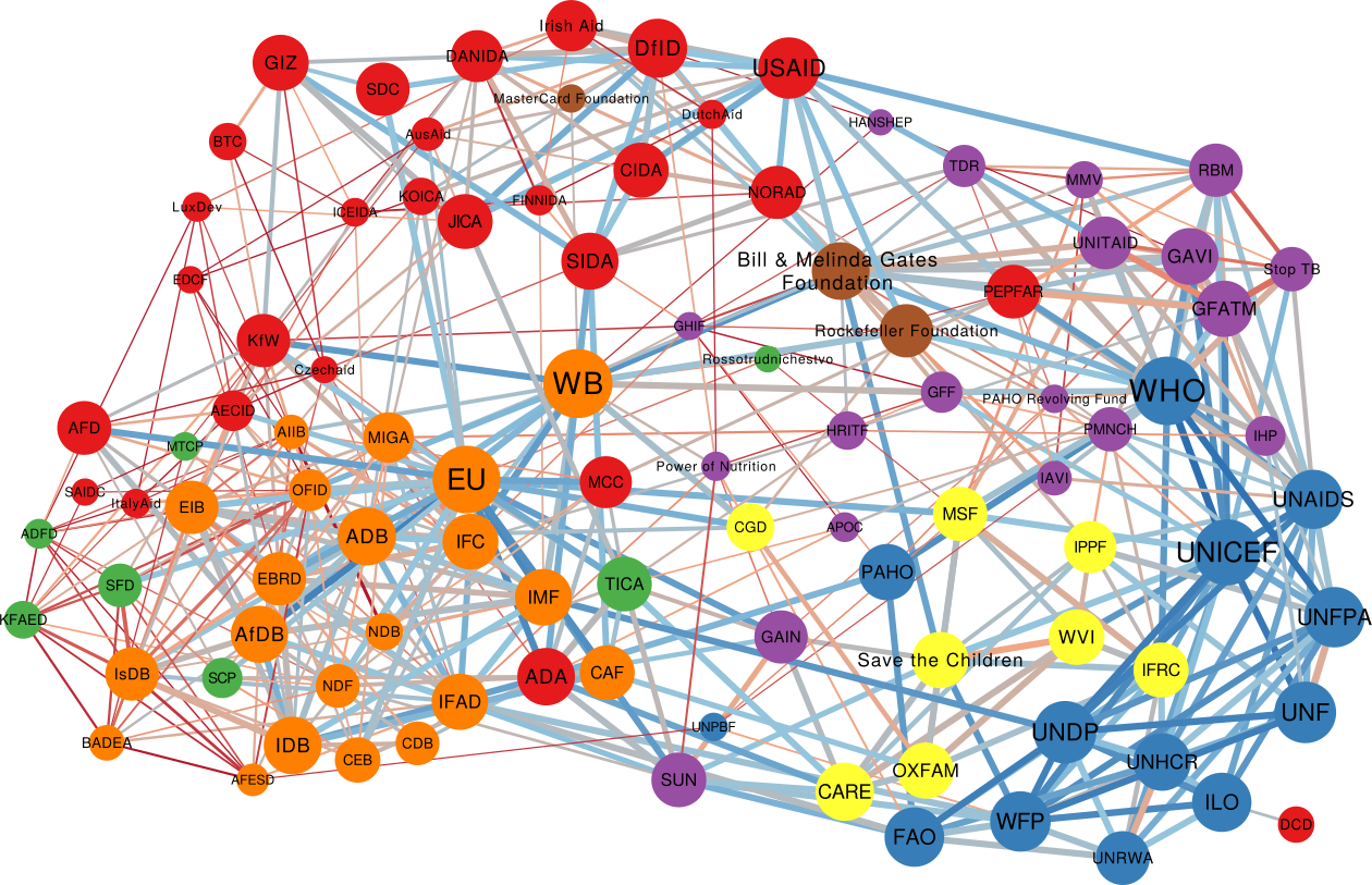
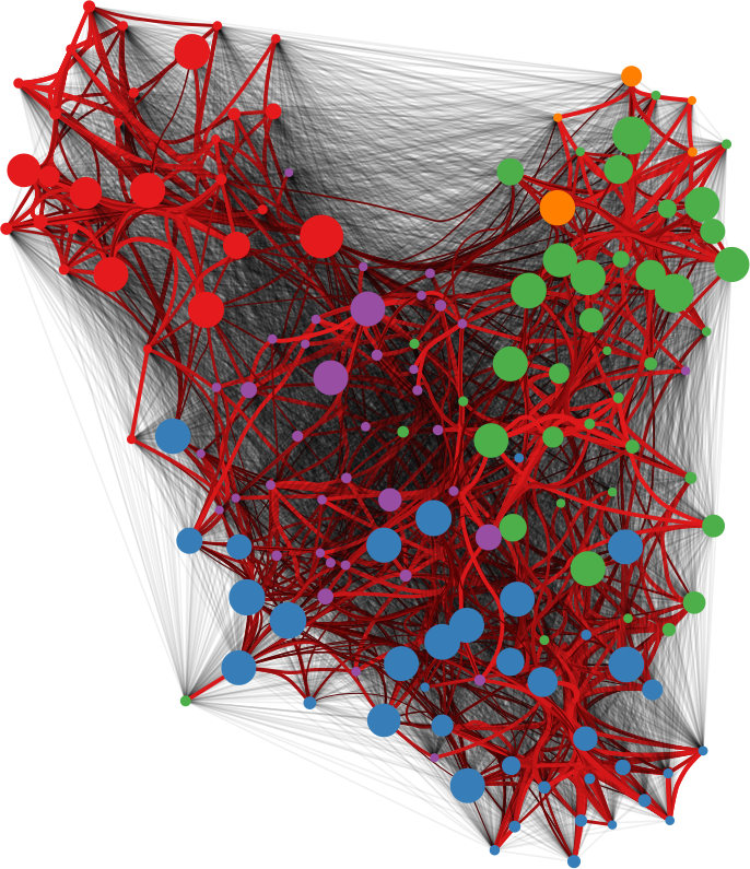
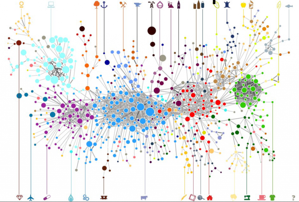
One thing I didn’t expect was that organizations cluster by type. The “type” here is the force behind the organization — private philanthropy, UN system, bilateral (a single country’s aid extension of the foreign ministry), multilateral (international co-operations acting globally), etc. In the picture above (click on the image to enlarge), we encode the agency type in the node color. Organizations are overwhelmingly co-mentioned with organizations of the same type, which is curious because bilaterals often have nothing in common with each other besides the fact they are bilaterals: they work on different issues, with different developed and developing partners.
We can make a similar map connecting issues if they are co-mentioned in a web page. The map is useful as validation because it connects some “synonyms”, for instance “TB” and “Tubercolosis”. However, you can do much more with it. For instance, you can use color to show where an organization is most often cited. Below (click on the image to enlarge) you see the issue map for the World Bank, with the red nodes showing the issues strongly co-mentioned with the World Bank. Basically, the node color is the edge weight in a organization-issue bipartite network, where the organization is the World Bank. To give you an idea, the tiny “Infant Survival” node on the right saw the World Bank mentioned in 9% of the pages in which it was discussed. The World Bank was mentioned in 3.8% of web pages discussing AIDS.
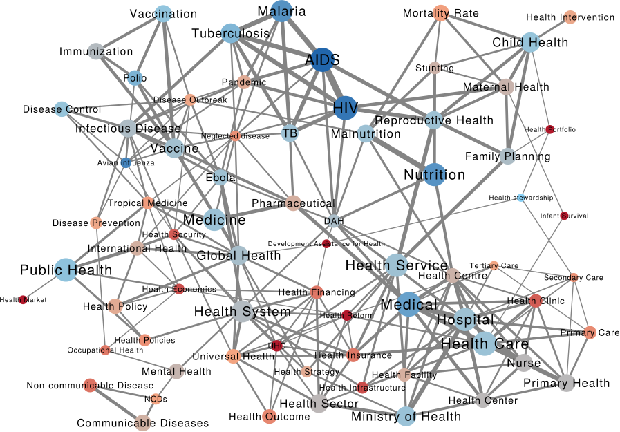
This can lead to interesting discussions. While the World Bank does indeed discuss a lot about some of the red issues above — for instance about “Health Market” and “Health Reform” — its doesn’t say much about “Infant Survival”, relatively speaking at least. It’s intriguing that other organizations mention this particular issue so often in conjunction with the World Bank.
This difference between the global speech about issues and the one specific to another organization allows us to calculate two measures we call “Alignment” and “Impact”. By analyzing how similar the issue co-occurrence network of an organization is with the global one — a simple correlation of edge weights — we can estimate how “Aligned” it is with the global community. On the other hand, an “Impactful” organization is one that, were it to disappear, would dramatically change the global issue network: issues would not be co-mentioned that much.
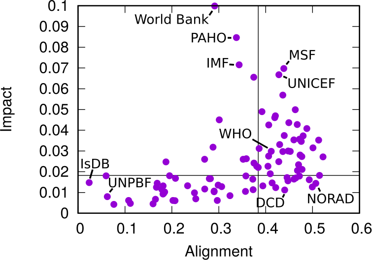
In the plot above, we have Alignment and Impact on the x and y axis, respectively. The horizontal and vertical lines cutting through the plot above show the median of each measure. The top-right quadrant are organization both impactful and aligned: the organizations that have probably been setting the discourse of the international aid community. No wonder the World Health Organization is there. On the top left we have interesting mavericks, the ones which are not aligned to the community at large, and yet have an impact on it. They are trying to shape the international aid community into something different than what it is now.
A final fun — if a bit loose — analysis regards the potential for an organization to spread a message through the international aid network. What would be the reach of a message if it originated from a specific organization? We can use the Susceptible-Infected model from epidemiology. A message is a “virus” and it is more likely to infect an agency if more than a x% of the agency’s incoming links come from other infected agencies.
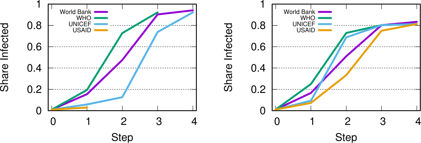
This depends on the issue, as shown above. In the figures we see the fraction of “infected” agencies (on the y-axis) given an original “patient zero” organization which starts spreading the message. To the left we see the result of the simulation aggregating all issues. The World Bank reaches saturation faster than UNICEF, and USAID is only heard by a tiny fraction of the network. However, if we only consider web pages talking about “Nurses” (right), then USAID is on par with the top international aid organizations — and UNICEF beats the World Bank. This happens because the discourse on the topic is relatively speaking more concentrated in USAID than average.
As with the Aid Explorer, this is a small step forward improving the provision of international aid. We do not have an interactive website this time, but you can download both the data and the code to create your own maps. Ideally, what we did only for international aid keywords can be extended for all other topics of interest in the humanitarian community: economic development, justice, or disaster relief.