25 March 2020 ~ 0 Comments

How Quickly is COVID Really Spreading?

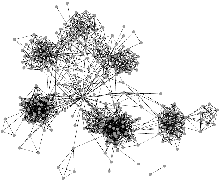
I don’t need to introduce to you what the corona virus is: COVID-19 has had a tremendous impact on everyone’s life in the past weeks and months. All of a sudden, our social media feeds have been invaded with new terminology: social distancing, R0, infection rate, exponential growth. Overnight, we turned ourselves into avid consumers of epidemics literature. We learned what the key to prevent the infection from becoming a larger problem is: slow the bugger down. That is why knowing how fast corona is actually moving is such a crucial piece of information. You have seen the pictures many times, they look something like this:

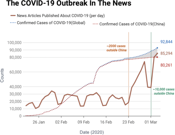
Image courtesy of my data science students: Astrid Machholm, Jacob Kristoffer Hessels, Marie-Louise Tommerup, Simon Breum, Zainab Ali Shaker Khudoir. If anything, it warms my heart knowing that, even during a pandemic, many journalists take their weekends off 🙂

What you’re seeing is the evolution in number of infected people — and how much non-infected people like me blabber about them online. Epidemiologists try to estimate the speed of infection by fitting the real data you see on an SI model. In it, people turn from Susceptible to Infected at a certain rate. These models are usually precise at estimating the number of infected over time, but they lack a key component: they assume that each individual is interchangeable and that anyone has a chance to be infected by anyone in their close proximity. In other words, they ignore the fact that we are embedded in a social network: some people are more central than others, and some have more friends than others.

To properly estimate how fast a disease moves, you need to take the network into account. And this is the focus of a paper of mine: “Generalized Euclidean Measure to Estimate Network Distances“. The paper has been accepted for publication at the 2020 ICWSM conference. The idea of the paper is to create a new measure that estimates the distance between the state of the disease at two moments in time, taking the underlying network topology into account.

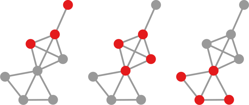
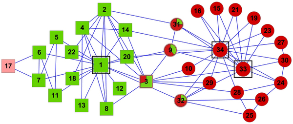
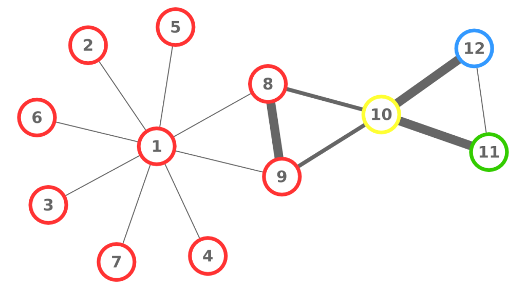
The question here is deceptively simple. Suppose you have a set of infected individuals. In the picture above, they are the nodes in red in the leftmost social network. After a while, some people recover, while others catch the disease. You might end up with the set of infected from the network in the middle, or the one in the right. In which case did the disease spread more quickly?

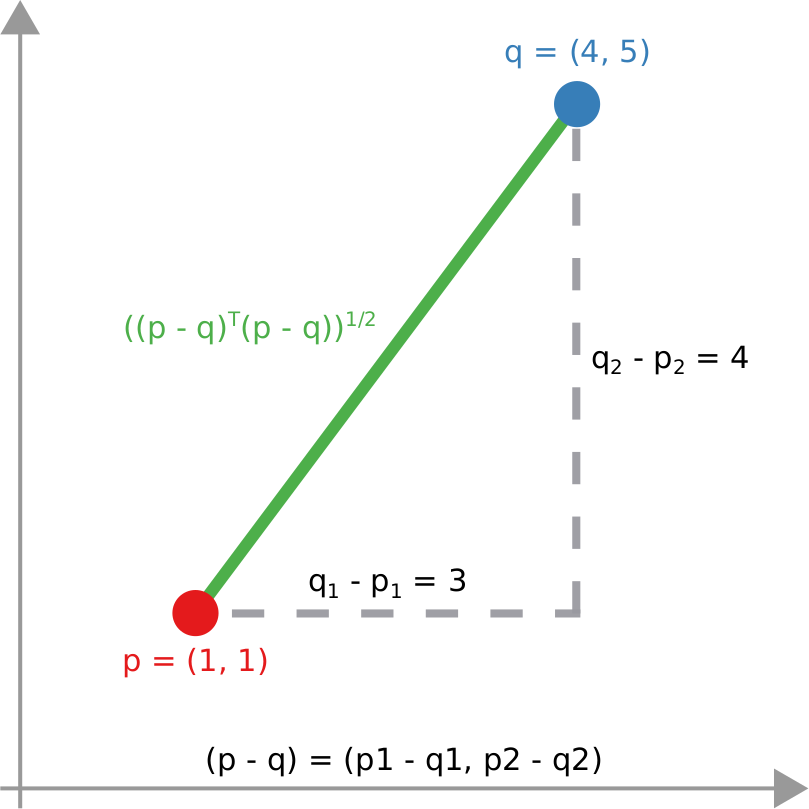
We have a clear intuitive answer: the rightmost network experienced a faster spread, because the infected nodes are farther from the original ones. We need to find a measure that matches this intuition. How do we normally estimate distances in the real world? We use a ruler: we draw a straight line between two points and we measure how long that line is. This is the Euclidean distance. Mathematically, that means representing the two points as vectors of coordinates (p and q), calculating their difference, and then using Pythagoras’ theorem to calculate the length of the straight line between them:

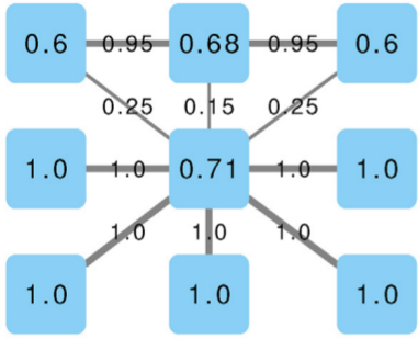
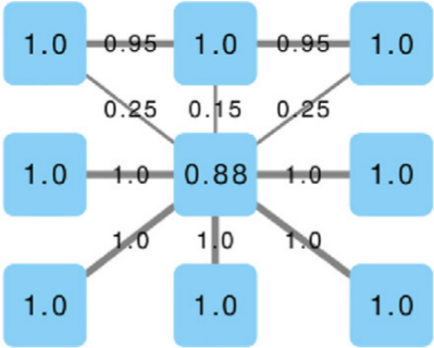
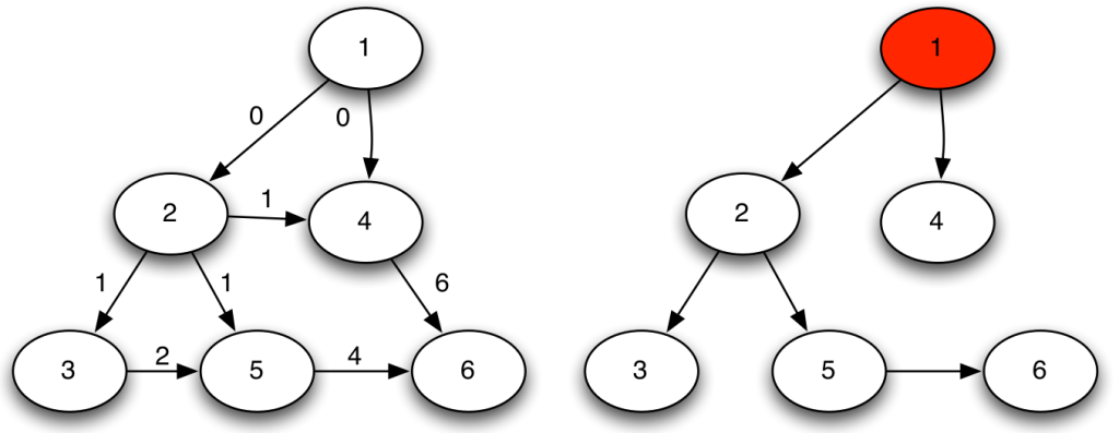
We cannot apply this directly to our network problem. This is because, for silly Euclid, every dimension has the same importance in estimating the distance between points. However, in our case, the points are the states of the disease. They do not live on the plane of Euclidean geometry, but on a network. Some moves in this network space are short and easy: moving between two connected nodes. But other moves are long and hard: between two nodes that are far apart. In other words, nodes that are connected to each other contribute less than unconnected nodes to the distance. The simplest example I can make is:

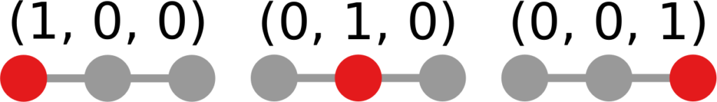
In the figure, each vector — for instance (1,0,0) — is the representation of the state of the disease of the graph beneath it: the entries equal to one identify the currently infected node. Clearly, the infection closer to the left graph is the middle one, not the right one. However, the Euclidean distance between the three vectors is the same: the square root of two. So how do we fix this problem? There is a distance measure that allows you to weigh dimensions differently. It is my favorite distance metric (yes, I am the kind of person who has a favorite distance metric): the Mahalanobis distance. Mahalanobis simply says that correlated variables should count less in estimating the distance: taller people tend to be heavier — because there’s more person to weigh — so we shouldn’t be surprised if someone taller than me is also heavier. But, if they weigh less, we would find it remarkable.

Now we’re just left with the problem of figuring out how to estimate, mathematically, what “correlated” means in a network. The paper has the full details. For here, suffice to say we augment Pythagoras’ theorem with the pseudoinverted graph Laplacian — a sentence I’m writing only to pretend I’m smart (it’s actually not sophisticated at all, and a super easy thing to calculate). The reason we use the graph Laplacian is because it is a standard instrument to estimate how fast things spread in a network.

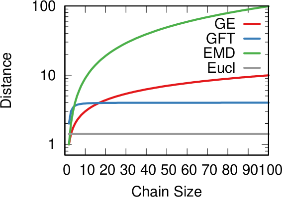
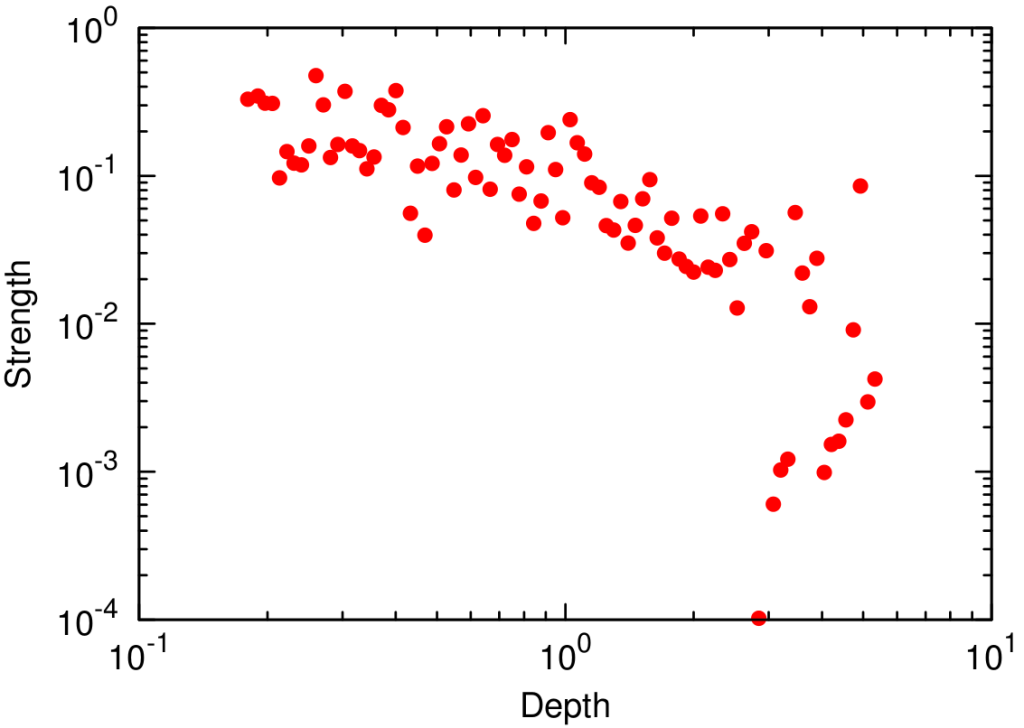
In the paper I run a bunch of tests to show that this measure matches our intuition. For instance, as shown above, if we have infected people at the endpoints of a chain graph, the longer the chain (x axis) the higher the estimated distance should be (y axis). GE (= Generalized Euclidean, in red) is my measure, and it behaves as it should: a constantly growing function (the actual values don’t really matter as long as they constantly grow as we move left to right). I compare the measure with few alternatives. The Euclidean (gray) obviously fails because it doesn’t know what a network is. EMD (green) is the Earth-Mover Distance, which is as good as my measure, but computationally more expensive. GFT (blue) is the Graph Fourier Transform, which is less sensitive to longer distances.

More topically, I can simulate different diseases with a SI model on a network. I can randomly change their infectiousness: how likely you (S) are to contract the disease if you’re in contact with an infected (I) individual. By looking at the beginning and at the end of an infection event, my measure can recover that infectiousness parameter, meaning it can distinguish between slow- and fast-moving diseases.

I’m obviously not pretending to be smarter than the thousands of epidemiologists that are doing a terrific job in fighting — and spreading awareness about — the disease. Their models at a global, national, and regional level for sure work extremely well and do not need this little paper of mine. However, this tool might find its use, when you have detailed data about a specific social network, for instance by using phone data to reconstruct a network of physical contacts. It also has a wider applicability to anything you can model as a diffusion process on a network, being a marketing campaign, the exploration of the Product Space by a country, or even computer vision. If you want to play with the code, I implemented a few network distance methods in a Python library.

Continue Reading

11 December 2018 ~ 0 Comments

How to Sample Networks Using Social Media APIs

If you were a social network analyst in the 1920s, 90% of your work would be to go around bugging people so that they could tell you whom they were friends with — we were, and still are, no fun at parties. Today, instead, we live in the land of plenty: 400 million new Instagram stories per day, 330 million monthly active users on Twitter, a gazillion Facebook profiles! What is there not to love? Well, to start, the fact that you do not have a download button, for very good and real reasons. That means that now 90% of your work is trying to figure out how to interface with these online media to sample the best possible representation of their social networks. So today I’m talking about how to sample a network via a social media API.

Let’s define our terms here. “Sampling a network” means to extract a part of it whose characteristics are as similar as possible to the entire structure. “API” is short for “Application Programming Interface.” It is the program in the server which interacts with the one you wrote to collect data. If you want to know the connections of user X, you ask the API and it will tell you. Most of the time. After a bit of nagging.

A good sample would look like the original network. A good sample like they wanted :’)

There are many approaches to sample networks, and many people have studied them to understand which one works best. But none of these studies actually made an experiment simulating their relationship with the actual API systems they have to work on. The comparisons made so far assume you can know all the connections of a user in one go, and that you can move to the other users as soon as you’re done exploring the current one. Sadly, the real world doesn’t remotely work that way. Thus we need to know how different API systems will influence different sampling methods. With Luca Rossi I wrote a paper about that, “Benchmarking API Costs of Network Sampling Strategies“, which I’ll present this month at the International Conference on Big Data.

An API system will put itself in the way of your noble sampling quest in three ways: (i) by returning only a maximum of n connections per request (i.e. by paginating the results), (ii) by making you wait a certain amount of time between requests, and (iii) by taking some time to respond (i.e. by having latency). The reason why considering the API hurdles is important is that they have a non-trivial relationship with your sampling method.

To illustrate my point consider two API systems. The first system, A1, gives you 100 connections per request, but imposes you to wait two seconds between requests. The second system, A2, gives you only 10 connections per request, but allows you a request per second. A2 is a better system to get all users with fewer than 10 connections — because you are done with only one request and you get one user per second –, and A1 is a better system in all other cases — because you make far fewer requests, for instance only one for a node with 50 connections, while in A2 you’d need five requests.

It seems trivial that A1 is a better system than A2, because it gives you 50 connections per second instead of 10 (we’re ignoring latency here). However, that’s not necessarily the case. Real world networks are far from equal: there are a few superstars with millions of followers, while your average user only has a handful (but I’m catching up with you, Katy!). This means that there are way way way way way way way way more users with 10 or fewer connections than there are with more than 10. In the case represented by the figure, sampling the full network via A2 will actually take half as much time as via A1, even if theoretically we thought we were going to be five times slower.

How many users (y-axis) have this many connections (x-axis). The blue area is where A2 works best — one user per second — while the purple area is where A1 works best. But there are 492.5k users in the blue area (the Michele Coscias), and only 7.5k in the purple (the Katy Perrys)!

With Luca, I created a benchmarking system — which you can freely use — that allows you to simulate network sampling by letting you define:

So now we get to the point of the post where I tell you which sampling method is the very best and you should always use it and it will solve world peace and stuff. And that method is…

…none of them. Unfortunately we realized that, in the world of network sampling, there is no free lunch. The space of possible characteristics of interest, API systems, networks on which you work, and budget constraints is so vast that each sampling method is the best — or worst — in some combinations of these factors. We ran a bazillion tests, but none of them summarizes the results better than these two plots.

On the left you see how badly we get the degree distribution wrong (y-axis, lower is better) at different budget levels (x-axis, from left to right we increase the amount of time we spend sampling the network). If we don’t have much time, the best methods are a variant of Random Walks (MHRW) or Snowball sampling, while the worst method is DFS. But surprise surprise, if we have tons of time, DFS is the best method, and MHRW and Snowball are the worst. By a long margin. No free lunch. On the right we have another instance of the same problem: here we want to know how well we identify central nodes in the network (y-axis, higher is better). The difference at increasing budget levels is ridiculous: the rankings you get when you have a lot of time to sample are practically the opposite of the one you get when you’re in a hurry!

This means that you really need to be careful when you extract networks from social media. You cannot barge in and grab whatever you can, however you can. You need to know which characteristics of the network are important to you. You need to know what the underlying network might look like. You need to know how much time you have to sample the network, compared to its size. You need to know how their APIs work. Otherwise you’re going to run in circles in a very very mad world. And you thought that they had it worse in the 1920s.

Continue Reading

19 April 2018 ~ 0 Comments

Birds of a Feather Scam Together

In Italy we have a saying:

He who walks with the lame learns how to limp

It means that the company you keep will influence your behavior, more often than not in a negative way — never mind the fact that Judas had impeccable friends. Setting my mind on how to verify this tidbit of ancient wisdom, I decided to investigate how the fraudulent behavior of some businesses might correlate with that of the other companies they work with. Does doing business with a crook say something about you? Will Mexican drug cartels ever recoup the damage to their reputation when it turns out they do business with European banks?

The result is the paper “Birds of a feather scam together: Trustworthiness homophily in a business network” published last month in the Social Networks journal. I wrote this paper with Mauro Barone at the Agenzia delle Entrate, the Italian equivalent of the IRS in the US. The idea is simple. We want to answer the question: is the level of fraud committed by a business correlated with the level of fraud committed by its customer/supplier businesses?

I bet none of these birdbrains filled in their 1040 this year.

To answer the question we analyze a business-to-business (B2B) network. Each node in the network is a company, and it connects to other companies with directed edges. The edge goes from a provider to a customer, it follows the flow of goods and services. These connections are weighted according to the monetary value of the total transaction value during the year. The network contains all the relationships of a few thousands audited Italian businesses, centered on one Italian region: Tuscany.

The peculiarity of the data structure that allow us to speak about tax fraud is that each connection is registered twice. Say we have business A and business B. The “A sold to B” connection should be reported by both A and B: A says how much it sold, and B says how much it purchased. See the example below: the blue edges are A’s declarations, and the orange edges are B’s. The two businesses agree on how much B sold to A (75 Euros), but they disagree on how much A sold to B.

Finding who’s trustworthy and who’s not seems, at first sight, an easy problem. If a business constantly misreports its transactions with its customer/supplier network, then we have good ground to suspect something fishy is going on. However, it’s not that easy. Say we decide a mismatch of 5 Euros is divided into 2.5 blamed on A and 2.5 blamed on B. We might think we’re doing a neutral operation, but we aren’t. What appears to be fair — shifting the blame equally to both actors involved in a disagreement — is already a heavy judgment. Maybe the fault lays completely on B, and A is a blameless victim. We all know how the story ends if we simply wash our hands of the problem like Pontius Pilate: with brigands freed and prophets on the cross.

Paradoxically, if you simply average mismatches, the larger you are, the more you can con. The vast majority of businesses are honest thus, if you have a lot of relationships, they will mostly check out and bring your average match value up. At that point, you can tactically limit your misreports to a few connections and thus evade your taxes. The network also has a broad degree distribution, meaning that most businesses have few connections. This means that your victims will not have enough honest links to make up for the curveball you just threw at them. You can see an example below: the number on the node is their average edge weight, which is the match level of the connection — the total amount of Euros accounted for over the total transaction value (in the A-B example above, we have 75+75+100+95=345 total edge value, but only 340 accounted for given the mismatch of 5, thus the edge weight would be 340/345= 0.9855). Even though the hub has the most fraudulent connections — edges with low match values — its average is higher than that of its victims.

We solve this problem by taking these average mismatches only as a starting condition. At each iteration, we recalculate the average by re-weighting connections according to the trustworthiness equilibrium. The trick is to do it in an asymmetric way. If the previous iteration’s trustworthiness of A was larger than B’s, then in this iteration the mismatch for A is reduced, thus more of the blame will end on B. In practice, if on average we trusted A more, then we’re going to keep doing so in its other cases of mismatch. We don’t let a speck in A’s eye to make us miss the plank in B’s. (Man, my Biblical references today are on point!)

The exact mathematical formulation of this trick is in the paper. In practice, in our example above, the honest businesses below the hub siphon out all its trustworthiness — as they should. They leave it dealing with the businesses at the top, which are corroborating each other honesty with their own high-match links. After a few iterations, the hub ends up being the only business we should not trust — see below (note that I changed the node’s trust value, but I kept the edges constant, as showing the asymmetric correction would make the picture more confusing). In the paper we show that now we break the relationship between the trustworthiness score and the topological characteristics of the nodes: they are now being judged not by their position, but by their actions.

So: is it true that the friends of lame businesses are picking up limps? Yes it is: the difference in trustworthiness levels is a significant indicator whether a connection between two businesses is there or not. In practice, you can use it to predict future links in the B2B network. A strong match on trustworthiness doubles the chances that two businesses are connected to each other when compared to businesses with very different trustworthiness levels.

Making a point about Italian popular wisdom is all good and well, but this paper has a few more things to say. The trustworthiness score as we defined it has some interesting practical applications when it comes to predict which businesses to audit. If a low-trust business is audited, its probability of being fined — meaning something was indeed fishy — is ten percentage points higher than a high-trust business. Since our sample comes from audited businesses, it is not randomly selected: we’re observing businesses that were already suspect. So, if anything, this is an underestimation of the power of our measure: if we’re able to weed out the small crooks from the big ones, we’re probably going to do an even better job distinguishing innocents and culprits.

I think that this paper can do good for honest businesses. To be audited is a long and painful process: if you can skip it because the Agenzia delle Entrate knows how to find the bad guys, you can save time, energy, and peace of mind. And the crooks? Well, the crooks will have to render unto Caesar the things which are Caesar’s.

Continue Reading

22 January 2015 ~ 0 Comments

Surprising Facts About Shortest Paths

Maybe it’s the new year, maybe it’s the fact that I haven’t published anything new recently, but today I wanted to take a look at my publication history. This, for a scientist, is something not unlike a time machine, bringing her back to an earlier age. What was I thinking in 2009? What sparked my interest and what were the tools further refined to get to the point where I am now? It’s usually a humbling (not to say embarrassing) operation, as past papers always look so awful – mine, at least. But small interesting bits can be found, like the one I retrieved today, about shortest paths in communication networks.

A shortest path in a network is the most efficient way to go from one node to another. You start from your origin and you choose to follow an edge to another node. Then you choose again an edge and so on until you get to your destination. When your choices are perfect and you used the minimum possible number of edges to follow, that’s a shortest path (it’s A shortest path and not THE shortest path because there might be alternative paths of the same length). Now, in creating this path, you obviously visited some nodes in between, unless your origin and destination are directly connected. Turns out that there are some nodes that are crossed by a lot of shortest paths, it’s a characteristic of real world networks. This is interesting, so scientists decided to create a measure called betweenness centrality. For each node, betweenness centrality is the share of all possible shortest paths in the network that pass through them.

Intuitively, these nodes are important. Think about a rail network, where the nodes are the train stations. High betweenness stations see a lot of trains passing through them. They are big and important to make connections run faster: if they didn’t exist every train would have to make detours and would take longer to bring you home. A good engineer would then craft rail networks in such a way to have these hubs and make her passengers happy. However, it turns out that this intuitive rule is not universally applicable. For example some communication networks aren’t willing to let this happen. Michele Berlingerio, Fosca Giannotti and I stumbled upon this interesting result while working on a paper titled Mining the Temporal Dimension of the Information Propagation.

tas2

We built two communication networks. One is corporate-based: it’s the web of emails exchanged across the Enron employee ecosystem. The email record has been publicly released for the investigation about the company’s financial meltdown. An employee is connected to all the employees she emailed. The second is more horizontal in nature, with no work hierarchies. We took users from different email newsgroups and connected them if they sent a message to the same thread. It’s the nerdy version of commenting on the same status update on Facebook. Differently from most communication network papers, we didn’t stop there. Every edge still carries some temporal information, namely the moment in which the email was sent. Above you have an extract of the network for a particular subject, where we have the email timestamp next to each edge.

Here’s where the magic happens. With some data mining wizardry, we are able to tell the characteristic reaction times of different nodes in the network. We can divide these nodes in classes: high degree nodes, nodes inside a smaller community where everybody replies to everybody else and, yes, nodes with high betweenness centrality, our train station hubs. For every measure (characteristic), nodes are divided in five classes. Let’s consider betweenness. Class 1 contains all nodes which have betweenness 0, i.e. those through which no shortest path passes. From class 2 to 5 we have nodes of increasing betweenness. So, nodes in class 3 have a medium-low betweenness centrality and nodes in class 5 are the most central nodes in the network. At this point, we can plot the average reaction times for nodes belonging to different classes in the two networks. (Click on the plots to enlarge them)

tas1

The first thing that jumps to the eye is that Enron’s communications (on the left) are much more dependent on the node’s characteristics (whether the characteristic is degree or betweenness it doesn’t seem to matter) than Newsgroup’s ones, given the higher spread. But the interesting bit, at least for me, comes when you only look at betweenness centrality – the dashed line with crosses. Nodes with low (class 2) and medium-low (class 3) betweenness centrality have low reaction times, while more central nodes have significantly higher reaction times. Note that the classes have the same number of nodes in them, so we are not looking at statistical aberrations*. This does not happen in Newsgroups, due to the different nature of the communication in there: corporate in Enron versus topic-driven in Newsgroup.

The result carries some counter intuitive implications. In a corporate communication network the shortest path is not the fastest. In other words, don’t let your train pass through the central hub for a shortcut, ’cause it’s going to stay there for a long long time. It looks like people’s brains are less elastic than our train stations. You can’t add more platforms and personnel to make more things passing through them: if your communication network has large hubs, they are going to work slower. Surprisingly, this does not hold for the degree (solid line): it doesn’t seem to matter with how many people you interact, only that you are the person through which many shortest paths pass.

I can see myself trying to bring this line of research back from the dead. This premature paper needs quite some sanity checks (understatement alert), but it can go a long way. It can be part of the manual on how to build an efficient communication culture in your organization. Don’t overload people. Don’t create over-important nodes in the network, because you can’t allow all your communications to pass through them. Do keep in mind that your team is not a clockwork, it’s a brain-work. And brains don’t work like clocks.


* That’s also the reason to ditch class 1: it contains outliers and it is not comparable in size to the other classes.


Continue Reading

20 March 2014 ~ 0 Comments

When Dimensions Collide

The literature about community discovery, which deals with the problem of finding related groups of nodes in a network, is vast, interesting and full of potential practical applications. However, if I would have to give one critique of it, it would be about its self referential character. Most community discovery papers I read in computer science and physics journals are mainly about finding communities. Not much time is spent thinking about what to do with them, or what they mean. My first post in this blog was about a community discovery algorithm. Recently, an extended version of that paper has been accepted in a computer science journal. Since that first post, I (mainly) added some crucial modifications and features to the algorithm. I don’t want to talk about those here: they are boring. I also didn’t bring up this paper to boast about it. Okay, maybe a little. I did it because the paper touches upon the issue I am talking about here: it tries to do something with communities, it tries to explain something about them. Namely, it asks: why do communities overlap?

First of all: communities do overlap. When trying to detect them, many researchers realized that hard partitions, where each node can belong to one and only one community, are not always a good idea. Most of them found this a problem. Others were actually very happy: the problem gets harder! Nice! (Researchers are weird). Blinded by their enthusiasm, they started developing algorithms to deal with this overlap. Not many asked the question I am trying to answer here: why do communities overlap? As a result, some of these algorithms detect this overlap, but using approaches that do not really mean anything in real life, it’s just a mathematical trick. Others, instead, build the algorithm around a core hypothesis.

This hypothesis is nothing unheard of. Communities overlap because people have complex lives. Some of your college mates also attend your yoga class. And you know your significant other’s colleagues, which puts you in their community. All these communities have you as common member, and probably some more people too. The beauty of this is that it is not only intuitive: it works well in finding communities in real world social networks. So well that it is the assumption of my approach and of many others outstanding algorithms (this and this are the first two that pop into my mind, but there are probably many more). Another beautiful thing about it is that it is almost obvious, and so it is probably true. But here we hit a wall.

The fact that it is simple, reasonable and it works well in practice proves nothing about its property of being true. There are things that are not simple nor reasonable, but nevertheless true (hello quantum physics!). And there is practical knowledge that does not quite correspond to how things work (in my opinion, most computer science is a patch and nobody really knows why it works). Unless we test it, we cannot say that this nice practical principle actually corresponds to something happening in reality. So how do we go on and prove it? In the paper I proposed a first step.

This brings me back to another old love of mine. Multidimensional networks. They are networks in which we put multiple relations in a cage together in mating season and see what happens (research is fun). The idea behind the paper is that multidimensional networks give us the perfect tool to test the hypothesis. In monodimensional networks you have no clue why two people are connecting besides the obvious “they know each other”. In a multidimensional network, you know why they know each other, it’s information embedded in the type of the relation. So, the hypothesis is that different types of relations are the cause of the community overlap, and with multidimensional networks we can look at how communities distribute over relations. First, let us take a look at what two overlapping communities look like in a multidimensional network.

We collected a multidimensional social network putting together relationships between users in Facebook, Twitter and Foursquare. We then used DEMON to extract overlapping communities from each dimension. We then took two communities with extensive overlap in the Facebook dimension (picture below).

We then looked at the very same set of nodes, but now in the Foursquare network. In the picture below, we kept the edges, and the node positioning, of the Facebook network to make the comparison easier, but keep in mind that the edges in the Foursquare dimension are different, and they are the ones that decide to what community the nodes belong.

Very interesting. The communities look a lot alike, although the shared (and non shared) nodes are slightly different. Now node 7369 is shared (it wasn’t in Facebook) while node 8062 isn’t (whereas it was before). Let’s put another nail on the coffin and see the communities these nodes belong in Twitter (same disclaimer applies):

Surprise surprise, in Twitter there is actually only one community, which brings together the majority of the nodes of the two communities. So here’s where our overlap comes from: common affiliations in different dimensions! Now, I’m going to deal with that voice in your head that is screaming “Anecdotal! Anecdotal!”. (You don’t hear it? Did I already mention that researchers are weird? In any case “Anecdotal” refers to a type of evidence that bears no value in scientifically proving a point if not backed by more solid proofs). Put in a more general way: the more two communities overlap in some dimension, the more likely it is we can find a dimension in which these communities are actually a single community. This involves boring details you can find in the paper which ultimately generate this plot:

Does this plot prove our theory without leaving out any reasonable doubt? Maybe, or not really. There are still things to check. But science is made by tiny steps forward. And this is certainly one.

Continue Reading

14 November 2013 ~ 2 Comments

What is a “Community”?

The four of you who follow this blog regularly will know that I have a thing for something called “community discovery“. That’s because no matter how you call it, it always sounds damn cool. “Discovering Communities” or “Detecting the functional modules” or “Uncovering node clusters”. These are all names given to the task of finding groups of nodes in a network that are very similar to each other. And they make you feel like some kind of wizard. Adding to that, there are countless applications in epidemiology, sociology, immunology, marketing.

Far from being original, I share this passion with at least a thousand researchers. Being as smart as they are, they quickly realized that there are many ways in which you can group nodes based on their similarity. On the one hand, this is good news, as we basically have an algorithm for any possible community you want to find in your network. On the other hand, this made a lot of people freak out, as too many algorithms and too different solutions are usually a big red flag in computer science. A flag that says: “You have no idea what you are doing!” (although a computer scientist would put it in the cold and rational “Your problem is not formally defined”: it means the same).

Yes, my signature "Community Discovery Picture" strikes again!

Yes, my signature “Community Discovery Picture” strikes again!

I personally think that the plus side is more predominant than the minus side, and you can get rid of the latter with a bit of work. Work that I have done with Dino Pedreschi and Fosca Giannotti in our paper “A classification for Community Discovery Methods in Complex Networks“. The trick is very simple. It just consists in noticing what’s wrong with the starting point. “Finding groups of nodes in a network that are very similar to each other”. Exactly what is “similar“? It is an umbrella term that can be interpreted in many different ways. After all, we already do this outside of network science. People can be very similar because they look alike. Or because they like the same things. So why can’t we just have different definitions of communities, based on how we intend similarity?

Well, because at the beginning of community discovery we thought that the problem was well defined. The first definition of community was something like: “A community is a group of nodes that are densely connected, and they have few edges connecting them to nodes outside the community”. Which is fine. In some cases. In others, we discovered that it doesn’t really make sense. For example, we discovered that many social networks have a pervasive overlap. It means that nodes are densely connected with many different groups, disproving the definition: now, the area outside the community could be just as dense as the community itself! And this is just one example: you take a hundred community discovery algorithms in literature and you’ll get a hundred different community results on the same network.

Overlap in the infamous Zachary Karate Club network.

Overlap in the infamous Zachary Karate Club network, you can even win a prize if you mention it!

So now researchers in the community discovery… well… community were divided in three factions. We had those who thought that the problem was ill defined, thus everything done so far was just a royal mess. Then there were those who still thought that the problem was well defined, because their definition of community was the only one standing on solid ground and everybody else was just running around like a headless chicken. And then there were people like me and Sune Lehmann (whom I thank for the useful discussions). Our point was that there were many different definitions of communities, and the incompatible results are just the output of incompatible definitions of community.

This is the main take-away message of the paper. We then moved on and tried to actually spot and categorize all different community definitions (for 90s kids: think of a Pokédex for algorithms). Some choices were easy, some others weren’t. I personally think that more than an established classification, this is just a conversation starter. Also because the boundaries between community definitions are at least as fuzzy as the boundaries between the communities themselves. Algorithms in one category may also satisfy conditions imposed by another category. And to me that’s fine: I don’t really like to put things in separate boxes, I just want to have an insight about them.

I put tags, not classes.

I put tags, not classes.

So here you go, the classification we made includes the following “community types” (names are slightly changed from the paper, but it should be obvious which is which):

  • Common Features: in this definition, each node has a number of attributes. If we are in a social network and the nodes are people, these attributes may well be the social connections, the movies you like, the songs you listen to. Communities are groups of nodes with similar attributes.
  • Internal Density: the classical starting point of community discovery. Here we are interested in just maximizing the number of edges inside the communities.
  • External Sparsity: a subtle variant of the Internal Density class. The focus of this definition is on considering communities as islands of nodes, not necessarily densely connected.
  • Action Communities: this is a very dynamic definition of communities. Nodes are not just static entities, but they perform actions. Again, in a social network you not only like a particular artist: you listen to her songs. If your listening happens with the same, or similar, dynamics of other people, then you might as well form a community with them.
  • Proximal Nodes: here we want the edges inside the communities to make it easy for a node to be connected to all other nodes in the community. Or: to get to any other node in the community I have to follow just a few edges.
  • Fixed Structure: this is a very demanding community definition. It says that the algorithm knows what a community looks like and it just has to find that structure in the network.
  • Link Communities: one of my favorites, because it revolutionizes the idea of community. Here we think that we need to group the edges, not the nodes. In a social network, we know different people for different reasons: family, work, free time, … The reason why you know somebody is the community. And you belong to many of them: to all the communities your edges belong to.
  • Others: in any decent classification there must be a miscellaneous category! Some algorithms do not really follow a particular definition, whether because they just add features to other community discovery algorithms or because they let the user define their communities and then try to find them.

And now just a shortlist of readily available community discovery algorithms you can find on the Web:

That’s it! I hope I created a couple of new community discovery aficionados!

Continue Reading

10 October 2013 ~ 0 Comments

The Paradox of Social Controllability

“It’s a bit sad that some among the most brilliant minds of our generation are working tirelessly on strategies to increase clicks on online ads” popped up on my Facebook stream some days ago (I don’t remember who wrote it, so you are welcome to contact me to restore credit where credit is due 🙂 ). But the point still remains. I actually don’t find it that bad. Yes, it’s bad, but it could be worse. It reminds me of other “wrong” reasons to do incredible improvements in science and stuff. For example, war is responsible for many technology advancements. Even if the aim of online marketing is just to increase revenues, what it actually requires is to understand human psychology, behavior and social interactions. In practice, that’s philosophy of the human mind at its best: how does the brain work? How does a collection of brains work? What drives our behavior and needs?

When you put together many minds in the real world, you have to deal with complex networks. We are not connected with one another at random, and the eyes of our friends are the channel through which we observe the world. This fact is studied in complex network analysis, in the sub-branch of cascade behaviors. Cascade behaviors happen when a person in a social network decides to modify her behavior according to the behavior of the people she is connected to. As a consequence, there are some people in the network who are in a very particular position: given the people they know and their prominence among them, they can modify their behavior and they will modify their friends’ behavior and so on an so forth, changing forever how every node in the network behaves. And that’s the cascade. If you find a way to identify these prominent actors in the network, you can control the behavior of the entire system. Now you can see why there is a mountain of work about it. In the computer science approach, we have threshold models simulating the cascade for many starting nodes and thus identify the practical leaders (for example Jon Kleinberg’s work); in physics we have models, aiming at understanding the degree of controllability of complex systems (I’ll go with Laszlo Barabasi in this).


Visualization of network cascade, from my good friend Mauro Martino. The red dots at the bottom are the “drivers”, who influence the collection of green nodes they are attached to.

Genuinely curious about the topic, I started my own track of research on it. One thing that Diego Pennacchioli, Giulio Rossetti, Luca Pappalardo, Dino Pedreschi, Fosca Giannotti and me found curious is that everybody working on social prominence was looking at it from a monodimensional perspective. That means: the only thing they are interested in is how to maximize the number of nodes influenced by the leaders. The bigger this number, the better. All fun and games, but why? I can think about several scenarios where the final total number is not the most important thing. For example:

  • What if I want people to buy a product? The total number of people knowing about the product is nice, but I want them to be strongly committed, strongly enough to buy it.
  • What if I am actually looking to reach a particular person? Then I care how deeply my message can go through the network.
  • What if I just care about my friends? Then screw their friends (and everybody else), as long as I can influence a wide range of my direct connections!

toy
To calculate our measure we need to infer the diffusion trees. So from the left, where the number on each arrow gives you the action time of the node at the base of the arrow, we go to the right by selecting the lowest possible combination of arrows.

Strength, depth and width of social prominence. That’s why our paper is called “The Three Dimensions of Social Prominence” (check it out). Strength is how committed the people you influenced are to keep doing what you influenced them to do. Depth is how many degrees of separation (or, how far) the cascade of influence that you triggered can go. Width is simply the ratio of your friends that you are able to influence. By analyzing how much a user in Last.fm (a social website based on music) is able to influence her friends in listening to new artists, we found a collection of very interesting facts.

For example, it is well known that in social networks there are some nodes that are structurally very important. They are the central users, the ones that keep the network connected. Intuitively, they are the only way, or the easiest way, through which a signal (in our case social influence) can go from one part of the network to the other. Guess what: they can’t do it. We found a significant anti-correlation between centrality and width and depth. That is bad news, because those nodes are the ones in the only position with a theoretical ability of controlling the network and a practical inability in doing so. I like to call it “The Paradox of Social Controllability” (hence, the post title).

ds
The anti-correlation between depth and strength.

Another piece of food for thought is the trade off between strength and depth. While width is unrelated to both, we found that if you want to go deeply into the network, then you can’t expect that the people you touch will be extremely committed to your message.

The third big thing is the distribution of connections per leader. We found that the leaders showing highest values of strength, depth and width were those who used Last.fm with average frequency. The highly connected and very active users (hubs, in network lingo) scored poorly, as we saw. So did the occasional users, the ones with just two or three connections (that is the majority of the system). The people who have control over the network are the mildly engaged. They are you, in practice: chances are that you are not a record label, nor a music fanatic, but just a person with her tastes and preferences. So you have control. Problem is, the control is scattered equally on the vast set of people like you.

To conclude, we saw what wonderful things network cascades are: they could empower us to do a lot of good. We also saw how there are theoretical results about the possibility of identifying people who can trigger them. But my unfortunate conclusion is about the paradox between theory and practice. Those who theoretically should, apparently can’t.

Continue Reading

12 August 2013 ~ 0 Comments

Personal vs Social Knowledge

Today I want to talk about jobs. Or, better, about finding a job. Sooner or later, this is a task that many people will have to perform and it is not usually a very enjoyable one. Writing a CV is mostly painful. You have to list all your skills, all the knowledge you have, what you have done in the past, the tasks you can perform. Everything to maximize your value to the eyes of the examiner, who is judge, jury and executioner of your working fate. But, after all, you can’t complain. You know the rules of the game. It is only fair, because the recruiter wants to see the best possible CV and the best possible CV is the one that includes the most relevant information: you have to stuff the maximum amount of skills in your body to maximize your value and it is the most valuable person the one who is going to be picked. Right?

Wrong. There’s one critical flaw to that reasoning, and that is time. Time is limited. You can’t spend too much time in stuffing knowledge into you, because there is too much knowledge out there and if you try to internalize everything you don’t have time to produce anything. This is not just my opinion. It is one of the cornerstones of widely accepted and useful theories, for example the division of labour. This is linked to the concept of “social knowledge“. Social knowledge is the collection of what people in society know. While personal knowledge is bounded by time, social knowledge is not, because many different brains work on it at the same time, making it grow beyond what any individual can grasp.

social-knowledge-broker

If you want to have 100 people to make cars, you don’t teach each one of them to make a car from scratch and then you watch them making 100 cars at the same time. Each guy will assemble one part. And he’ll be awesome at that particular part. This applies not only to manufacturing. How many times in your working life you found yourself struck with a problem, not exactly in your knowledge domain, and you solved it by simply asking someone about it? In my case, many. Think about how many times you Google something. That’s accessing the social knowledge of humanity. That is one of the reasons why, for example, the social return of education exceeds the private return.

The way you access social knowledge also changes the usefulness of it. It is better if a friend takes time to explain things to you than if you have to read an answer in Quora, that is also related only to some extent to your specific problem. Because tacit knowledge needs a broker to make it explicit and understandable. So it is better to have knowledgeable friends in many fields, or: your social network matters for your qualifications, because it’s the principal medium you use to get explicit knowledge from the tacit social knowledge.

social-network

So it seems like we are onto an interesting problem. On one hand, I hope to have convinced you that social knowledge is an important component of someone’s value; on the other hand that creates more questions than answers. How do we evaluate a person for a job? How do we measure the social knowledge she has access to? Well, if you know me you know what’s going to happen. A network algorithm, of course! Precisely, an algorithm with a flavor of Philip K. Dick in its name: UBIK, or “U know Because I Know”. This algorithm has been created and developed with the help of Giulio Rossetti, Diego Pennacchioli and Damiano Ceccarelli and has resulted in a paper published in the ASONAM 2013 conference that will take place later this month. Also, the code of UBIK is available for use.

Here’s how UBIK works. First, you have to start by collecting information about the social connections of people. It’s even better if you can find multiple types of connections from multiple sources, because the channel through which knowledge passes influences the quality of that knowledge. Second, for each person you have to collect their CV. Personal knowledge is still important. Once you have these pieces of information, UBIK can unweave its magic.

ubiktoy

Let’s look at a simple example. The above picture can be considered a network of people: each node is a person, each person is connected to the people she knows, her color represents the skill in which she is specialized, and the width of the link is the strength of the connection (important: UBIK works with qualities of links, not strengths, but for the sake of simplicity in this example we use the latter). The consequence of our theory is that the skills of each person are transferred through the links of the network. Also, a direct connection is stronger than a connection through another node. For example, node 8 passes her skills more efficiently to 1 than node 10 does.

So, at the first iteration, UBIK passes the skills of each node to its neighbors. Node 1 gets a lot of red skill, node 10 gets all kinds of skills. It is a percolation process. At each iteration, UBIK keeps passing the entire set of updated skills, with an increasing penalty due to the social distance. I won’t bother you with the equations. Just know that, at some point, the penalty is so high that the algorithm stops.  The skill transfer happens proportionally to the strength of the links connecting the nodes. As a result, node 10 is super valuable, because she has access to the knowledge about all skills in the network, while for example node 1 will be a uber-specialist of the red skill. By just looking at their CV, it would be impossible to extract this information.

ubikplots

Some of you familiar with network analysis may have some bells ringing in their heads. “This is node ranking!” Well, yes. “So just use PageRank!” “Or HITS!” “Why do we need UBIK?” Well, for a number of reasons. First, UBIK handles multiple link types and multiple skills at the same time: (variants of) PageRank and HITS can do one or the other, but not so many can do it simultaneously yielding effective results. Second, PageRank and HITS have flaws. PageRank correlates with degree (the number of connections of a node) and centrality measures: see the above picture where we confront the rankings of the algorithms with the degree rank. HITS has similar flaws related to the nodes’ tendency of cluster in communities.

Moreover, when we applied the algorithms to network of researchers, UBIK was most likely to rank them in the same way as measures independent from networks such as the H-Index. This shows that UBIK may be more useful than other network ranking techniques when these independent evaluation criteria are not available. The beauty of UBIK consists in multiple rankings. Below I report some rankings of researchers in Computer Science. Each number is the rank that UBIK gave to the researcher in a particular conference. Each conference is a different ranking that UBIK is able to distinguish. We are able to spot the specialists of many computer science conferences, highlighting their prominence in one community and low ranking in others. Also, we report the rankings in these conferences for the most prominent general authors, showing that they rank on average well in many different venues, but they are not really specialists.

ubiktable

And that’s why you should give UBIK a chance.

Continue Reading

15 July 2013 ~ 0 Comments

ICWSM 2013 Report

The second half of the year, for me, is conference time. This year is no exception and, after enjoying NetSci in June, this month I went to ICWSM: International Conference on Weblogs and Social Media. Those who think little of me (not many, just because nobody knows me) would say that I went there just because it was organized close to home. It’s the first conference for which I travel not via plane, but via bike (and lovin’ it). But those people are just haters: I was there because I had a glorious paper, the one about internet memes I wrote about a couple of months ago.

In any case, let’s try to not be so self-centered now (good joke to read in a personal website, with my name in the URL, talking about my work). The first awesome thing coming to my mind are the two very good keynotes. The first one, by David Lazer, was about bridging the gap between social scientists and computer scientists, which is one of the aims of the conference itself. Actually, I have been overwhelmed by the amount of the good work presented by David, not being able to properly digest the message. I was struck with awe by the ability of his team to get great insights from any source of data about politics and society (one among the great works was about who and how people contact other people after a shock, like the recent Boston bombings).

For the second keynote, the names speak for themselves: Fernanda Viégas and Martin Wattenberg. They are the creators of ManyEyes, an awesome website where you can upload your data, in almost any form, and visualize it with many easy-to-use tools. They constantly do a great job in infographics, data visualization and scientific design. They had a very easy time pleasing the audience with examples of their works: from the older visualizations of Wikipedia activities to the more recent wind maps that I am including below because they are just mesmerizing (they are also on the cover of an awesome book about data visualization by Isabel Meirelles). Talks like this are the best way to convince you of the importance of a good communication in every aspect of your work, whether it is scientific or not.

As you know, I was there to present my work about internet memes, trying to prove that they indeed are proper memes and they are characterized by competition, collaboration, high-order organization and, maybe I’ll be able to prove in the future, mutation and evolution. I knew I was not alone in this and I had the pleasure to meet Christian Bauckhage, who shares with me an interest in the subject and a scientific approach to it. His presentation was a follow-up to his 2011 paper and provides even more insights about how we can model the life-span of an internet meme. Too bad we are up against a very influential person, who recently stated his skepticism about internet memes. Or maybe he didn’t, as the second half of his talk seems to contradict part of the first, and his message goes a bit deeper:

http://www.youtube.com/watch?v=GFn-ixX9edg

Other great works from the first day include a great insight about how families relate to each other on Facebook, from Adamic’s group. Alice Marwick also treated us to a sociological dive into the world of fashion bloggers, in the search of the value and the meaning of authenticity in this community. But I have to say that my personal award for the best presentation of the conference goes to “The Secret Life of Online Moms” by Sarita Yardi Schoenebeck. It is a hilarious exploration of YouBeMom, a discussion platform where moms can discuss with each other preserving their complete anonymity. It is basically a 4chan for moms. For those who know 4chan, I mean that literally. For those who don’t, you can do on of two things to understand it: taking a look or just watching this extract from 30 Rock, that is even too vanilla in representing the reality:

I also really liked the statistical study about emoticon usage in Twitter across different cultures, by Meeyoung Cha‘s team. Apparently, horizontal emoticons with a mouth, like “:)”, are very Western, while vertical emoticons without a mouth are very Eastern (like “.\/.”, one of my personal favorites, seen in a South Korean movie). Is it possible that this is a cultural trait due to different face recognition routines of Western and Eastern people? Sadly, the Western emoticon variation that includes a nose “:-)”, and that I particularly like to use, apparently is correlated with age. I’m an old person thrown in a world where young people are so impatient that they can’t lose time pressing a single key to give a nose to their emoticons :(

My other personal honorable mention goes to Morstatter et al.’s work. These guys had the privilege to access the Twitter Firehouse APIs, granting them the possibility of analyzing the entire Twitter stream. After that, they crawled Twitter using also the free public APIs, which give access to 1% of all Twitter streams. They shown that the sampling of this 1% is not random, is not representative, is not anything. Therefore, all studies that involve data gathering through the public APIs have to focus on phenomena that include less than 1% of the tweets (because in that case even the public APIs return all results), otherwise the results are doomed to be greatly biased.

Workshops and tutorials, held after the conference, were very interesting too. Particularly one, I have to say: Multiple Network Models. Sounds familiar? That would be because it is the tutorial version of the satellite I did with Matteo Magnani. Luca Rossi and others at NetSci. Uooops! This time I am not to blame, I swear! Matteo and Luca organized the thing all by themselves and they did a great job in explaining details about how to deal with these monstrous multiple networks, just like I did in an older post here.

I think this sums up pretty much my best-of-the-best picks from a very interesting conference. Looking forward to trying to be there also next year!

Continue Reading

15 September 2012 ~ 0 Comments

On Social Balance and Link Classification

Imagine being subscribed to a service where you can read other users’ opinions about what interests you. Imagine that, for your convenience, the system allows you to tag other users as “reliable” or “unreliable”, such that the system will not bother you by signaling new opinions from users that you regard as unreliable, while highlighting the reliable ones. Imagine noticing a series of opinions, by a user you haven’t classified yet, regarding stuff you really care about. Imagine also being extremely lazy and unwilling to make up your own mind if her opinions are really worth your time or not. How is it possible to classify the user as reliable or unreliable for you without reading?

What I just described in the previous paragraph is a problem affecting only very lazy people. Computer Science is the science developed for lazy people, so you can bet that this problem definition has been tackled extensively. In fact, it has been. This problem is known as “Edge Sign Classification”, the art of classifying positive/negative relations in social media.

Computer Science is not only a science for lazy people, is also a science carried out by lazy people. For this reason, the edge sign classification problem has been mainly tackled by borrowing the social balance theory for complex networks, an approach that here I’m criticizing (while providing an alternative, I’m not a monster!). Let’s dive for a second into social balance theory, with the warning that we will stay on the surface without oxygen tanks, to get to the minimum depth that is sufficient for our purposes.

Formally, social balance theory states that in social environments there exist structures that are balanced and structures that are unbalanced. The former should be over-expressed (i.e. we are more likely to find them) while the latter should be rarer than expected. If these sentences are unclear to you, allow me to reformulate them using ancient popular wisdom. Social balance theory states mainly two sentences: “The friend of my friend is usually my friend too” and “The enemy of my enemy is usually my friend”, so social relations following these rules are more common than ones that do not follow them.

Let’s make two visual examples among the many possible. These structures in a social network are balanced:

(on the left we have the “friend of my friend” situation, while on the right we have the “enemy of my enemy” rule). On the other hand, these structures are unbalanced:

(the latter on the right is actually a bit more complicated situation, but our dive in social balance is coming to an abrupt end, therefore we have no space to deal with it).

These structures are indeed found, as expected, to be over- or under-expressed in real world social networks (see the work of Szell et al). So the state of the art of link sign classification simply takes an edge, it controls for all the triangles surrounding it and returns the expected edge (here’s the paper – to be honest there are other papers with different proposed techniques, but this one is the most successful).

Now, the critique. This approach in my opinion has two major flaws. First, it is too deterministic. By applying social balance theory we are implying that all social networks obey to the very same mechanics even if they appear in different contexts. My intuition is that this assumption is rather limiting and untrue. Second, it limits itself to simple structures, i.e. triads of three nodes and edges. It does so because triangles are easy to understand for humans, because they are described by the very intuitive sentences presented before. But a computer does not need this oversimplification: a computer is there to do the work we find too tedious to do (remember the introduction: computer scientists are lazy animals).

In the last months, I worked on this problem with a very smart undergraduate student for his master thesis (this is the resulting paper, published this year at SocialCom). Our idea was (1) to use graph mining techniques to count not only triangles but any kind of structures in signed complex networks. Then, (2) we generated graph association rules using the frequencies of the structures extracted and (3) we used the rules with highest confidence and support to classify the edge sign. Allow me to decode in human terms what I just described technically.

1) Graph mining algorithms are algorithms that, given a set of small graphs, count in how many of the graphs a particular substructure is present. The first problem is that these algorithms are not really well defined if we have a single graph for which we want to count how many times the structure is present*. Unfortunately, what we have is indeed not a collection of small graphs, but a single large graph, like this:

So, the first step is to split this structure in many small graphs. Our idea was to extract the ego network for each node in the network, i.e. the collection of all the neighbors of this node, and the edges among them. The logical explanation is that we count how many users “see” the given structure around them in the network:

(these are only 4 ego networks out of a total of 20 from the above example).

2) Now we can count how many times, for example, a triangle with three green edges is “seen” by the nodes of the network. Now we need to construct the “graph association rule”. Suppose that we “see” the following graph 20 times:

and the following graph, which is the same graph but with one additional negative edge, 16 times:

In this case we can create a rule stating: whenever we see the former graph, then we know with 80% confidence (16 / 20 = 0.8) that this graph is actually part of the latter one. The former graph is called premise and the latter is the consequence. We create rules in such a way that the consequence is an expansion of just one edge of the premise.

3) Whenever we want to know if we can trust the new guy (i.e. we have a mysterious edge without the sign), we can check around what premises match.  The consequences of these premises give us a hunch at the sign of our mysterious edge and the consequence with highest confidence is the one we will use to guess the sign.

In the paper you can find the details of the performance of this approach. Long story short: we are not always better than the approach based on social balance theory (the “triangle theory”, as you will remember). We are better in general, but worse when there are already a lot of friends with an expressed opinion about the new guy**. However, this is something that I give away very happily, as usually they don’t know, because social networks are sparse and there is a high chance that the new person does not share any friends with you. So, here’s the catch. If you want to answer the initial question the first thing you have to do is to calculate how many friends of yours have an opinion. If few do (and that happens most of the time) you use our method, otherwise you just rely on them and you trust the social balance theory.

With our approach we overcome the problems of determinism and oversimplification I stated before, as we generate different sets of rules for different networks and we can generate rules with an arbitrary number of nodes. Well, we could, as for now this is only a proof of principle. We are working very hard to provide some usable code, so you can test yourself the long blabbering present in this post.


* Note for experts in graph mining: I know that there are algorithms defined on the single-graph setting, but I am explicitly choosing an alternative, more intuitive way.

** Another boring formal explanation. The results are provided in function of a measure called “embeddedness” of an edge (E(u,v) for the edge connecting nodes u and v). E(u,v) is a measure returning the number of common neighbors of the two nodes connected by the mysterious edge. For all the edges with minimum embeddedness larger than zero (E(u,v) > 0, i.e. all the edges in the network) we outperform the social balance, with accuracy close to 90%. However, for larger minimum embeddedness (like E(u,v) > 25), social balance wins. This happens because there is a lot of information around the edge. It is important to note that the number of edges with E(u,v) > 25 is usually way lower than half of the network (from 4% to 25%).

Continue Reading