30 November 2016 ~ 1 Comment

Exploring the Uncharted Export

Exporting goods is great for countries: it is a way to attract foreign currency. Exports are also fairly easy to analyze, since they are put in big crates and physically shipped through borders, where they are usually triple checked*. However, there is another way to attract foreign currency that escapes this analytical convenience. And it is a huge one. Tourism. When tourists get inside your country, you are effectively exporting something: anything that they buy. Finding out exactly what and how much you’re exporting is tricky. Some things are easy: hotels, vacation resorts, and the like. Does that cover all they buy? Probably not.

Investigating this question is what I decided to do with Ricardo Hausmann and Frank Neffke in our new CID Working Paper “Exploring the Uncharted Export: An Analysis of Tourism-Related Foreign Expenditure with International Spend Data“. The paper analyzes tourism with a new and unique dataset. The MasterCard Center for Inclusive Growth endowed us with a data grant, sharing with us anonymized and aggregated transaction data giving us insights about the spend behavior of foreigners inside two countries, Colombia and the Netherlands.

tourism1

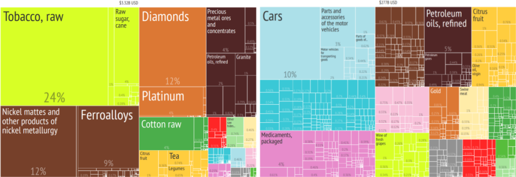
The first thing to clear is the question: does tourism really matter? Tourism might be huge for some countries — Seychelles or Bahamas come to mind** — but does it matter for any other country? Using World Bank estimates — which we’ll see they are probably underestimations — we can draw tourism as the number one export of many countries. Above you see two treemaps (click on them to enlarge) showing the composition of the export basket of Zimbabwe and Spain. The larger the square the more the country makes exporting that product. Tourism would add a square larger than tobacco for Zimbabwe, and twice as big as cars for Spain. Countries make a lot of money out of tourism, so it is crucial to have a more precise way to investigate it.

tourism2

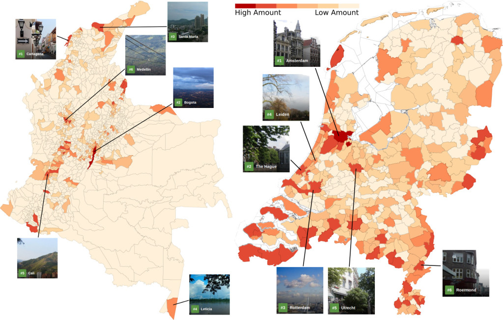
How do we measure tourism? As said before, we’re working with anonymized and aggregated transaction data. In practice, for each postal code of the country of destination we can know how many cards and how much expenditure in total happened in different retail sectors. We focus on cards which were issued outside the country we are analyzing. This way we can be confident we are capturing mostly foreign expenditures. There are many caveats to keep in mind which affect our results: we do not see cash expenditures, we have only a non-random sample from MasterCard cards, and so on. However, when we look at maps showing us the dollar intensity in the various parts of the country (above for Colombia and the Netherlands — click on them to enlarge), we find comforting validation with external data: the top six tourism destinations as reported by Trip Advisor always correspond to areas where we see a lot of activity also in our data.

nld_communities

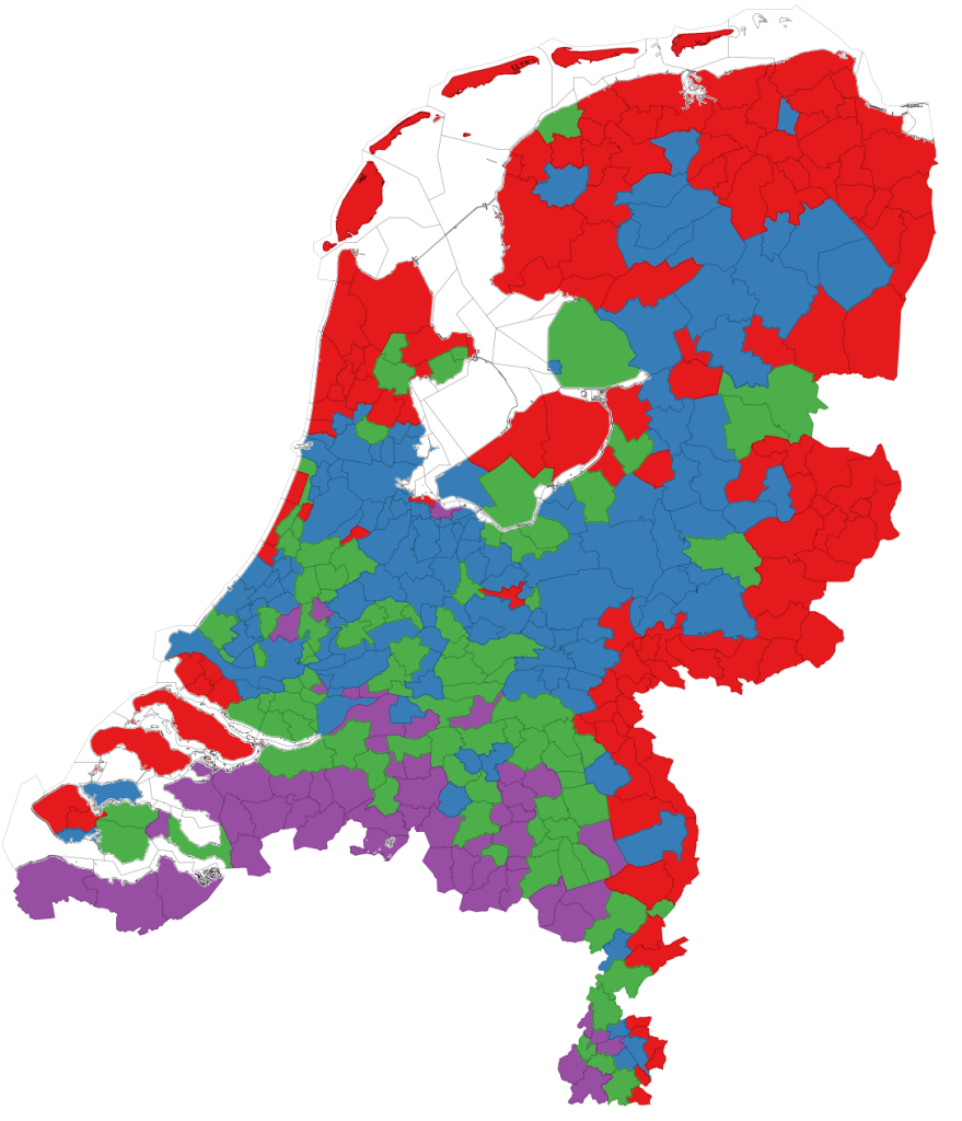
We also see an additional thing, and it turns out to be related to the advantage of our data over traditional tourism reports. A lot is happening on the border. In fact, the second most popular Colombian city after Bogotà is Cucuta. If you never heard of Cucuta it just means that you are not from Colombia, or Venezuela: Cucuta is a city on the northeastern border of the country. It is the place where many Venezuelan cross the border to do shopping, representing a huge influx of cash for Colombia. Until the border got closed, at least (the data is from before this happened, now it’s open again). In the Netherlands, you can cluster municipalities according to the dominant foreign countries observed there — see map above. You will find a Belgian cluster, for instance (in purple). This cluster is dominated by grocery and shopping.
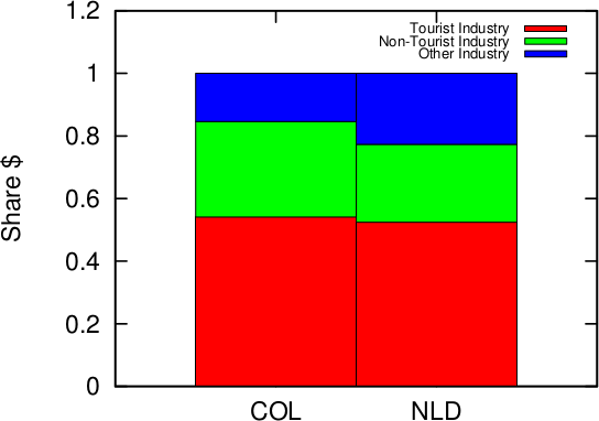
tourism3

While these Belgian shoppers are probably commuters rather than tourists, they are nevertheless bringing foreign currency to local coffers, so that’s great. And it is something not really captured by alternative methodologies. We classify a merchant type as “commuting” if it is predominant in the purple cluster, because it is more popular for “local” Belgian travelers. Everything else is either “tourism” — if it is predominant in the other non-border municipalities –, or “other” if there is no clear dominance anywhere. In the tourism cluster you find things like “Accommodations” and “Travel Agencies and Tour Operators”; in the commuting cluster you have merchants classified under “Automotive Retail” and “Pet Stores”. When you look at the share of expenditures going to the commuting cluster (above in green), you realize how significant this is. One out of four foreign dollars spent in the Netherlands go to non-tourism related activities. The share for Colombia goes up to 30%.

tourism4

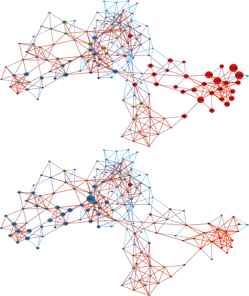
A post in this blog would not be complete without a gratuitous network visualization, so here we are. What you see is what we call “Origin Space” for Colombia (above) and the Netherlands (below). Nodes are countries of origin, and they are connected if the tourists from these countries behave similarly in what and where they make their purchases. The color of the node tells you the continent of the country. The size is the presence of tourists in the country of destination, relative to the origin’s GDP. The size and color of the edge is proportional to how similar the two origins are (orange = very similar; blue = similar, but not so much). We can see that Colombia has a lot of large red nodes — from the Americas — and the Netherlands is strong in blue nodes — from Europe.

If you click on the picture and zoom into the Colombia network you will see why this kind of visualization is useful. Colombia is fairly well-placed in the Australian market: the corresponding node is quite large. A thing then jumps to the eye. Australia has a large and very orange connection. To New Zealand. No surprise: Australians and New Zealanders are similar. Yet, the New Zealand node is much smaller than Australia. It shouldn’t be: these are relative expenditures. This means that, for some reason, Colombia is not currently an appealing destination for New Zealanders, even if it should, based on their similarity with Australians. New Zealand should then be a target of further investigation, which might lead to the untapping of a new potential market for Colombian tourism.

And this concludes the reasons why this data is so amazing to study tourism. To wrap up the message, we have first validated the data, showing that it agrees with what we expect being the most important tourism destinations of a country. Then, we unleashed its potential: the ability to detect “non-tourism” foreign cash inflows, and the promising initial development of tools to discover potential missing opportunities.


* The process is not foolproof, thought. I don’t remember where I read it, but it seems that if you sum all declared exports of countries and all declared imports, and subtract the two, you get a quite high positive number. I wonder where all these extra exports are going. Mars?

** When I was told we were doing a tourism project I got high hopes. I’m still waiting for a fully paid work mission to be approved by management. Any day now.
Continue Reading

07 July 2016 ~ 0 Comments

Building Data-Driven Development

A few weeks ago I had to honor to speak at my group’s  “Global Empowerment Meeting” about my research on data science and economic development. I’m linking here the Youtube video of my talk and my transcript for those who want to follow it. The transcript is not 100% accurate given some last minute edits — and the fact that I’m a horrible presenter 🙂 — but it should be good enough. Enjoy!


We think that the big question of this decade is on data. Data is the building blocks of our modern society. We think in development we are not currently using enough of these blocks, we are not exploiting data nearly as much as we should. And we want to fix that.

Many of the fastest growing companies in the world, and definitely the ones that are shaping the progress of humanity, are data-intensive companies. Here at CID we just want to add the entire world to the party.

So how do we do it? To fix the data problem development literature has, we focus on knowing how the global knowledge building looks like. And we inspect three floors: how does knowledge flow between countries? What lessons can we learn inside these countries? What are the policy implications?

To answer these questions, we were helped by two big data players. The quantity and quality of the data they collect represent a revolution in the economic development literature. You heard them speaking at the event: they are MasterCard – through their Center for Inclusive Growth – and Telefonica.

Let’s start with MasterCard, they help us with the first question: how does knowledge flow between countries? Credit card data answer to that. Some of you might have a corporate issued credit card in your wallet right now. And you are here, offering your knowledge and assimilating the knowledge offered by the people sitting at the table with you. The movements of these cards are movements of brains, ideas and knowledge.

When you aggregate this at the global level you can draw the map of international knowledge exchange. When you have a map, you have a way to know where you are and where you want to be. The map doesn’t tell you why you are where you are. That’s why CID builds something better than a map.

We are developing a method to tell why people are traveling. And reasons are different for different countries: equity in foreign establishments like the UK, trade partnerships like Saudi Arabia, foreign greenfield investments like Taiwan.

Using this map, it is easy to envision where you want to go. You can find countries who have a profile similar to yours and copy their best practices. For Kenya, Taiwan seems to be the best choice. You can see that, if investments drive more knowledge into a country, then you should attract investments. And we have preliminary results to suggest whom to attract: the people carrying the knowledge you can use.

The Product Space helps here. If you want to attract knowledge, you want to attract the one you can more easily use. The one connected to what you already know. Nobody likes to build cathedrals in a desert. More than having a cool knowledge building, you want your knowledge to be useful. And used.

There are other things you can do with international travelers flows. Like tourism. Tourism is a great export: for many countries it is the first export. See these big portion of the exports of Zimbabwe or Spain? For them tourism would look like this.

Tourism is hard to pin down. But it is easier with our data partners. We can know when, where and which foreigners spend their money in a country. You cannot paint pictures as accurate as these without the unique dataset MasterCard has.

Let’s go to our second question: what lessons can we learn from knowledge flows inside a country? Telefonica data is helping answering this question for us. Here we focus on a test country: Colombia. We use anonymized call metadata to paint the knowledge map of Colombia, and we discover that the country has its own knowledge departments. You can see them here, where each square is a municipality, connecting to the ones it talks to. These departments correlate only so slightly with the actual political boundaries. But they matter so much more.

In fact, we asked if these boundaries could explain the growth in wages inside the country. And they seem to be able to do it, in surprisingly different ways. If you are a poor municipality in a rich state in Colombia, we see your wage growth penalized. You are on a path of divergence.

However, if you are a poor municipality and you talk to rich ones, we have evidence to show that you are on a path of convergence: you grow faster than you expect to. Our preliminary results seem to suggest that being in a rich knowledge state matters.

So, how do you use this data and knowledge? To do so you have to drill down at the city level. We look not only at communication links, but also at mobility ones. We ask if a city like Bogota is really a city, or different cities in the same metropolitan area. With the data you can draw four different “mobility districts”, with a lot of movements inside them, and not so many across them.

The mobility districts matter, because combining mobility and economic activities we can map the potential of a neighborhood, answering the question: if I live here, how productive can I be? A lot in the green areas, not so much in the red ones.

With this data you can reshape urban mobility. You know where the entrance barriers to productivity are, and you can destroy them. You remodel your city to include in its productive structure people that are currently isolated by commuting time and cost. These people have valuable skills and knowhow, but they are relegated in the informal sector.

So, MasterCard data told us how knowledge flows between countries. Telefonica data showed the lessons we can learn inside a country. We are left with the last question: what are the policy implications?

So far we have mapped the landscape of knowledge, at different levels. But to hike through it you need a lot of equipment. And governments provide part of that equipment. Some in better ways than others.

To discover the policy implications, we unleashed a data collector program on the Web. We wanted to know how the structure of the government in the US looks like. Our program returned us a picture of the hierarchical organization of government functions. We know how each state structures its own version of this hierarchy. And we know how all those connections fit together in the union, state by state. We are discovering that the way a state government is shaped seems to be the result of two main ingredients: where a state is and how its productive structure looks like.

We want to establish that the way a state expresses its government on the Web reflects the way it actually performs its functions. We seem to find a positive answer: for instance having your environmental agencies to talk with each other seems to work well to improve your environmental indicators, as recorded by the EPA. Wiring organization when we see positive feedback and rethinking them when we see a negative one is a direct consequence of this Web investigation.

I hope I was able to communicate to you the enthusiasm CID discovered in the usage of big data. Zooming out to gaze at the big picture, we start to realize how the knowledge building looks like. As the building grows, so does our understanding of the world, development and growth. And here’s the punchline of CID: the building of knowledge grows with data, but the shape it takes is up to what we make of this data. We chose to shape this building with larger doors, so that it can be used to ensure a more inclusive world.


By the way, the other presentations of my session were great, and we had a nice panel after that. You can check out the presentations in the official Center for International Development Youtube channel. I’m embedding the panel’s video below:

Continue Reading

24 April 2014 ~ 1 Comment

Data: the More, the Merrier. Right? Of Course Not

You need to forgive me for the infamous click-bait title I gave to the post. You literally need to, because you have to save your hate for the actual topic of the post, which is Big Data. Or whatever you want to call the scenario in which scientists are flooded with so much data that traditional approaches break, for one reason or another. I like to use the Big Data label just because it saves time. One of the advantages of Big Data is that it’s useful. Once you can manage it, simple analysis will yield great profits. Take Google Translate: it does not need very sophisticated language models because millions of native speakers will contribute better translations, and simple Bayesian updates make it works nicely.

Of course there are pros and cons. I am personally very serious about the pros. I like Big Data. Exactly because of that love, honesty pushes me to find the limits and scrutinize the cons of Big Data. And that’s today’s topic: “yet another person telling you why Big Data is not such a great thing (even if it is, sometimes)” (another very good candidate for a click-bait title). The occasion for such a shameful post is the recent journal version of my work on human mobility borders (click for the blog post where I presented it). In that work we analysed the impact of geographic resolution on mobility data to locate the real borders of human mobility. In this updated version, we also throw temporal resolution in the mix. The new paper is “Spatial and Temporal Evaluation of Network-Based Analysis of Human Mobility“. So what does the prediction of human mobility have to do with my blabbering about Big Data?

Big Data is founded on the idea that more data will increase the quality of results. After all, why would you gather so much data at the point of not knowing how to manage them if it was not for the potential returns? However, sometimes adding data will actually decrease the research quality. Take again the Google Translate example: a non native speaker could add noise, providing incorrect translations. In this case the example does not really hold, because it’s likely that the vast majority of contributions comes from people who are native speakers in one of the two languages involved. But in my research question about human mobility it still holds. Remember what was the technique in the paper: we have geographical areas and we consider them nodes in a network. We connect nodes if people travel from an area to another.

Let’s start from a trivial observation. Weekends are different from weekdays. There’s sun, there’s leisure time, there are all those activities you dream about when you are stuck behind your desk Monday to Friday. We expect to find large differences in the networks of weekdays and in the networks of weekends. Above you see three examples (click for larger resolution). The number of nodes and edges tells us how many areas are active and connected: there are much fewer of them during weekends. The number of connected components tells us how many “islands” there are, areas that have no flow of people between them. During weekends, there are twice as much. The average path length tells us how many connected areas you have to hop through on average to get from any area to any other area in the network: higher during weekdays. So far, no surprises.

If you recall, our objective was to define the real borders of the macro areas. In practice, this is done by grouping together highly connected nodes and say that they form a macro area. This grouping has the practical scope of helping us predict within which border an area will be classified: it’s likely that it won’t change much from a day to another. The theory is that during weekends, for all the reasons listed before (sun’n’stuff), there will be many more trips outside of a person’s normal routine. By definition, these trips are harder to predict, therefore we expect to see lower prediction scores when using weekend data.

The first part of our theory is proven right: there are indeed much less routine trips during weekends. Above we show the % of routine trips over all trips per day. The consequences for border prediction hold true too. If you use the whole week data for predicting the borders of the next week you get poorer prediction scores. Poorer than using weekday data for predicting weekday borders. Weekend borders are in fact much more volatile, as you see below (the closer the dots to the upper right corner, the better the prediction, click for higher resolution):

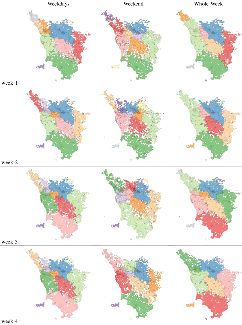
In fact we see that the borders are much crazier during weekends and this has a heavy influence on the whole week borders (see maps below, click for enjoying its andywarholesque larger resolution). Weekends have a larger effect on our data (2/7), much more than our example in Google Translate.

maps

The conclusion is therefore a word of caution about Big Data. More is not necessarily better: you still need theoretical grounds when you add data, to be sure that you are not introducing noise. Piling on more data, in my human mobility study, actually hides results: the high predictability of weekday movements. It also hides the potential interest of more focused studies about the mobility during different types of weekends or festivities. For example, our data involves the month of May, and May 1st is a special holiday in Italy. To re-ignite my Google Translate example: correct translations in some linguistic scenarios are incorrect otherwise. Think about slang. A naive Big Data algorithm could be caught in between a slang war, with each faction claiming a different correct translation. A smarter, theory-driven, algorithm will realize that there are slangs, so it will reduce its data intake to solve the two tasks separately. Much better, isn’t it?

Continue Reading