There was a nice paper published a while ago by the excellent Taha Yasseri showing that soccer is becoming more predictable over time: from the early 90s to now, models trying to guess who would win a game had grown in accuracy. I got curious and asked myself: does this hold only for soccer, or is it a general phenomenon across different team sports? The result of this question was the paper: “Which sport is becoming more predictable? A cross-discipline analysis of predictability in team sports,” which just appeared on EPJ Data Science.
My idea was that, as there is more and more money and professionalism in sport, those who are richer will become stronger over time, and dominate for a season, which will make them more rich, and therefore more dominant, and more rich, until you get Juventus, which came in first or second in almost 50% of the 119 soccer league seasons played in Italy.
My first step was to get data about 300,000 matches played across 49 leagues in nine disciplines (baseball, basket, cricket, football, handball, hockey, rugby, soccer, and volleyball). My second step was to blatantly steal the entire methodology from Taha’s paper because, hey, why innovate when you can just copy the best? (Besides, this way I could reproduce and confirm their finding, at least that’s the story I tell myself to fall asleep at night)
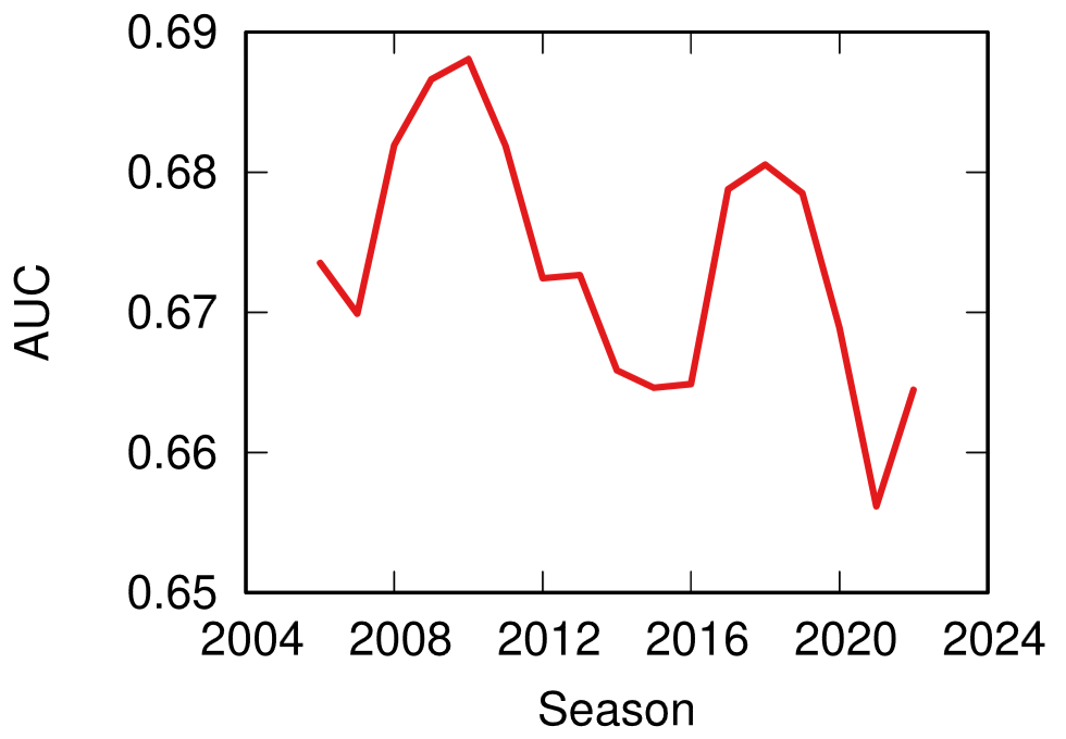
Predictability (y axis, higher means more predictable) over time (x axis) across all disciplines. No clear trend here!
The first answer I got was that Taha was right, but mostly only about soccer. Along with volleyball (and maybe baseball) it is one of the few disciplines that is getting more predictable over time. The rest of the disciplines are a mixed bag of non-significant results and actual decreases in predictability.
One factor that could influence these results is home advantage. Normally, the team playing home has slighter higher odds of winning. And, sometimes, not so slight. In the elite rugby tournament in France, home advantage is something like 80%. To give an idea, 2014 French champions Toulon only won 4 out of their 13 away games, and two of them were against the bottom two teams of the league that got relegated that season.
It’s all in the pilou pilou. Would you really go to Toulon and tell this guy you expect to win? Didn’t think so.
Well, this is something that actually changed almost universally across disciplines: home advantage has been shrinking across the board — from an average of 64% probability of home win in 2011 to 55% post-pandemic. The home advantage did shrink during Covid, but this trend started almost a decade before the pandemic. The little bugger did nothing to help — having matches played behind closed doors altered the dynamics of the games –, but it only sped up the trend, it didn’t create it.
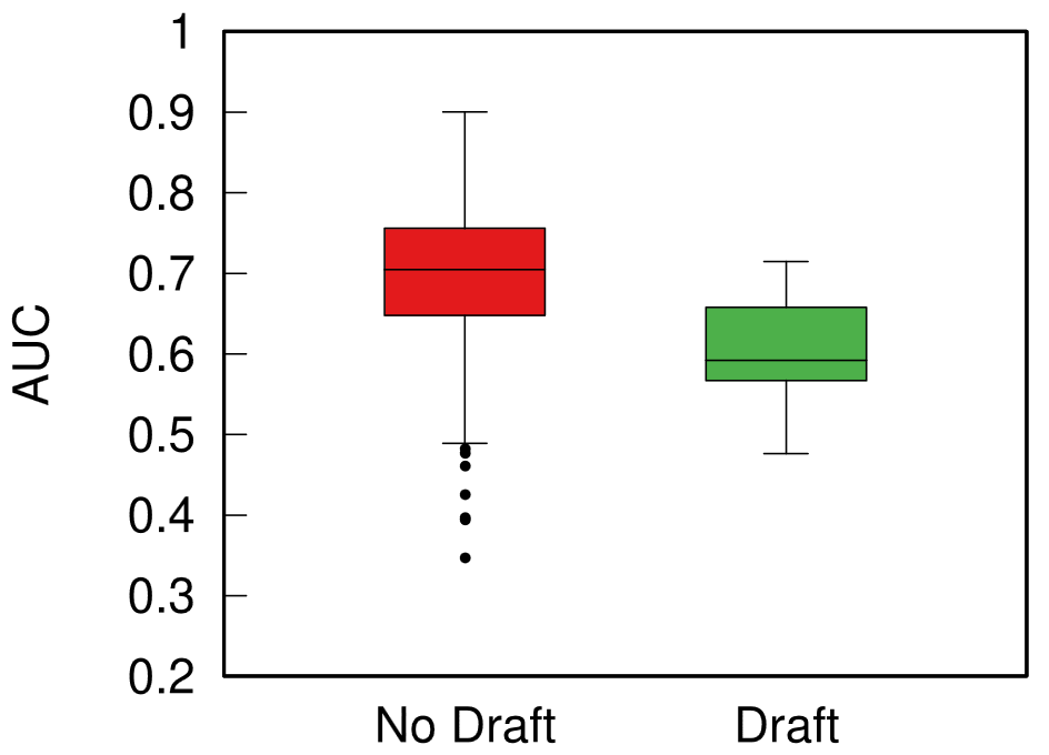
What about my original hypothesis? Is it true that the rich-get-richer effect is behind predictability? This can be tested, because most American sports are managed under a socialist regime: players have unions, the worst performing teams in one season can pick the best rookies for the next, etc. In Europe, players don’t have unions and if you have enough money you can buy whomever you want.
Boxplot with the distributions of predictability for European sports (red) and American ones (green). The higher the box, the more predictable the results.
When I split leagues by the management system they follow, I can clearly see that indeed those under the European capitalistic system tend to be more predictable. So next time you’re talking with somebody preaching laissez-faire anarcho-capitalism tell them that, at least, under socialism you don’t get bored at the stadium by knowing in advance who’ll win.
When you’re studying complex systems, one of the most important questions you might have is: how will this system evolve in the future? If you’re modeling your system as a network — as I like to do in my spare time — this boils down to predicting the arrival of new nodes and links. This is the realm of link prediction. In this post, I’ll describe one advancement in the field that I developed with fellow NERDMichael Szell in the paper “Multiplex Graph Association Rules for Link Prediction“, to appear next year at the ICWSM conference.
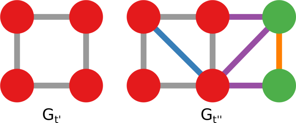
A graph evolving: the green nodes and non-gray links are added over time.
There are many ways to predict new links in a network, but most of these methods have a disadvantage: they can only give you a score for potential future connections between two nodes that are already in the network when you observe it. In other words, they cannot predict new incoming nodes. But with a technique called “graph association rules”, used by the GERM algorithm published in 2009, we can predict new nodes. How is that possible?
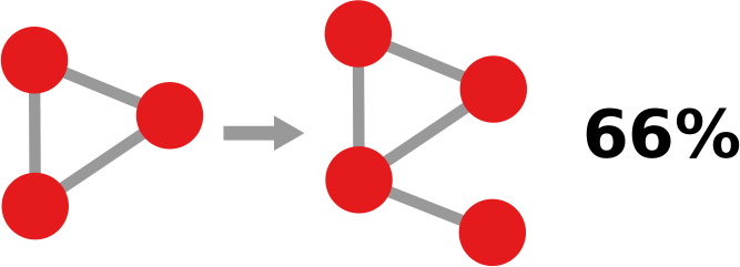
In simple terms, a “graph association rule” is a rule that tells you: every time you see in your network a pattern A, it will turn into pattern B, with a certain degree of confidence. The rule is extracted by counting how many times patterns A and B appear. For instance, in the image below, if pattern A (the triangle) appears 9 times and pattern B (the triangle with a dangling node) appears 6 times, the confidence of the rule is 2/3. 66% of the time, a triangle has attracted a dangling node. Note that pattern B must include pattern A, otherwise it’s difficult to hypothesize that A evolved into B.
GERM has a problem of its own, which Michael and I set out to solve: it can predict incoming nodes and links, but it cannot distinguish between different link types. In other words, every predicted link is the same to GERM. However, many real world networks have link types: nodes can connect in different ways. For instance, on social media, you connect to the people you know in different ways: via Facebook, Twitter, Linkedin, etc.
You’d model such system with a multiplex network, which allows for link types. If you have a multiplex network, you need multiplex graph association rules for link prediction. Which is exactly the title of our paper! What a crazy coincidence!
In the paper we re-purpose Moss, a graph pattern miner that can extract multiplex patterns, to build such rules. We created a pre- and post-processor of Moss that can construct the rules based on the patterns it finds. Now we can give colors to the links that are featured in our rules, as the figure below shows. This is a generalization of the signed link predictor I already wrote about a long time ago (the second ever post on this blog. I feel old).
Doing so isn’t painless though. We made sacrifices. For instance, our rule extractor doesn’t really understand the passage of time. It knows that the input network is in the past and spits out the rules to predict its evolution, but it doesn’t know how long a rule will take to complete. Unlike GERM, which can tell you that a rule will take n timesteps to complete.
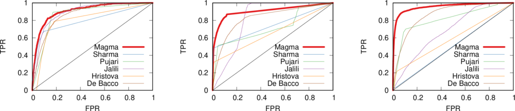
This downside is minor though. Our link predictor performs well, as witnessed by the ROC curves below (our method in red). The comparisons are other multiplex link predictors. Not only are they worse at predicting links, but they have the added disadvantage of being unable to predict the arrival of new nodes. They also have issues with memory consumption, because they generate a score for each pair of nodes that is not connected in the training data — which, for sparse networks, is a lot of scores. Our predictor, instead, only gives scores to the links that are valid consequences of the rules that we found, usually way fewer than all unconnected node pairs.
If you want to play with our link predictor, you can do so by downloading the code I made public for the replication of the paper’s results. The code is very academic — meaning: badly written, unreasonably fragile, and horribly inefficient. I have in the works an extension with more efficient and robust code, and a generalization from multiplex to fully multilayer networks. Stay tuned!
A few weeks ago I had to honor to speak at my group’s “Global Empowerment Meeting” about my research on data science and economic development. I’m linking here the Youtube video of my talk and my transcript for those who want to follow it. The transcript is not 100% accurate given some last minute edits — and the fact that I’m a horrible presenter 🙂 — but it should be good enough. Enjoy!
We think that the big question of this decade is on data. Data is the building blocks of our modern society. We think in development we are not currently using enough of these blocks, we are not exploiting data nearly as much as we should. And we want to fix that.
Many of the fastest growing companies in the world, and definitely the ones that are shaping the progress of humanity, are data-intensive companies. Here at CID we just want to add the entire world to the party.
So how do we do it? To fix the data problem development literature has, we focus on knowing how the global knowledge building looks like. And we inspect three floors: how does knowledge flow between countries? What lessons can we learn inside these countries? What are the policy implications?
To answer these questions, we were helped by two big data players. The quantity and quality of the data they collect represent a revolution in the economic development literature. You heard them speaking at the event: they are MasterCard – through their Center for Inclusive Growth – and Telefonica.
Let’s start with MasterCard, they help us with the first question: how does knowledge flow between countries? Credit card data answer to that. Some of you might have a corporate issued credit card in your wallet right now. And you are here, offering your knowledge and assimilating the knowledge offered by the people sitting at the table with you. The movements of these cards are movements of brains, ideas and knowledge.
When you aggregate this at the global level you can draw the map of international knowledge exchange. When you have a map, you have a way to know where you are and where you want to be. The map doesn’t tell you why you are where you are. That’s why CID builds something better than a map.
We are developing a method to tell why people are traveling. And reasons are different for different countries: equity in foreign establishments like the UK, trade partnerships like Saudi Arabia, foreign greenfield investments like Taiwan.
Using this map, it is easy to envision where you want to go. You can find countries who have a profile similar to yours and copy their best practices. For Kenya, Taiwan seems to be the best choice. You can see that, if investments drive more knowledge into a country, then you should attract investments. And we have preliminary results to suggest whom to attract: the people carrying the knowledge you can use.
The Product Space helps here. If you want to attract knowledge, you want to attract the one you can more easily use. The one connected to what you already know. Nobody likes to build cathedrals in a desert. More than having a cool knowledge building, you want your knowledge to be useful. And used.
There are other things you can do with international travelers flows. Like tourism. Tourism is a great export: for many countries it is the first export. See these big portion of the exports of Zimbabwe or Spain? For them tourism would look like this.
Tourism is hard to pin down. But it is easier with our data partners. We can know when, where and which foreigners spend their money in a country. You cannot paint pictures as accurate as these without the unique dataset MasterCard has.
Let’s go to our second question: what lessons can we learn from knowledge flows inside a country? Telefonica data is helping answering this question for us. Here we focus on a test country: Colombia. We use anonymized call metadata to paint the knowledge map of Colombia, and we discover that the country has its own knowledge departments. You can see them here, where each square is a municipality, connecting to the ones it talks to. These departments correlate only so slightly with the actual political boundaries. But they matter so much more.
In fact, we asked if these boundaries could explain the growth in wages inside the country. And they seem to be able to do it, in surprisingly different ways. If you are a poor municipality in a rich state in Colombia, we see your wage growth penalized. You are on a path of divergence.
However, if you are a poor municipality and you talk to rich ones, we have evidence to show that you are on a path of convergence: you grow faster than you expect to. Our preliminary results seem to suggest that being in a rich knowledge state matters.
So, how do you use this data and knowledge? To do so you have to drill down at the city level. We look not only at communication links, but also at mobility ones. We ask if a city like Bogota is really a city, or different cities in the same metropolitan area. With the data you can draw four different “mobility districts”, with a lot of movements inside them, and not so many across them.
The mobility districts matter, because combining mobility and economic activities we can map the potential of a neighborhood, answering the question: if I live here, how productive can I be? A lot in the green areas, not so much in the red ones.
With this data you can reshape urban mobility. You know where the entrance barriers to productivity are, and you can destroy them. You remodel your city to include in its productive structure people that are currently isolated by commuting time and cost. These people have valuable skills and knowhow, but they are relegated in the informal sector.
So, MasterCard data told us how knowledge flows between countries. Telefonica data showed the lessons we can learn inside a country. We are left with the last question: what are the policy implications?
So far we have mapped the landscape of knowledge, at different levels. But to hike through it you need a lot of equipment. And governments provide part of that equipment. Some in better ways than others.
To discover the policy implications, we unleashed a data collector program on the Web. We wanted to know how the structure of the government in the US looks like. Our program returned us a picture of the hierarchical organization of government functions. We know how each state structures its own version of this hierarchy. And we know how all those connections fit together in the union, state by state. We are discovering that the way a state government is shaped seems to be the result of two main ingredients: where a state is and how its productive structure looks like.
We want to establish that the way a state expresses its government on the Web reflects the way it actually performs its functions. We seem to find a positive answer: for instance having your environmental agencies to talk with each other seems to work well to improve your environmental indicators, as recorded by the EPA. Wiring organization when we see positive feedback and rethinking them when we see a negative one is a direct consequence of this Web investigation.
I hope I was able to communicate to you the enthusiasm CID discovered in the usage of big data. Zooming out to gaze at the big picture, we start to realize how the knowledge building looks like. As the building grows, so does our understanding of the world, development and growth. And here’s the punchline of CID: the building of knowledge grows with data, but the shape it takes is up to what we make of this data. We chose to shape this building with larger doors, so that it can be used to ensure a more inclusive world.
By the way, the other presentations of my session were great, and we had a nice panel after that. You can check out the presentations in the official Center for International Development Youtube channel. I’m embedding the panel’s video below:
My last post on this blog was about mobility in Colombia. For that study, I had the opportunity of dunking my hands into a bag filled with interesting data. To do so, I traveled to Bogotá. It is a fascinating place and I decided to dedicate this post to it: what the city looks like under the lens of some simple mobility and economic data analysis. If in the future I will repeat the experience somewhere else I will be more than happy to make this a recurrent column of this blog.
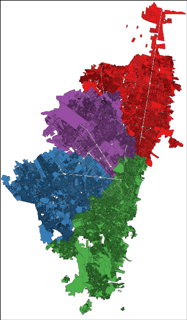
The cliché would demand from me a celebration of the chaos in Bogotá. After all, we are talking about one of the top five largest capitals in Latin America, the chaos continent par excellence. Yet, your data goggles would tell you a different story. Bogotá is extremely organized. Even at the point of being scary. There is a very strict division of social strata: the city government assigns each block a number from 1 (poorest) to 6 (richest) according to its level of development and the blocks are very clustered and homogeneous:
In the picture: red=1, blue=2, green=3, purple=4, yellow=5 and orange=6 (grey = not classified). That map doesn’t seem very chaotic to me, rather organized and clustered. One might feel uneasy about it, but that is how things are. The clustering is not only on the social stratum of the block, but also in where people work. If you take a taxi ride, you will find entire blocks filled with the very same economic activities. Not knowing that, during one of my cab rides I thought in Bogotá everybody was a car mechanic… until we got passed that block.
The order emerges also when you look at the way the people use the city. My personal experience was of incredulity: I went from the city hall to the house of a co-worker and it felt like moving to a different city. After a turn left, the big crowded highway with improvised selling stands disappeared into a suburb park with no cars and total quiet. In fact, Bogotá looks like four different cities:
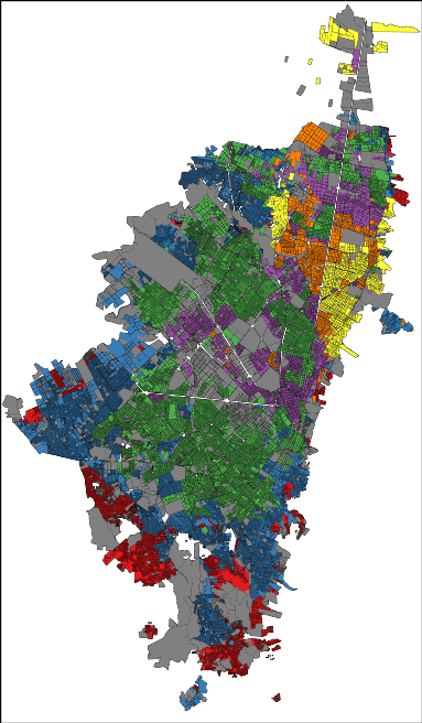
Here I represented each city block as a node in a network and I connected blocks if people commute to the two places. Then I ran a community discovery algorithm, and plotted on the map the result. Each color represents an area that does not see a lot of inter-commutes with the other areas, at least compared with its own intra-commutes.
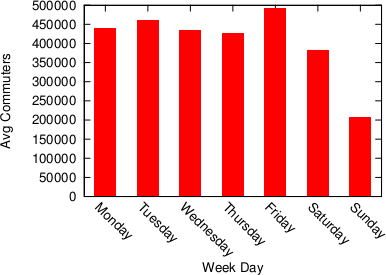
Human mobility is interesting because it gives you an idea of the pulse of a place. Looking at the commute data we discovered that a big city like Bogotá gets even bigger during a working day. Almost half a million people pour inside the capital every day to work and use its services, which means that the population of the city increases, in a matter of hours, by more than 5%.
It’s unsurprising to see that this does not happen during a typical Sunday. The difference is not only in volume, but also in destination: people go to different places on weekends.
Here, the red blocks are visited more during weekdays, the white blocks are visited more in weekends. It seems that there is an axis that is more popular during weekdays — that is where the good jobs are. The white is prevalently residential.
Crossing this commute information with the data on establishments from the chamber of commerce (camara de comercio), we can also know which businesses types are more visited during weekends, because many commuters are stopping in areas hosting such businesses. There is a lot of shopping going on (comercio al por menor) and of course visits to pubs (Expendio De Bebidas Alcoholicas Para El Consumo Dentro Del Establecimiento). It matches well with my personal experience as, once my data quests were over, my local guide (Andres Gomez) lead me to Andres Carne de Res, a bedlam of music, food and lights, absolutely not to be missed if you find yourself in Bogotá. My personal advice is to be careful about your beverage requests: I discovered too late that a mojito there is served in a soup bowl larger than my skull.
Most of what I wrote here (minus the mojito misadventure) is included in a report I put together with my travel companion (Frank Neffke) and another local (Eduardo Lora). You can find it in the working paper collection of the Center for International Development. I sure hope that my data future will bring me to explore other places as interesting as the capital of Colombia.
Maybe it’s the new year, maybe it’s the fact that I haven’t published anything new recently, but today I wanted to take a look at my publication history. This, for a scientist, is something not unlike a time machine, bringing her back to an earlier age. What was I thinking in 2009? What sparked my interest and what were the tools further refined to get to the point where I am now? It’s usually a humbling (not to say embarrassing) operation, as past papers always look so awful – mine, at least. But small interesting bits can be found, like the one I retrieved today, about shortest paths in communication networks.
A shortest path in a network is the most efficient way to go from one node to another. You start from your origin and you choose to follow an edge to another node. Then you choose again an edge and so on until you get to your destination. When your choices are perfect and you used the minimum possible number of edges to follow, that’s a shortest path (it’s A shortest path and not THE shortest path because there might be alternative paths of the same length). Now, in creating this path, you obviously visited some nodes in between, unless your origin and destination are directly connected. Turns out that there are some nodes that are crossed by a lot of shortest paths, it’s a characteristic of real world networks. This is interesting, so scientists decided to create a measure called betweenness centrality. For each node, betweenness centrality is the share of all possible shortest paths in the network that pass through them.
Intuitively, these nodes are important. Think about a rail network, where the nodes are the train stations. High betweenness stations see a lot of trains passing through them. They are big and important to make connections run faster: if they didn’t exist every train would have to make detours and would take longer to bring you home. A good engineer would then craft rail networks in such a way to have these hubs and make her passengers happy. However, it turns out that this intuitive rule is not universally applicable. For example some communication networks aren’t willing to let this happen. Michele Berlingerio, Fosca Giannotti and I stumbled upon this interesting result while working on a paper titled Mining the Temporal Dimension of the Information Propagation.
We built two communication networks. One is corporate-based: it’s the web of emails exchanged across the Enron employee ecosystem. The email record has been publicly released for the investigation about the company’s financial meltdown. An employee is connected to all the employees she emailed. The second is more horizontal in nature, with no work hierarchies. We took users from different email newsgroups and connected them if they sent a message to the same thread. It’s the nerdy version of commenting on the same status update on Facebook. Differently from most communication network papers, we didn’t stop there. Every edge still carries some temporal information, namely the moment in which the email was sent. Above you have an extract of the network for a particular subject, where we have the email timestamp next to each edge.
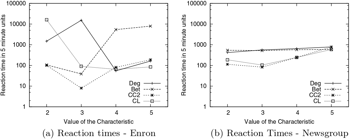
Here’s where the magic happens. With some data mining wizardry, we are able to tell the characteristic reaction times of different nodes in the network. We can divide these nodes in classes: high degree nodes, nodes inside a smaller community where everybody replies to everybody else and, yes, nodes with high betweenness centrality, our train station hubs. For every measure (characteristic), nodes are divided in five classes. Let’s consider betweenness. Class 1 contains all nodes which have betweenness 0, i.e. those through which no shortest path passes. From class 2 to 5 we have nodes of increasing betweenness. So, nodes in class 3 have a medium-low betweenness centrality and nodes in class 5 are the most central nodes in the network. At this point, we can plot the average reaction times for nodes belonging to different classes in the two networks. (Click on the plots to enlarge them)
The first thing that jumps to the eye is that Enron’s communications (on the left) are much more dependent on the node’s characteristics (whether the characteristic is degree or betweenness it doesn’t seem to matter) than Newsgroup’s ones, given the higher spread. But the interesting bit, at least for me, comes when you only look at betweenness centrality – the dashed line with crosses. Nodes with low (class 2) and medium-low (class 3) betweenness centrality have low reaction times, while more central nodes have significantly higher reaction times. Note that the classes have the same number of nodes in them, so we are not looking at statistical aberrations*. This does not happen in Newsgroups, due to the different nature of the communication in there: corporate in Enron versus topic-driven in Newsgroup.
The result carries some counter intuitive implications. In a corporate communication network the shortest path is not the fastest. In other words, don’t let your train pass through the central hub for a shortcut, ’cause it’s going to stay there for a long long time. It looks like people’s brains are less elastic than our train stations. You can’t add more platforms and personnel to make more things passing through them: if your communication network has large hubs, they are going to work slower. Surprisingly, this does not hold for the degree (solid line): it doesn’t seem to matter with how many people you interact, only that you are the person through which many shortest paths pass.
I can see myself trying to bring this line of research back from the dead. This premature paper needs quite some sanity checks (understatement alert), but it can go a long way. It can be part of the manual on how to build an efficient communication culture in your organization. Don’t overload people. Don’t create over-important nodes in the network, because you can’t allow all your communications to pass through them. Do keep in mind that your team is not a clockwork, it’s a brain-work. And brains don’t work like clocks.
* That’s also the reason to ditch class 1: it contains outliers and it is not comparable in size to the other classes.
You need to forgive me for the infamous click-bait title I gave to the post. You literally need to, because you have to save your hate for the actual topic of the post, which is Big Data. Or whatever you want to call the scenario in which scientists are flooded with so much data that traditional approaches break, for one reason or another. I like to use the Big Data label just because it saves time. One of the advantages of Big Data is that it’s useful. Once you can manage it, simple analysis will yield great profits. Take Google Translate: it does not need very sophisticated language models because millions of native speakers will contribute better translations, and simple Bayesian updates make it works nicely.
Of course there are pros and cons. I am personally very serious about the pros. I like Big Data. Exactly because of that love, honesty pushes me to find the limits and scrutinize the cons of Big Data. And that’s today’s topic: “yet another person telling you why Big Data is not such a great thing (even if it is, sometimes)” (another very good candidate for a click-bait title). The occasion for such a shameful post is the recent journal version of my work on human mobility borders (click for the blog post where I presented it). In that work we analysed the impact of geographic resolution on mobility data to locate the real borders of human mobility. In this updated version, we also throw temporal resolution in the mix. The new paper is “Spatial and Temporal Evaluation of Network-Based Analysis of Human Mobility“. So what does the prediction of human mobility have to do with my blabbering about Big Data?
Big Data is founded on the idea that more data will increase the quality of results. After all, why would you gather so much data at the point of not knowing how to manage them if it was not for the potential returns? However, sometimes adding data will actually decrease the research quality. Take again the Google Translate example: a non native speaker could add noise, providing incorrect translations. In this case the example does not really hold, because it’s likely that the vast majority of contributions comes from people who are native speakers in one of the two languages involved. But in my research question about human mobility it still holds. Remember what was the technique in the paper: we have geographical areas and we consider them nodes in a network. We connect nodes if people travel from an area to another.
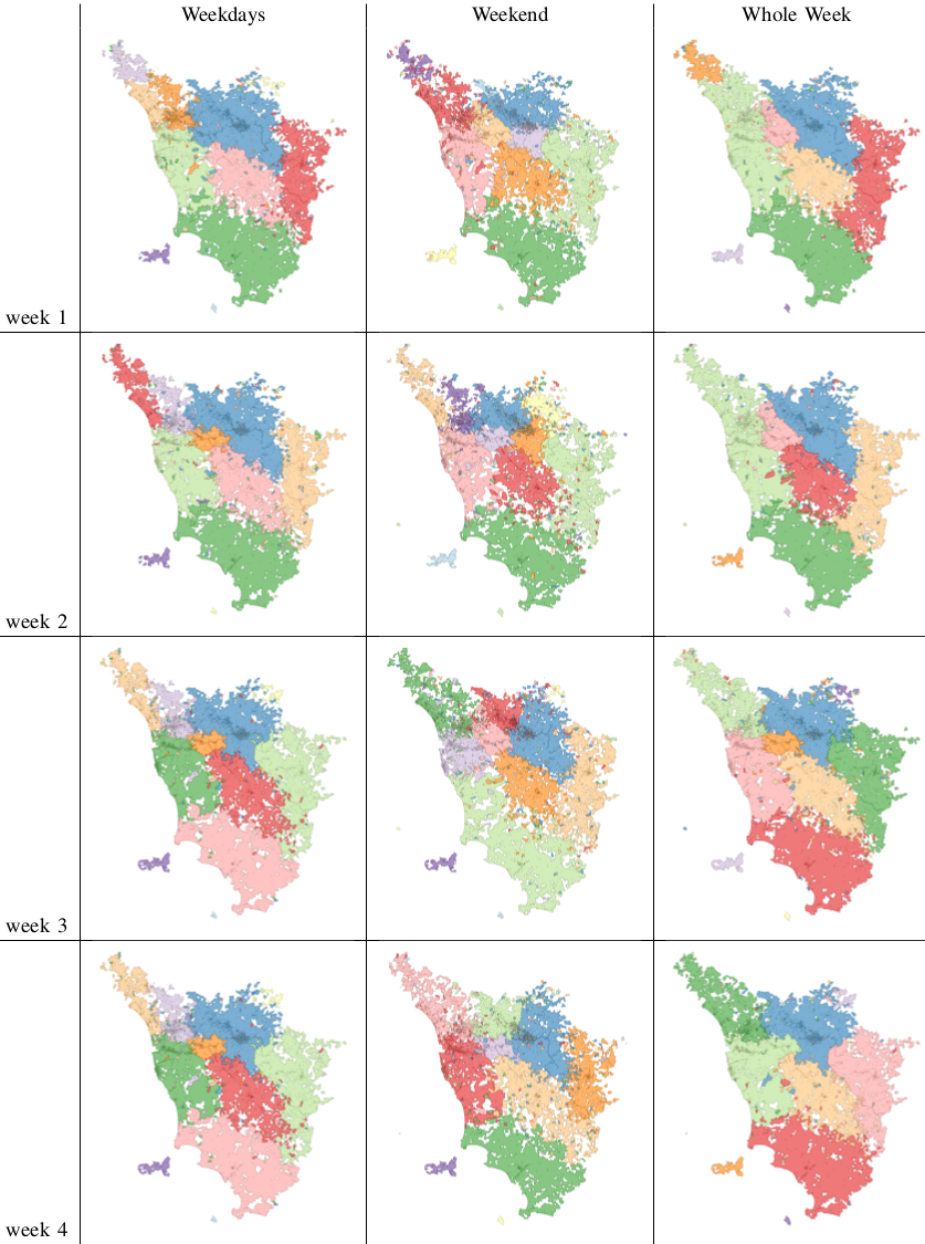
Let’s start from a trivial observation. Weekends are different from weekdays. There’s sun, there’s leisure time, there are all those activities you dream about when you are stuck behind your desk Monday to Friday. We expect to find large differences in the networks of weekdays and in the networks of weekends. Above you see three examples (click for larger resolution). The number of nodes and edges tells us how many areas are active and connected: there are much fewer of them during weekends. The number of connected components tells us how many “islands” there are, areas that have no flow of people between them. During weekends, there are twice as much. The average path length tells us how many connected areas you have to hop through on average to get from any area to any other area in the network: higher during weekdays. So far, no surprises.
If you recall, our objective was to define the real borders of the macro areas. In practice, this is done by grouping together highly connected nodes and say that they form a macro area. This grouping has the practical scope of helping us predict within which border an area will be classified: it’s likely that it won’t change much from a day to another. The theory is that during weekends, for all the reasons listed before (sun’n’stuff), there will be many more trips outside of a person’s normal routine. By definition, these trips are harder to predict, therefore we expect to see lower prediction scores when using weekend data.
The first part of our theory is proven right: there are indeed much less routine trips during weekends. Above we show the % of routine trips over all trips per day. The consequences for border prediction hold true too. If you use the whole week data for predicting the borders of the next week you get poorer prediction scores. Poorer than using weekday data for predicting weekday borders. Weekend borders are in fact much more volatile, as you see below (the closer the dots to the upper right corner, the better the prediction, click for higher resolution):
In fact we see that the borders are much crazier during weekends and this has a heavy influence on the whole week borders (see maps below, click for enjoying its andywarholesque larger resolution). Weekends have a larger effect on our data (2/7), much more than our example in Google Translate.
The conclusion is therefore a word of caution about Big Data. More is not necessarily better: you still need theoretical grounds when you add data, to be sure that you are not introducing noise. Piling on more data, in my human mobility study, actually hides results: the high predictability of weekday movements. It also hides the potential interest of more focused studies about the mobility during different types of weekends or festivities. For example, our data involves the month of May, and May 1st is a special holiday in Italy. To re-ignite my Google Translate example: correct translations in some linguistic scenarios are incorrect otherwise. Think about slang. A naive Big Data algorithm could be caught in between a slang war, with each faction claiming a different correct translation. A smarter, theory-driven, algorithm will realize that there are slangs, so it will reduce its data intake to solve the two tasks separately. Much better, isn’t it?