16 February 2016 ~ 0 Comments

Data Trips Diary: Bogotá

My last post on this blog was about mobility in Colombia. For that study, I had the opportunity of dunking my hands into a bag filled with interesting data. To do so, I traveled to Bogotá. It is a fascinating place and I decided to dedicate this post to it: what the city looks like under the lens of some simple mobility and economic data analysis. If in the future I will repeat the experience somewhere else I will be more than happy to make this a recurrent column of this blog.

The cliché would demand from me a celebration of the chaos in Bogotá. After all, we are talking about one of the top five largest capitals in Latin America, the chaos continent par excellence. Yet, your data goggles would tell you a different story. Bogotá is extremely organized. Even at the point of being scary. There is a very strict division of social strata: the city government assigns each block a number from 1 (poorest) to 6 (richest) according to its level of development and the blocks are very clustered and homogeneous:

sisben_strata

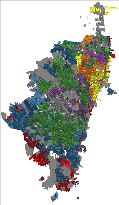
In the picture: red=1, blue=2, green=3, purple=4, yellow=5 and orange=6 (grey = not classified). That map doesn’t seem very chaotic to me, rather organized and clustered. One might feel uneasy about it, but that is how things are. The clustering is not only on the social stratum of the block, but also in where people work. If you take a taxi ride, you will find entire blocks filled with the very same economic activities. Not knowing that, during one of my cab rides I thought in Bogotá everybody was a car mechanic… until we got passed that block.

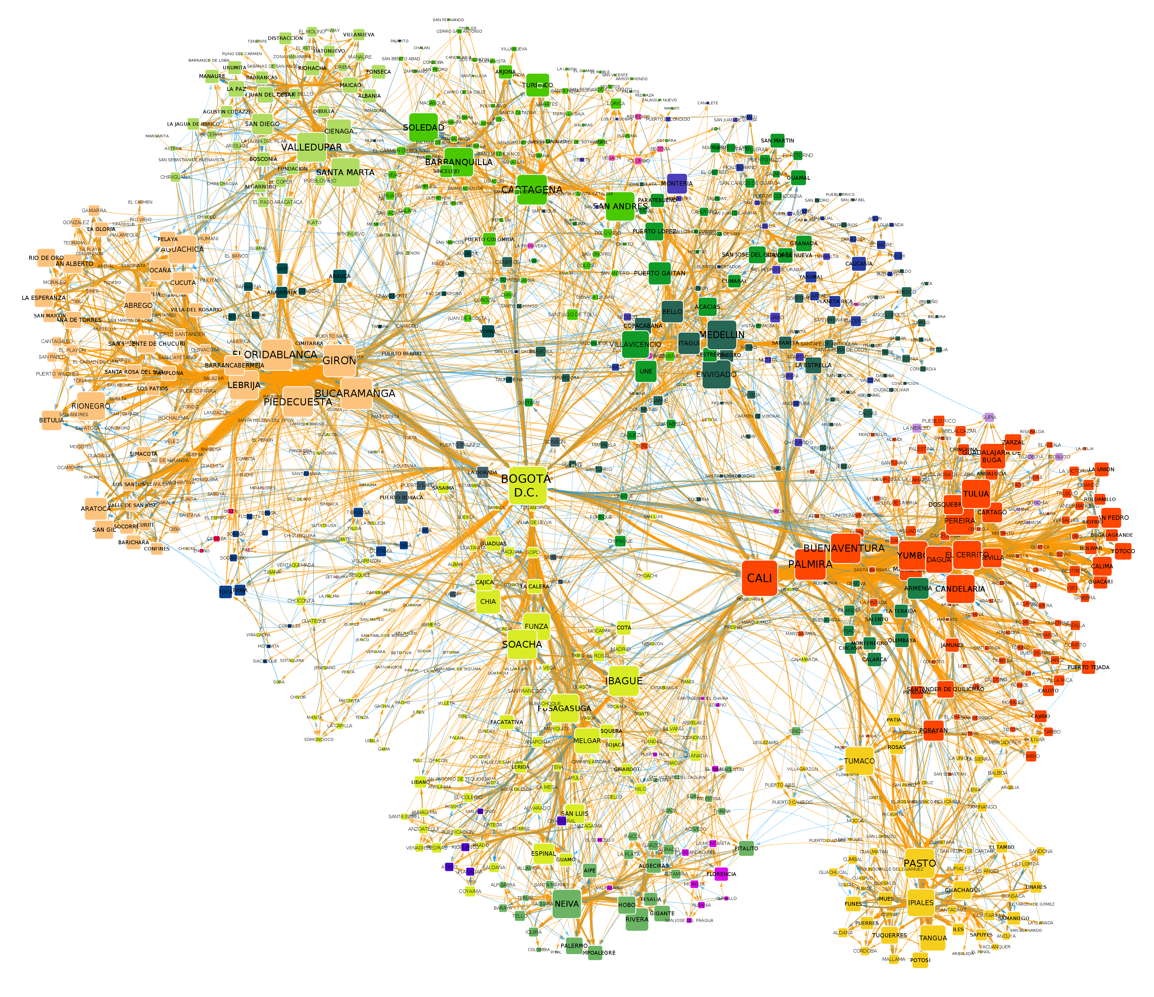
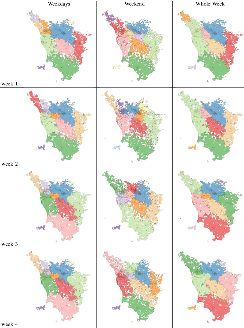
The order emerges also when you look at the way the people use the city. My personal experience was of incredulity: I went from the city hall to the house of a co-worker and it felt like moving to a different city. After a turn left, the big crowded highway with improvised selling stands disappeared into a suburb park with no cars and total quiet. In fact, Bogotá looks like four different cities:

bogota_mobilityclusters

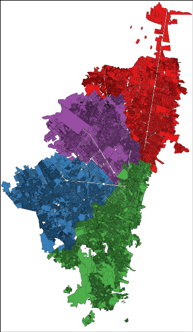
Here I represented each city block as a node in a network and I connected blocks if people commute to the two places. Then I ran a community discovery algorithm, and plotted on the map the result. Each color represents an area that does not see a lot of inter-commutes with the other areas, at least compared with its own intra-commutes.

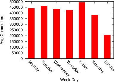
Human mobility is interesting because it gives you an idea of the pulse of a place. Looking at the commute data we discovered that a big city like Bogotá gets even bigger during a working day. Almost half a million people pour inside the capital every day to work and use its services, which means that the population of the city increases, in a matter of hours, by more than 5%.

bogota1

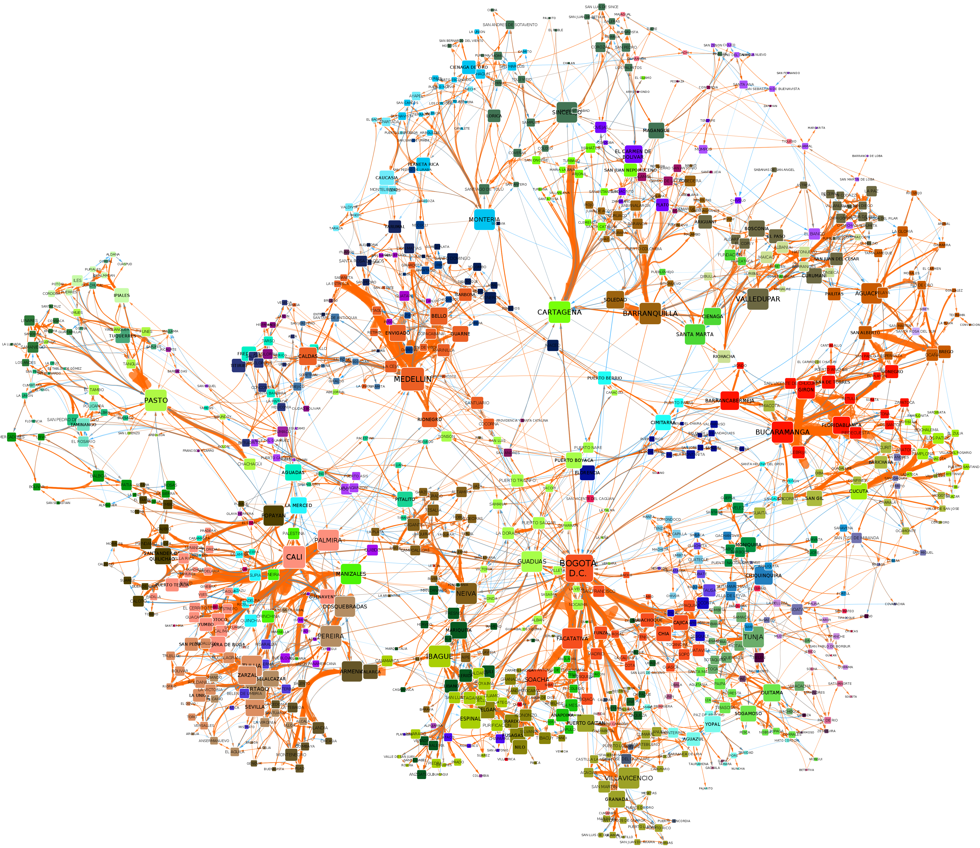
It’s unsurprising to see that this does not happen during a typical Sunday. The difference is not only in volume, but also in destination: people go to different places on weekends.

cell_avgdaycommuters_weekdaydifference

Here, the red blocks are visited more during weekdays, the white blocks are visited more in weekends. It seems that there is an axis that is more popular during weekdays — that is where the good jobs are. The white is prevalently residential.

Crossing this commute information with the data on establishments from the chamber of commerce (camara de comercio), we can also know which businesses types are more visited during weekends, because many commuters are stopping in areas hosting such businesses. There is a lot of shopping going on (comercio al por menor) and of course visits to pubs (Expendio De Bebidas Alcoholicas Para El Consumo Dentro Del Establecimiento). It matches well with my personal experience as, once my data quests were over, my local guide (Andres Gomez) lead me to Andres Carne de Res, a bedlam of music, food and lights, absolutely not to be missed if you find yourself in Bogotá. My personal advice is to be careful about your beverage requests: I discovered too late that a mojito there is served in a soup bowl larger than my skull.

Most of what I wrote here (minus the mojito misadventure) is included in a report I put together with my travel companion (Frank Neffke) and another local (Eduardo Lora). You can find it in the working paper collection of the Center for International Development. I sure hope that my data future will bring me to explore other places as interesting as the capital of Colombia.

Continue Reading

15 January 2016 ~ 0 Comments

The Limited Power of Telecommunication

As a kid from the 80s*, I remember how revolutionary the cellphone era was. It happened so fast. It seemed that, overnight, you could carry in your pocket a device connecting you to everybody you knew, no matter how far. To me, it changed everything. But did it? Yes, over-apprehensive parents can check their babies at the swipe of a finger, and whoever does not carry their cellphone with themselves at all times is labeled as a weirdo — I’m guilty of that. But the telecommunication revolution promised something more: the elimination of distance in communication. Did it deliver? This question was the motivation engine for the paper “Evidence That Calls-Based and Mobility Networks Are Isomorphic” which I wrote with my boss Ricardo Hausmann and which recently appeared in PLoS One.

The question is rather daring, so we decided to take it step by step. The simplest thing we came up was: let’s draw a map of cellphone calls and see if it looks like a geographical map. If it does, we might be onto something. To do so, we obtained data from telecommunication operators in Colombia. They provided us call detail records, where identifiers were encrypted to preserve the anonymity of the people making and receiving the calls. We also aggregated the data to make even the slightest re-identification impossible: every ID was associated to the municipality in which it spent most of its time and so all data was lumped together at the municipality level. At this point, we could draw a map of which municipalities had a significant call traffic with one another. This we called the “Call-based” network:

colombia_social

Click to enlarge

Before jumping to conclusions with this picture, we built a sister network. Since we just said we knew the location of a phone when making a call, we can keep a record of the different municipalities where we spotted the phone. Again, we joined together all data at the municipality level. This sister network is then a “Mobility” network of Colombia:

colombia_mobility

Click to enlarge

It seems there’s something here. The two networks appear to be similar: Bogotá seems to be a prominent center and the connections have a geographical component embedded into them. To make this more evident, we drew the networks on a Colombian map. The color of the municipalities is the same color of the nodes in the pictures above: nodes with the same color are very related in the network — network clusters.

plos1

Click to enlarge

The call-based network is on the left, the mobility is on the right. Blocks of the same color on the left are a clear indication of the call connections being influenced by geography. If there was no relation, the map would look like the Harlequin shirt, with colors scattered evenly across the territory. Mobility clusters are also short-range, although the pattern is harder to see because I had to use many more colors: the clusters are smaller. But the two networks are closely related: in fact, the larger call-based clusters contain the smaller mobility ones, as we show in the paper. We can say that there is a strong relationship between calls and mobility.

This is nice, because it fits with many works in computer science that actually use social relationships to predict human mobility… and vice versa. On the other hand, it is not nice because the existence of these papers also tells us ours is not a new result. Moreover, my starting point was to hint that the call-based and mobility networks are obeying the same laws, not that they are merely correlated. We need to go a step further.

Our step was to consider the difference that distance makes in the two networks. When looking at mobility, the distance between an origin and a destination is an important cost. In the call-based networks, things are a bit trickier. If modern telecommunication really delivered what it promised, distance should be a really low cost, and probably non-linear. To start a social relationship it is not needed to be in the same place at any given time, and even if we move to opposite ends of the world, we can still call each other. As a consequence, there shouldn’t be a way to scale the cost of distance in the call-based network to look like the one in the mobility network.

When we attempted to perform such scaling, we discovered it was actually possible. We checked, at any given distance, the ratio between commuters and callers. If two municipalities are at 50km distance, and there are twice as many commuters than callers, we have a dot on coordinates (50, 2). If we take two municipalities at 100km distance, and the commuters are just a third of the number of callers, the data point is at coordinates (100, .33). Once we consider all data points, we can fit our green line, AKA the scaling function from calls to mobility:

plos3

When we used this adjustment to calculate new call-based clusters using the distance cost “as if” it was the mobility network, we obtained the mobility clusters. We detail in the paper the reasons why this is not as circular as it seems.  In practice, our green line is a transformation function that morphs the call-based network into the mobility network. If modern telecommunication really killed distance, that green line shouldn’t exist, or at least it should be so wobbly to be practically useless.

There are many ways in which you could interpret this result. One that Ricardo and I like focuses on the relationship between face-to-face and electronic mediated meetings. It’s not like the people you call are the ones you really would rather meet but you cannot. It’s more like you call AND you meet, whenever it is possible. Face-to-face and electronic mediated meetings are not really substitutes in this world, they are more like complements. To come back to my opening, I’d say new technologies didn’t eliminate distance from the communication equation. Alleviate, yes. But ultimately, it’s more like an increased bandwidth than a revolution. At least so far.


* Shut up, I’m still in my twenties. Everybody knows 1996 was only 10 years ago.

Continue Reading

16 October 2015 ~ 0 Comments

Central Places and Sophistication

601px-US_population_map

Looking at a population map, one may wonder why sometimes you find metropoles in the middle of nowhere — I’m looking at you, Phoenix. Or why cities are distributed the way they are. When in doubt, you should always refer to your favorite geographer. She would probably be very happy to direct your interest to the Central Place Theory (CPT), developed by Walter Christaller in the 30s. The theory simply states that cities provide services to the surrounding areas. As a consequence, the big cities will provide many services and small cities a few, therefore the small cities will gravitate around larger settlements. This smells like complexity science to me and this post is exactly about connecting CPT with my research on retail customer sophistication and mobility. But first I need to convince you that CPT actually needs this treatment.

CPT explains why sometimes you will need a big settlement in the middle of the desert. That is because, for most of history, civilizations relied on horses instead of the interwebz for communication and, with very long stretches of nothing, that system would fall apart. That is why Phoenix has been an obsolete city since 1994 at the very least, and people should just give it up and move on. You now might be tempted to take a look at the Wikipedia page of the Central Place Theory to get some more details. If you do, you might notice a few “simplifications” used by Christaller when developing the theory. And if you don’t, let me spoil it for you. Lo and behold, to make CPT work we need:

  • An infinite flat Earth — easy-peasy-lemon-squeezy compared to what comes next;
  • Perfectly homogeneous distribution of people and resources;
  • Perfectly equidistant cities in a grid much like the one of Civilization 5;
  • The legendary perfect competition and rational market conjured by economists out of thin air;
  • Only one mode of transportation;
  • A completely homogeneous population, all equal in desires and income.

In short, the original CPT works in a world that is no more real than Mordor.

48958238

And here where’s sophistication comes into play. I teamed up with Diego Pennacchioli and Fosca Giannotti with the objective of discovering the relationship between CPT and our previous research on sophistication — the result is in the paper Product Assortment and Customer Mobility, just published on EPJ Data Science. In the past, we showed that the more sophisticated the needs of a customer, the further the customer is willing to travel to satisfy those. And our sophistication measure worked better than other product characteristics, such as the price and its average selling volume.

Now, to be honest, geographers did not sleep for 80 years, and they already pointed out the problems of CPT. Some of them developed extensions to get rid of many troubling assumptions, others tested the predictions of these models, others just looked at Phoenix in baffled awe. However, without going too in depth (I’m not exactly qualified to do it) these new contributions are either very theoretical in nature, or they haven’t used larger and more detailed data validation. Also, the way central places are defined is unsatisfactory to me. Central places are either just very populous cities, or cities with a high variety of services. For a person like me trained in complexity science, this is just too simple. I need to bring sophistication into the mix.

cpt1

Focusing on my supermarket data, variety is the number of different products provided. Two supermarkets selling three items have the same variety. Sophistication requires the products not only to be different, but also to satisfy different needs. Suppose shop #1 sells water, juice and soda, and shop #2 sells water, bread and T-shirts. Even if the shops have the same variety, one is more sophisticated than the other. And indeed the sophistication of a shop explains better the “retention rate” of a shop, its ability to preserve its customer base even for customers who live far away from the shop. That is what the above table reports: controlling for distance (which causes a 2.6 percentage point loss of customer base per extra minute of travel), each standard deviation increase in sophistication strengthens the retention rate by 11 percentage points. Variety of products does not matter, the volume of the shop (its sheer size) matters just a bit.

In practice, what we found is that CPT holds in our data where big supermarkets play the role of big cities and provide more sophisticated “services”. This is a nice finding for two reasons. First, it confirms the intuition of CPT in a real world scenario, making us a bit wiser about the world in which we live — and maybe avoiding mistakes in the future, such as creating a new Phoenix. This is non-trivial: the space in our data is not infinite, homogeneous, with a perfect market and it has differentiated people. Yet, CPT holds, using our sophistication measure as driving factor. Second, it validates our sophistication measure in a theoretical framework, potentially giving it the power to be used more widely than what we have done so far. However, both contributions are rather theoretical. I’m a man of deeds, so I asked myself: are there immediate applications of this finding?

cpt2

There might be one, with caveats. Remember we are analyzing hundreds of supermarkets in Italy. We know things about these supermarkets. First, we have a shop type, which by accident correlates with sophistication very well. Then, we know if the shop was closed down during the multi-year observation period. We can’t know the reason, thus everything that follows is a speculation to be confirmed, but we can play with this. We can compare the above mentioned retention rate of closing and non-closing shops. We can also define a catch rate. While “retention” meant how many of your closest customers you can keep, catch means how many of the non-closest customers you can get. The above plots show retention and catch ratios. The higher the number the more the ratio is in favor of the non-closing shop.

For the retention rate, the average sophistication shops (green) have by far the largest spread between shops that are still open and the ones which got shut down. It means that these medium shops survive if they can keep their nearby customers. For the catch rate, the very sophisticated shops (red) are always on top, regardless of distance. It means that large shops survive if they really can attract customers, even if they are not the closest shop. The small shops (blue) seem to obey neither logic. The application of this finding is now evident: sophistication can enlighten us as to the destiny of different types of shops. If medium shops fail to retain their nearby customers, they’re likely to shut down. If large shops don’t catch a wider range of customers, they will shut down. This result talks about supermarkets, but there are likely connections with settlements too, replacing products with various services. Once we calculate a service sophistication, we could know which centers are aptly placed and which ones are not and should be closed down. I know one for sure even without running regressions: Phoenix.

tumblr_n5lo16gWQC1ra6yclo1_500

Continue Reading

12 August 2015 ~ 1 Comment

Entropy Applied to Shopping

I don’t know about you guys, but when it comes to groceries I show behaviors that are strongly reminiscent of Rain Man. I go to the supermarket the same day of the week (Saturday) at the same time (9 AM), I want to go through the shelves in the very same order (the good ol’ veggie-cookies-pasta-meat-cat food track), I buy mostly the same things every week. Some supermarkets periodically re-order their shelves, for reasons that are unknown to me. That’s enraging, because it breaks my pattern. The mahātmā said it best:

regularity-quotes-1

Amen to that. As a consequence, I signed up immediately when my friends Riccardo Guidotti and Diego Pennacchioli told me about a paper they were writing about studying the regularity of customer behavior. Our question was: what is the relationship between the regularity of a customer’s behavior and her profitability for a shop? The results are published in the paper “Behavioral Entropy and Profitability in Retail“, which will be presented in the International Conference on Data Science and Advanced Analytics, in October. To my extreme satisfaction the answer is that the more regular customers are also the most profitable. I hope that this cry for predictability will reach at least the ears of the supermarket managers where I shop. Ok, so: how did we get to this conclusion?

First, we need to measure regularity in a reasonable way. We propose two ways. First, a customer is regular if she buys mostly the same stuff every time she shops, or at least her baskets can be described with few typical “basket templates”. Second, a customer is regular if she shows up always at the same supermarket, at the same time, on the same day of the week. We didn’t have to reinvent the wheel to figure out a way for evaluating regularity in signals: giants of the past solved this problem for us. We decided to use the tools of information theory, in particular the concept of information entropy. Information entropy tells how much information there is in an event. In general, the more uncertain or random the event is, the more information it will contain.

entropy

If a person always buys the same thing, no matter how many times she shops, we can fully describe her purchases with a single bit of information: the thing she buys. Thus, there is little information in her observed shopping events, and she has low entropy. This we call Basket Revealed Entropy. Low basket entropy, high regularity. Same reasoning if she always goes to the same shop, and we call this measure Spatio-Temporal Revealed Entropy. Now the question is: what does happen to a customer’s expenditure for different levels of basket and spatio-temporal entropy?

To wrap our heads around these two concepts we started by classifying customers according to their basket and spatio-temporal entropy. We used the k-Means algorithm, which simply tries to find “clumps” in the data. You can think of customers as ants choosing to sit in a point in space. The coordinates of this point are the basket and spatio-temporal entropy. k-Means will find the parts of this space where there are many ants nearby each other. In our case, it found five groups:

  1. The average people, with medium basket and spatio-temporal entropy;
  2. The crazy people, with unpredictable behavior (high basket and spatio-temporal entropy);
  3. The movers, with medium basket entropy, but high spatio-temporal entropy (they shop in unpredictable shops at unpredictable times);
  4. The nomads, similar to the movers, with low basket entropy but high spatio-temporal entropy;
  5. The regulars, with low basket and spatio-temporal entropy.

dsaa1
Click to enlarge

Once you cubbyholed your customers, you can start doing some simple statistics. For instance: we found out that the class E regulars spend more per capita over the year (4,083 Euros) than the class B crazy ones (2,509 Euros, see the histogram above). The regulars also visit the shop more often: 163 times a year. This is nice, but one wonders: why haven’t the supermarket managers figured it out yet? Well, they may have been, but there is also a catch: incurable creatures of habit like me aren’t a common breed. In fact, if we redo the same histograms looking at the group total yearly values of expenditures and baskets, we see that class E is the least profitable, because fewer people are very regular (only 6.9%):

dsaa2
Click to enlarge

Without dividing customers in discrete classes, we can see what is the direct relationship between behavioral entropy and the yearly expenditure of a customer. This aggregated behavioral entropy measure is simply the multiplication of basket and spatio-temporal entropy. Unsurprisingly, entropy and expenditure are negatively correlated:

dsaa3

Finally, we want to quantify this relationship. We want to have an objective way to tell how much more money the supermarket could make if the customers would be more regular. We didn’t get too fancy here, just a linear model where we try to predict the customers’ expenditures from their basket and spatio-temporal entropy. We don’t care very much about causation here, we just want to make the point that basket and spatio-temporal entropy are interesting measures.

dsaa4
Click to enlarge

The negative sign isn’t a surprise: the more chaotic a customer’s life, the lower her expenditures. What the coefficients tell us is that we expect the least chaotic (0) customer to spend almost four times as much as the most chaotic (1) customer*. You can understand why this was an extremely pleasant finding for me. This week, I’m going to print out the paper and ask to see the supermarket manager. I’ll tell him: “Hey, if you stop moving stuff around and you encourage your customers to be more and more regular, maybe you could increase your revenues”. Only that I won’t do it, because that’d break my Saturday shopping routine. Oh dear.


* The interpretation of coefficients in regressions are a bit tricky, especially when transforming your variables with logs. Here, I just jump straight to the conclusion. See here for the full explanation, if you don’t believe me.

Continue Reading

24 April 2014 ~ 1 Comment

Data: the More, the Merrier. Right? Of Course Not

You need to forgive me for the infamous click-bait title I gave to the post. You literally need to, because you have to save your hate for the actual topic of the post, which is Big Data. Or whatever you want to call the scenario in which scientists are flooded with so much data that traditional approaches break, for one reason or another. I like to use the Big Data label just because it saves time. One of the advantages of Big Data is that it’s useful. Once you can manage it, simple analysis will yield great profits. Take Google Translate: it does not need very sophisticated language models because millions of native speakers will contribute better translations, and simple Bayesian updates make it works nicely.

Of course there are pros and cons. I am personally very serious about the pros. I like Big Data. Exactly because of that love, honesty pushes me to find the limits and scrutinize the cons of Big Data. And that’s today’s topic: “yet another person telling you why Big Data is not such a great thing (even if it is, sometimes)” (another very good candidate for a click-bait title). The occasion for such a shameful post is the recent journal version of my work on human mobility borders (click for the blog post where I presented it). In that work we analysed the impact of geographic resolution on mobility data to locate the real borders of human mobility. In this updated version, we also throw temporal resolution in the mix. The new paper is “Spatial and Temporal Evaluation of Network-Based Analysis of Human Mobility“. So what does the prediction of human mobility have to do with my blabbering about Big Data?

Big Data is founded on the idea that more data will increase the quality of results. After all, why would you gather so much data at the point of not knowing how to manage them if it was not for the potential returns? However, sometimes adding data will actually decrease the research quality. Take again the Google Translate example: a non native speaker could add noise, providing incorrect translations. In this case the example does not really hold, because it’s likely that the vast majority of contributions comes from people who are native speakers in one of the two languages involved. But in my research question about human mobility it still holds. Remember what was the technique in the paper: we have geographical areas and we consider them nodes in a network. We connect nodes if people travel from an area to another.

Let’s start from a trivial observation. Weekends are different from weekdays. There’s sun, there’s leisure time, there are all those activities you dream about when you are stuck behind your desk Monday to Friday. We expect to find large differences in the networks of weekdays and in the networks of weekends. Above you see three examples (click for larger resolution). The number of nodes and edges tells us how many areas are active and connected: there are much fewer of them during weekends. The number of connected components tells us how many “islands” there are, areas that have no flow of people between them. During weekends, there are twice as much. The average path length tells us how many connected areas you have to hop through on average to get from any area to any other area in the network: higher during weekdays. So far, no surprises.

If you recall, our objective was to define the real borders of the macro areas. In practice, this is done by grouping together highly connected nodes and say that they form a macro area. This grouping has the practical scope of helping us predict within which border an area will be classified: it’s likely that it won’t change much from a day to another. The theory is that during weekends, for all the reasons listed before (sun’n’stuff), there will be many more trips outside of a person’s normal routine. By definition, these trips are harder to predict, therefore we expect to see lower prediction scores when using weekend data.

The first part of our theory is proven right: there are indeed much less routine trips during weekends. Above we show the % of routine trips over all trips per day. The consequences for border prediction hold true too. If you use the whole week data for predicting the borders of the next week you get poorer prediction scores. Poorer than using weekday data for predicting weekday borders. Weekend borders are in fact much more volatile, as you see below (the closer the dots to the upper right corner, the better the prediction, click for higher resolution):

In fact we see that the borders are much crazier during weekends and this has a heavy influence on the whole week borders (see maps below, click for enjoying its andywarholesque larger resolution). Weekends have a larger effect on our data (2/7), much more than our example in Google Translate.

maps

The conclusion is therefore a word of caution about Big Data. More is not necessarily better: you still need theoretical grounds when you add data, to be sure that you are not introducing noise. Piling on more data, in my human mobility study, actually hides results: the high predictability of weekday movements. It also hides the potential interest of more focused studies about the mobility during different types of weekends or festivities. For example, our data involves the month of May, and May 1st is a special holiday in Italy. To re-ignite my Google Translate example: correct translations in some linguistic scenarios are incorrect otherwise. Think about slang. A naive Big Data algorithm could be caught in between a slang war, with each faction claiming a different correct translation. A smarter, theory-driven, algorithm will realize that there are slangs, so it will reduce its data intake to solve the two tasks separately. Much better, isn’t it?

Continue Reading

09 September 2013 ~ 0 Comments

What Motivates a Customer

The Holy Grail of every marketing system is to understand how the mind of the customers works. For example answering the question: “From how far can I attract customers?” To do so means to increase profits. You can deploy your communication and products more efficiently and maximize your returns. Clearly, there is no silver bullet for this task. There is no way that one single aspect is so predominant in a person’s mind at the point of empowering a seller to have perfect control over who will buy her product, where and when. If that would be true, there would be no space left for marketing specialists, demand segmentation and so on. Many little tricks can be deployed in the market.

I am by no means an expert on the field, so my way to frame this problem may sound trivial. In any case, I can list three obvious parameters that affect a customer’s decision in buying or not buying a product. The first is price. Few people want to throw their money senselessly, most of them want to literally maximize the bang for their buck (okay, maybe not that literally). The second is the quantities needed: if I need to buy product X everyday in large bulks and product Y once in a blue moon, then it’s only fair to assume that I’ll consider different parameters to evaluate X and Y.

question

The third is the level of sophistication of a given product. There are things that fewer and fewer people need: birdseed, piña colada flavored lip balm. Narrower customer base means less widespread offer, thus the need of travel more to specialized shops. Intuitively, sophistication is more powerful than price and quantity: a Lamborghini is still a car – also quite useless when doing groceries – like a Panda, but it satisfies very different and much more sophisticated needs. Sophistication is powerful because you can play with it, increasing the perceived sophistication of a product, thus your market: like Jonah Berger‘s  “thee types of ice” bar, that looked more fancy just by inventing a way to make ice sound more sophisticated than it is.

So let’s play and try to use these concepts operatively. Say we want to predict the distance a customer is willing to travel to buy a product. Then, we try to predict such a distance using different variables. The one leading to better predictions of these distances wins as the best variable describing what motivates a customer to travel. We decided to test the three variables I presented before: price, quantity and sophistication. In this theory, higher prices mean longer distances to travel, as if I have to buy an expensive TV I’ll probably go around and check where is the best quality-price ratio. Higher quantities mean shorter distances, as if I have to buy bread everyday I don’t care where the best bakery of the city is if that means traveling ten kilometers everyday. Finally, higher sophistication means longer distances: if I have sophisticated needs I need to travel a lot to satisfy them.

Price and quantity are easy to deal with: they are just numbers. So we can put them on the X axis of a plot and put the distance traveled on the Y axis. And that’s what we did, for price:

scatter1

and for quantity:

scatter2

Here, each dot is a customer buying a product. If the dots had the same distance and the same price/quantity then we merged them together (brighter color = more dots here). We see that our theory, while not perfect, is correct: higher prices means longer distances traveled, higher quantities means shorter distances. Time to test for the level of sophistication! But now we hit a brick wall. How on earth am I suppose to measure the level of sophistication of a person and of a product? Should I split the brain of that person in half? How can I do this for thousands or millions of customers? We need to invent a brain splitting machine.

inside-the-customers-mind1

That’s more or less what we did. In a joint work with Diego Pennacchioli, Salvo Rinzivillo, Fosca Giannotti and Dino Pedreschi, that will appear in the BigData 2013 conference (you can download the paper, if you are interested), we proposed such a brain slice device. Of course I am somewhat scared by all the blood that would result in literally cutting open thousands of skulls, so we implemented a data mining machine that just quantifies with a number the level of sophistication of a customer’s needs and the level of sophistication that a product can satisfy, solving the issue at hand with no bloodshed.

The fundamental question is: is the level of sophistication a number? Intuition would tell us “no”: it’s a complex multidimensional space and my needs are unique like a snowflake. Kind of. But with a satisfying level of approximation, surprisingly, we can describe sophistication with a number. How is that possible? A couple of facts we discovered: customers buying the least sold products also buy everything else (the “simpler” stuff), and products bought just by few customers are bought only by those who also buy everything else. In other words, if you draw a matrix connecting the customers with the products they buy, this matrix is nested, meaning that all purchases are in the top left corner:

matrix

A-ha! Then it’s fair to make this assumption: customers are adding an extra product bought only if they already buy (almost) everything else “before” it. This implies two things: first, is that they add the extra product if all their previous products already satisfied their more basic needs (then, they are more sophisticated); second, is that they are moving on a monodimensional space, adding stuff incrementally. Then, they can be quantified by a number! I won’t go in the boring details about how to calculate this number. Suffice to say that they are very similar to how you calculate a country’s complexity, about which I wrote months ago; and that this number is not the total amount of money they spend, nor the quantity of products they buy.

So, how does this number relate to the distance traveled by customers?

scatter3

The words you are looking for is “astonishingly well”.

So our quantification of the sophistication level has a number of practical applications. In the paper we explore the task of predicting in which shop a customers will go to buy a given product. We are not claiming that this is the only important factor. But it gives a nice boost. Over a base accuracy of around 53%, using the price or the quantity gives you a +6-7% accuracy. Adding the sophistication level gives an additional +6-8% accuracy (plots would suggest more, but they are about continuous numbers, while in reality shop position is fixed and therefore a mistake of a few hundreds meters is less important). Not bad!

Continue Reading

04 January 2013 ~ 2 Comments

Data-Driven Borders

What defines the human division of territory? Think about it: cities are placed in particular areas for a number of good reasons: communication routes, natural resources, migration flows. But once cities are located in a given spot, who decides where one city ends and another begins? Likewise, who decides on the borders of a region or a nation and how? This decision, more often than not, is quite random.

Sometimes administrative borders are defined by natural barriers like mountains and rivers. This makes practical sense, although it is not always clear why the border should be that particular mountain or that particular river. In fact, the main criterion is usually historical: it’s because some dynasty of dudes conquered that area and then got lazy and didn’t go on (this may be the official version: unofficially, maybe, it’s because they found somebody who kicked their asses all day long, just like the complicated relationship of the Romans with the Parthians).

Of course, the borders of states or regions are sometimes re-arranged to better fit practical administrative purposes. In any case, these are nothing else than sub-optimal adjustments of a far-from-optimal process. Network analysis can be useful in this context, because it can provide an objective way to divide the territory according to a particular theory (and it can provide pretty pictures too).

The theory here is very simple: two territories are related if a lot of people travel regularly from one to the other. If people constantly travel back and forth between two territories, then it probably makes sense to combine these territories into one administrative unit. So, how do we determine which territories should be merged, and which shouldn’t be? This problem is easily solvable in network theory, because it contains a network in its very basic definition: two areas are strongly connected if many people travel from one to the other. What we aim for is a grouping of territories. This looks really familiar to the eyes of some readers of this website: grouping nodes in a network. Yes! Community discovery!

I am not claiming to be the first one to see the problem this way. There is a number of people who already worked on it: the two most important that I can think of are Brockmann et al. and Ratti et al. However, I am reporting this because I also have a paper on the topic. And, of course, I think it’s better than the alternatives, for a number of reasons that I won’t report because it’s boring for non nerd people. But then again, I am a narcissist, so I can’t resist giving you the short list:

  • The previous works are based on not so perfect data: Brockmann et al. work with the banknotes trajectories recorded by the “Where’s George?” website (an awesome idea, take a look at it), while Ratti et al. use cellphone mobility data. Both are not exact representations about how people move and contain critical error terms. In our work, we use GPS trajectories with very high frequency and precision: we are studying the real thing.
  • The previous works use outdated methods for community discovery which cannot detect small communities: we use a more up-to-date method that is considered the state-of-the-art of community discovery. For example, in Brockmann et al. the entire west part of the United States is apparently one single area, grouping California and Montana and creating a region of 60-something million people.
  • We actually create a framework that establishes the correct methodology to approach the problem in general, instead of just studying one particular case.

But enough blabbering! I promised pretty pictures and I’ll give you pretty pictures. The general shared methodology is the following (in the pictures, the example of  mobility in Tuscany, Italy):

1) We divide the territory in cells (either a regular grid or very fine grained census cells);

2) We connect the nodes according to how many cars went from one cell to the other;

3) We forget about geography and we obtain a complex network (here, the node layout has nothing to do with their location on the map);

4) We apply community discovery, grouping set of nodes (territories) that are visited by the same people;

5) We put the nodes back in their geographical positions, obtaining the borders we were yearning for.

Funnily enough, Italy is undergoing a re-organization process of its regions and provinces. The results in Tuscany are very similar to the insights of our work (not perfectly similar, as the current process is just a merge of the existing provinces and not a real re-design):

On the left the new provinces (colors) on top of the old ones (lines), on the right our clusters (click for a larger resolution).

The match suggests that our data-driven borders follow the general intuition about what the borders should look like. However, they are not just a blind merge of the existing provinces, such as the one made by the policy-makers, making them more connected with reality. Hurrah for network analysis!

Continue Reading