 I am an associate prof at IT University of Copenhagen. I mainly work on algorithms for the analysis of complex networks, and on applying the extracted knowledge to a variety of problems.
My background is in Digital Humanities, i.e. the connection between the unstructured knowledge and the coldness of computer science.
I have a PhD in Computer Science, obtained in June 2012 at the University of Pisa. In the past, I visited Barabasi's CCNR at Northeastern University, and worked for 6 years at CID, Harvard University.
I am an associate prof at IT University of Copenhagen. I mainly work on algorithms for the analysis of complex networks, and on applying the extracted knowledge to a variety of problems.
My background is in Digital Humanities, i.e. the connection between the unstructured knowledge and the coldness of computer science.
I have a PhD in Computer Science, obtained in June 2012 at the University of Pisa. In the past, I visited Barabasi's CCNR at Northeastern University, and worked for 6 years at CID, Harvard University. Finding a Connection between Kinship and Material Culture using Network Science
The past fascinates us. I often fantasize about how our ancestors lived: what did they do? How did they relate to one another? Were their social networks similar to ours? Archaeology is the way we try to answer these questions if we do not have written records. The main problem is that archaeology finds stuff — material culture. Social relationships can’t be dug up from the mud.

Together with Camilla Mazzucato and a team of archeologists and biologists, we decided to investigate whether we could actually infer the social relationships from the material culture we found. The result was the paper “‘A Network of Mutualities of Being’: Socio-material Archaeological Networks and Biological Ties at Çatalhöyük“, which appeared in January in the Journal of Archaeological Method and Theory.
The paper focuses on the site of Çatalhöyük which was inhabited in the Neolithic for several millennia. Çatalhöyük is the ideal place to draw connections between found material culture and interpersonal relationships because of some peculiar habits in the culture which inhabited the site. Upon the construction of a new building in the settlement, in fact, the habit was to bury the dead in the foundations (humans are weird).

Having lots of dead bodies is fantastic (all of a sudden I sound like Hannibal Lecter) because now in the buildings we can find material culture and human remains, both of which had a connection with the building itself. From the human remains we can infer kinship relationships between buildings, because people related to each other are buried in them.
This is where the team of biologists come in. They analyze the DNA of the human remains to establish which pairs of individuals have a first, second, or third degree relationship. Once we have both material culture and kinship relationships between buildings we can start asking ourselves whether the two correlate or not.

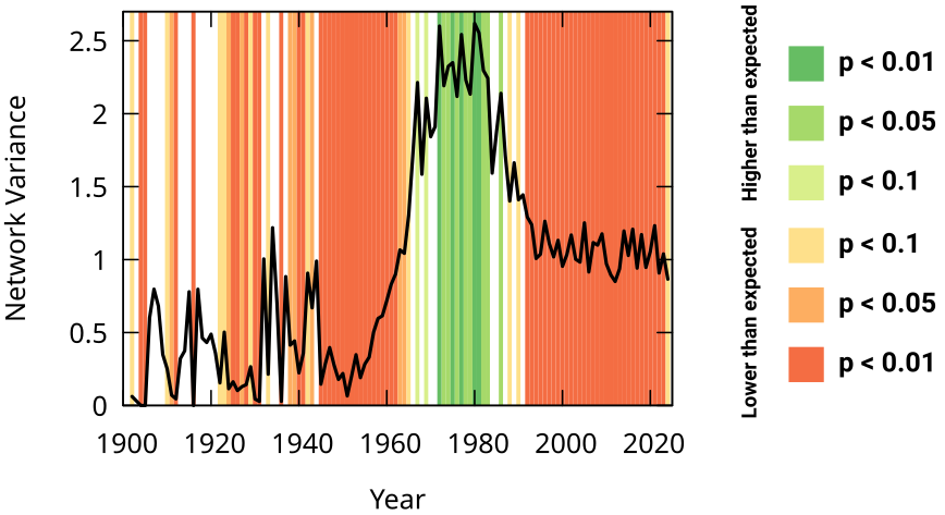
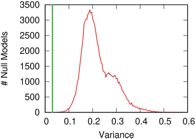
One way to do it is by using network variance. We can connect buildings — the nodes in the network — if they share significant amounts of material culture. Then, for a given kinship group — a set of people with at least second or third degree relationships –, we can create a numeric node attribute: how many individuals from that family were buried in each building.

The network variance of this attribute tells us how dispersed the family is in the material culture landscape. By comparing this with a null family — a family that buries individuals at random — we can know whether the real family tended to be more concentrated in the material culture space than expected, a sign that material culture and kinship correlate. Which is what we observe!
There are a number of possible alternative explanations, of course. One we checked for is geotemporal proximity. Buildings nearby each other and built around the same time also share more material culture and related individuals. So we control for geotemporal proximity and we see that the effect is still significant. In other words: it is more likely for related individuals to be buried in buildings with similar material culture, regardless of when and where these buildings were built. We also check the robustness of our results by slightly changing the way we build our networks, and the way we analyze the DNA remains — the result is still there.
Our result suggests a nice consequence: it is justified to say that sites containing the same material culture hosted individuals that were related to each other. Found material culture can tell us something interesting and meaningful about the shape and dynamics of past social networks.