Michele Coscia - Connecting Humanities

Michele Coscia I am an associate prof at IT University of Copenhagen. I mainly work on algorithms for the analysis of complex networks, and on applying the extracted knowledge to a variety of problems. My background is in Digital Humanities, i.e. the connection between the unstructured knowledge and the coldness of computer science. I have a PhD in Computer Science, obtained in June 2012 at the University of Pisa. In the past, I visited Barabasi's CCNR at Northeastern University, and worked for 6 years at CID, Harvard University.

28 February 2013 ~ 0 Comments

Networks and Eras

The real world has many important characteristics. One I heard being quite salient is the fact that time passes. Any picture of the world has to evolve to reflect change, otherwise it is doomed to be representative only of a narrow moment in time. This is quite a problem in computer science, because when we want to analyze something we need to spend a lot of time in gathering data and, usually, the analysis can be done only once we have everything we need. It’s a bit like in physics, when the problems are solved in the vacuum and in the absence of friction. Of course, many people work to develop dynamics models, trying to handle the changes in the data.

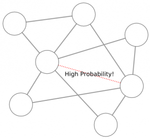
Take link prediction, for example. Link prediction is the branch of network science whose aim is to predict which connections are more likely to appear in the near future, given the current status of a network. There are many approaches to this problem: one simply states that the probability that two nodes will connect is proportional to their current degree (because it’s being observed that high degree nodes attracts more edges, it’s called “preferential attachment“), another looks at the history of the new edges which came into existence and tries to redact some evolution rules (see the paper, not much different from my work on signed networks).

What’s the problem in this? The problem lies in the fact that any link came into existence in a specific moment, in which the network shape was different from any other moment. Let’s consider the preferential attachment, with an example. The preferential attachment tells you that the position in the market of Google not only is not in danger: it will become stronger and stronger, because its high visibility attracts everybody who needs the services it is providing. However, Google was not born with the web, but several years after. So in the moment in which Google was born, the preferential attachment would have told you that Google had no chance to beat Yahoo. And now it’s easy to laugh at this idea.

So, what happened? The idea that I investigated with my colleagues at the KDDLab in Italy is extremely simple: just like Earth’s geological times, also complex networks (and complex systems in general) evolve discontinuously, with eras in which some evolution rules apply and some others, valid in other eras, don’t. The original paper is quite old (from 2010), but we recently published an update journal version of it (see the Intelligent Data Analysis Journal), that’s why I’m writing about it.

In our paper, we describe how to build a framework to understand what are the eras in the evolution of a network. Basically, everything boils down to have many snapshots of the network in different moments of time and a similarity measure that tells you how similar are two consecutive snapshots. Then, by checking the values of this similarity function, one can understand if the last trends she is seeing are providing reliable information to make predictions or not. In our world, then, we understand that when Google enters in the web anything can happen, because we are in a new era and we do not use outdated information that do not apply anymore to the new scenario. In our world, also, we are aware that nobody is doomed to success, regardless how good its current position is. A nice and humbling perspective, if I may say.

I suggest reading the paper to understand how nicely our era detection system fits with the data. The geekier readers will find a nice history of programming languages (we applied the era discovery system to the network of co-authorship in computer science), normal people will probably find more amusement in our history of movies (from networks of collaboration extracted from the Internet Movie Database).

So, next time you’ll see somebody trying to make predictions using complex network analysis, check if she is considering data history using an equivalent of our framework. If she does, thumbs up. If she doesn’t, trust her just like you would trust a meteorologist trying to forecast tomorrow’s weather by crunching data from yesterday down to the Mesozoic.

29 January 2013 ~ 0 Comments

Exploring Classical Archaeology

Science is awesome. It’s awesome to write and to read papers and learning a lot in the process. All this awesomeness comes with a price: the price of popularity. In the last decades, universities and research institutes became better and better in capturing talented people and in multiplying their scientific output. As a result, the number of peer-reviewed conferences and journals exploded, as well as the number of papers itself (the actual numbers are kind of scary). When browsing papers in this open sea of scientific publications, it’s hard to know what is relevant and hopeless to know what is related to what else.
Let’s make an example. Suppose you are back from a holiday in Italy and you are still amazed by the beautiful Greek temples of Paestum. You are a scientist, so you want to read papers (sigh). You go to a bibliographic database. You search for “Paestum” and you get a couple of hundreds works that spans from focused papers on Paestum to publications that mention Paestum by accident. They are sorted more or less by importance, as you would expect from Google Search. There’s not really much that tells you briefly what it is related to Paestum, where Paestum is in the landscape of classical archaeology and which are the sub-fields Paestum is more relevant to.

With this problem in mind, I teamed up with Maximilian Schich, a very bright guy I met when I was a guest researcher at Northeastern University in 2011. Max is an atypical art historian with a strong background in network analysis and he had the problem of finding a way to make sense of 370,000 publications by 88,000 authors collected in the Archäologische Bibliographie, a bibliographic database that collects and classifies literature in classical archaeology since 1956. Every publication is classified using 45,000 different classifications (think of tags describing the content of a paper).

Given our common interest in networks, and the fact that we were sharing a desk with a gigantic window providing inspiring landscapes for several months, we decided to team up and the result was a paper published in a KDD workshop. To solve our quest for Paestum, we created a browsing framework that adds two extra levels to the plain paper search I just described: a global level and a meso-level.

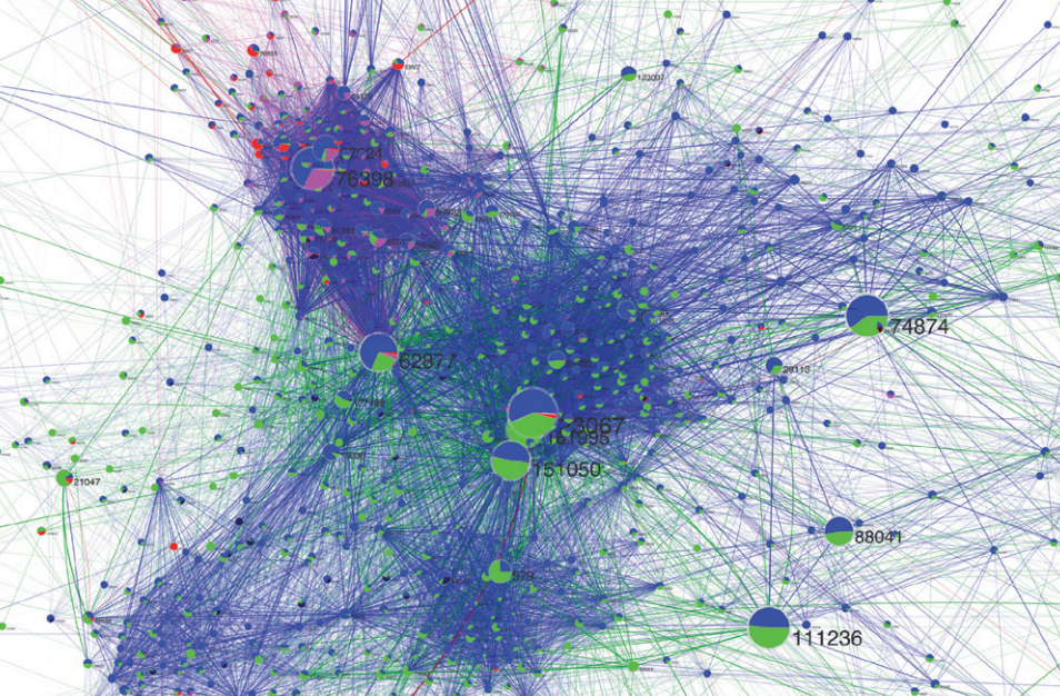
The global level aims at providing a general picture of a field, excluding details but allowing to understand where and how big are the sub-fields composing one field. It will tell us where Paestum is in the landscape of classical archaeology. At the global level, we created a network of classifications by connecting two of them if they are used to classify the same publication. On this network, we performed overlapping community discovery, i.e. we grouped together sets of classifications present in a set of related publications, allowing classifications to be in different communities at the same time. Instead of obtaining the expected structurless hairball, our community network shows structure. Classifications can be of different types: locations, people, periods, subject themes … . We assigned a color to each type. Then, we characterize each community (and link) with the type of classifications they contain.

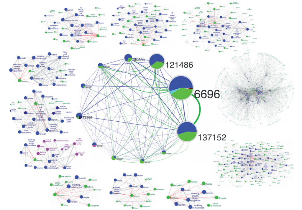
We found that there is an uneven and structured distribution of the different types of classifications in communities and clusters of communities (see the above picture: the colors are not randomly placed, click on it to enlarge). We found the first pill to cure our Paestum headache: when you look for it in the global level, you obtain 12 different communities, each one giving you a piece of information of where Paestum is in the landscape of classical archaeology

The meso-level stands in the middle between the papers and the global level. Its function is to provide information about what significantly characterizes a sub-field, in our case the sub-fields and all the other classifications relevant for Paestum. In the meso-level we are interested in putting together a coherent set of classifications that properly describe a sub-field of classical archaeology. To create it, we consider papers as customers “purchasing” classifications at the classification supermarket (remember: each publication is tagged according to its content). We then mine association rules from these purchases. Association rules are a mining tool that efficiently explore all possible significant purchases of the same products by the same customers, with surprising results in the same line of the (urban) legendary beer-diapers correlation. In our case, we end up with a subject theme network where we understand which subject theme is related with which other (in the below picture, the Plastic Art and Sculpture branch, click on it to enlarge).

In this meso-level we can characterize each one of the 12 communities with the sub-fields Paestum is related to: the period of time of the construction of the temples, the Magna Graecia geographical cluster, the fate of ancient monuments (pieces of the temples were used in other buildings), you get the idea. You have the possibility of switching back on the global level, by checking one of the related classifications connected to Paestum in one (or more than one) community and go on virtually to infinity (and beyond). Here’s what Paestum looks like in our system:

Exploring the two layers is lots of fun, because they provide complementary information. By jumping from one to another, you can find interesting and possibly unexplored combinations of classifications. On the one hand, the global level gives you an overview of the sub-fields and where and how the different sub-fields relate to each other, at the price of having a community network, where the single classifications disappeared. On the other hand, the meso-level focuses on the significant connections between single classifications and it highlights a true description of what a sub-field is about, with the caveat that we lack a general picture of where this sub-field is located in classical archaeology. In other words, you can create your own research niche in classical archaeology and be a successful scientist in the field (please acknowledge us if you do).

If you like the pictures and you want to have a clearer idea, you can check out the poster related to the paper, as it has a much higher level of detail, it’s an easier read than the paper itself and it’s a great piece of decoration for your living room.

As said above, science is awesome. When science goes meta and it uses itself to make sense of itself, it’s breathtaking.

04 January 2013 ~ 2 Comments

Data-Driven Borders

What defines the human division of territory? Think about it: cities are placed in particular areas for a number of good reasons: communication routes, natural resources, migration flows. But once cities are located in a given spot, who decides where one city ends and another begins? Likewise, who decides on the borders of a region or a nation and how? This decision, more often than not, is quite random.

Sometimes administrative borders are defined by natural barriers like mountains and rivers. This makes practical sense, although it is not always clear why the border should be that particular mountain or that particular river. In fact, the main criterion is usually historical: it’s because some dynasty of dudes conquered that area and then got lazy and didn’t go on (this may be the official version: unofficially, maybe, it’s because they found somebody who kicked their asses all day long, just like the complicated relationship of the Romans with the Parthians).

Of course, the borders of states or regions are sometimes re-arranged to better fit practical administrative purposes. In any case, these are nothing else than sub-optimal adjustments of a far-from-optimal process. Network analysis can be useful in this context, because it can provide an objective way to divide the territory according to a particular theory (and it can provide pretty pictures too).

The theory here is very simple: two territories are related if a lot of people travel regularly from one to the other. If people constantly travel back and forth between two territories, then it probably makes sense to combine these territories into one administrative unit. So, how do we determine which territories should be merged, and which shouldn’t be? This problem is easily solvable in network theory, because it contains a network in its very basic definition: two areas are strongly connected if many people travel from one to the other. What we aim for is a grouping of territories. This looks really familiar to the eyes of some readers of this website: grouping nodes in a network. Yes! Community discovery!

I am not claiming to be the first one to see the problem this way. There is a number of people who already worked on it: the two most important that I can think of are Brockmann et al. and Ratti et al. However, I am reporting this because I also have a paper on the topic. And, of course, I think it’s better than the alternatives, for a number of reasons that I won’t report because it’s boring for non nerd people. But then again, I am a narcissist, so I can’t resist giving you the short list:

  • The previous works are based on not so perfect data: Brockmann et al. work with the banknotes trajectories recorded by the “Where’s George?” website (an awesome idea, take a look at it), while Ratti et al. use cellphone mobility data. Both are not exact representations about how people move and contain critical error terms. In our work, we use GPS trajectories with very high frequency and precision: we are studying the real thing.
  • The previous works use outdated methods for community discovery which cannot detect small communities: we use a more up-to-date method that is considered the state-of-the-art of community discovery. For example, in Brockmann et al. the entire west part of the United States is apparently one single area, grouping California and Montana and creating a region of 60-something million people.
  • We actually create a framework that establishes the correct methodology to approach the problem in general, instead of just studying one particular case.

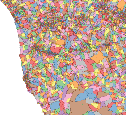
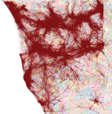
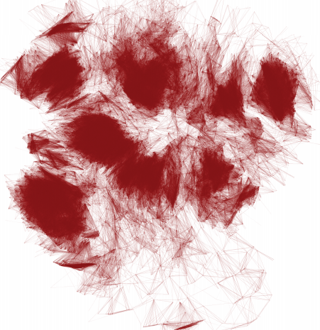
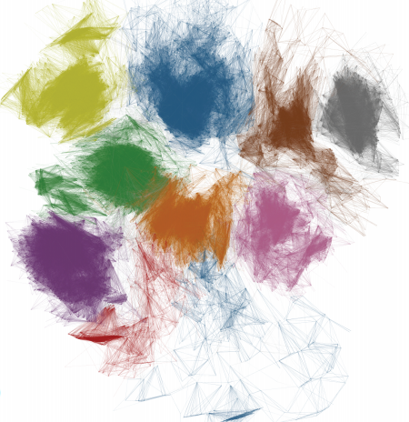
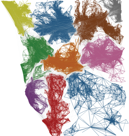
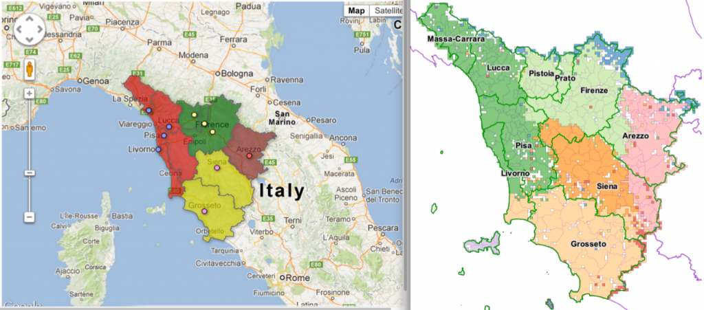
But enough blabbering! I promised pretty pictures and I’ll give you pretty pictures. The general shared methodology is the following (in the pictures, the example of  mobility in Tuscany, Italy):

1) We divide the territory in cells (either a regular grid or very fine grained census cells);

2) We connect the nodes according to how many cars went from one cell to the other;

3) We forget about geography and we obtain a complex network (here, the node layout has nothing to do with their location on the map);

4) We apply community discovery, grouping set of nodes (territories) that are visited by the same people;

5) We put the nodes back in their geographical positions, obtaining the borders we were yearning for.

Funnily enough, Italy is undergoing a re-organization process of its regions and provinces. The results in Tuscany are very similar to the insights of our work (not perfectly similar, as the current process is just a merge of the existing provinces and not a real re-design):

On the left the new provinces (colors) on top of the old ones (lines), on the right our clusters (click for a larger resolution).

The match suggests that our data-driven borders follow the general intuition about what the borders should look like. However, they are not just a blind merge of the existing provinces, such as the one made by the policy-makers, making them more connected with reality. Hurrah for network analysis!
04 December 2012 ~ 0 Comments

Complexity Squared

I decided to give to this blog post an obscure title because today I want to talk about something that in complex network analysis goes under many names, so I did not want to favor any of them. What I am talking about are networks with multiple types of relations in them, the main subject of my PhD Thesis and of a recent article that I published in the World Wide Web Journal. These structures are putting more complexity on top of complex networks, therefore they are complex network squared: hence the fancy blog title.

These networks are referred to in the literature with the following terms:

  • Multidimensional (the term that I use in my thesis);
  • Multirelational;
  • Layered;
  • Interdependent;
  • Multisliced;
  • Multilevel;

and so on and so forth. All these terms refer to the same theoretical object, that is also implemented in many ways. I’ll mention some of them just to sound like the guardian of an obscure cult: labeled multigraphs, hypergraphs, mesostructures and coupling edges.

Despite the confusion that I tried to create with the first paragraphs, the general idea of this line of research is brutally simple: in our everyday life we are not part of only one network. It may look like we are, but when we start thinking harder about our relationships, we realize that we know the people we know for different reasons. This idea is the one behind the fact that every person can belong to different “communities” at the same time, which I already discussed in these pages. But it is deeper than that. It does not only require the more sophisticated, but still traditional, community discovery algorithm that I described in that blog post. It requires a whole new model and mindset.

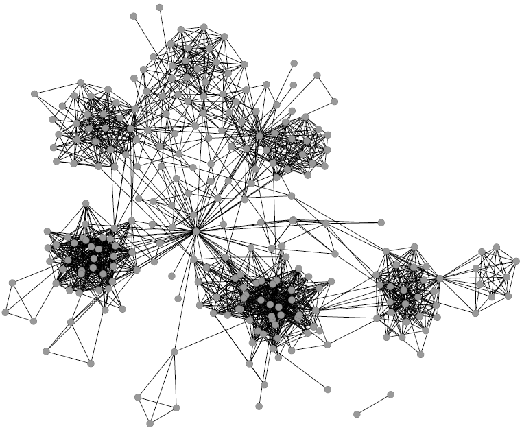
Before multidimensional networks (forgive me if for clarity I’ll use my term for these structures) the classical complex network analyst would just assume that a single relation represents a particular phenomenon and nothing else can be said about it. Allow me to recycle this picture about my Facebook friends:

Intuitively this looks nice, as we can find communities and central nodes. But is this picture really telling us everything about my Facebook friends? What about a higher order of aggregation among them? What about not only their friendship links but also their common interests? The multidimensional network analyst throws a bunch of new connections on top of it and she tells you: “There’s something more”. In this case:

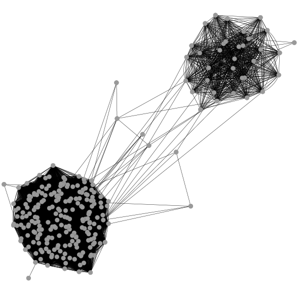
A visualization that is not nearly as elegant as the previous one, I give you that, but nevertheless it is useful to understand a higher level aggregation of my Facebook friends. On top of the connections between friends, we added edges connecting people if they are part of the same group or if they like the same stuff on Facebook. The two gigantic hairballs are composed by people who are in the same location: there is the cluster of people living in Italy, the one of people living in the US, and connections between them from people travelling between the two countries. So, we saw that adding different types of relations uncovers structural properties that none of the relations by itself would reveal.

I’ll give you another example of a cool real world effect of multidimensional networks. This is not from a work of mine, but it is from the Nature paper “Catastrophic cascade of failures in interdependent networks” by  Sergey V. Buldyrev, Roni Parshani, Gerald Paul, H. Eugene Stanley and Shlomo Havlin. Suppose you have a power grid: what happens if one plant is subject to a failure? The classical complex network analyst tells you that we could not care less: the power grid is a scale free network, in which the majority of plants are only connected to a couple other plants. So, a random failure of one plant does not affect the rest of the network too much, unless we are extremely unlucky and we lose a power hub (but that’s really rare, and the classical network guy is an incurable optimist).

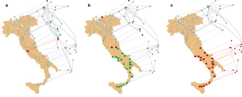
A multidimensional network scientist, instead, is way more careful. Why? Because he knows that the power grid network is not independent from everything else, but it is plugged into another network. For example, in a computer network that regulates its functioning. When a power plant goes down, a set of computers cannot work anymore. And what happen to the plants that are connected to those computers? They fail too, triggering another computer failure and God helps us all. It is theoretically proven that two different scale free relations, dependent on each other, are much much much more fragile than a single scale free network. This actually happened in Italy (where else?) and the following is a depiction from Buldyrev et al’s paper:

In the first Italy we see one plant going down (in red on the map) taking with it the computers it supplies with energy (in the flying network). This triggers a couple more failures in the second picture that eventually, in the third picture, completely destroy the power supply chain of southern Italy.
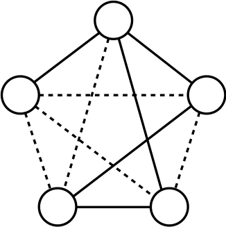
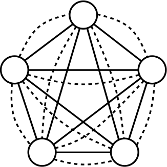
So far I gave you the idea that multidimensional networks are not exactly the same animal as classical complex networks. To give you a taste of how to prove this, I’ll spare you the super complicated equations of interdependent network percolation present in the Nature paper. I’ll instead provide another example from community discovery. As I said in my previous post, community discovery is loosely defined as the problem of grouping nodes in a network that are “densely connected”. Naturally, when we deal with multidimensional networks, the “densely connected” has to be changed into “multidimensionally densely connected”. Why is this challenging? Here I’ll give you an intuition and I promise that in the future I’ll come back with more details. For now, it is sufficient to use two pictures. Here’s the first:

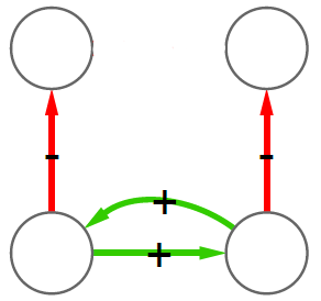
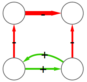
Here we assume that we have two different dimensions and they are represented with solid or dashed edges. Is this set of nodes multidimensionally dense? Of course: everybody is connected with everybody and all dimensions of the network are equally represented. Now consider another situation:

Is this set of nodes multidimensionally dense? Of course: everybody is connected with everybody and all dimensions of the network are equally represented. But the two examples are very different. That’s funny: we just discovered that, in multidimensional networks, density is an ambiguous concept.

And, as conclusion, I’ll add some multidimensional flavor to another classical network problem: link prediction. Link prediction aims at predicting your next Facebook friend. The above mentioned multidimensional network scientist steps in and says: “But why only your next Facebook friend? Why not your next virtual acquaintance tout-court?”. He means that all your social media connections and their different types play a role in determining when and where you’ll connect with somebody. This is exactly what multidimensional link prediction is, and how to do this is a complex problem that currently remains unsolved. But the multidimensional network guy loves complex problems as much as he loves complex words.

04 November 2012 ~ 0 Comments

Destroying Drug Traffic, One Query at a Time

in·tel·li·gence NOUN: a. The capacity to acquire and apply knowledge.

The intelligence process, like in Central Intelligence Agency, is the process any person or organization should go through when making important operative decisions. But this is a description of a perfect world. In reality, organizations have to face phenomena that are very complex. When the organization itself is significantly smaller than the complexity it has to face, its members have to rely on intuition, art or not solidly grounded decisions.

This is usually the case for the local police when facing organized crime. Large crime organizations like the Italian Camorra or the drug cartels in Mexico are usually international. If you read Roberto Saviano’s Gomorrah, you’ll realize that Camorra operates as far as Germany or Scotland, while drug cartels usually span from Colombia to the US passing through Mexico. On the other hand, most of their activities happen at the local level: kidnappings, killings, drug traffic. Their main adversary is not usually a broadly operating institution like the FBI, but the local police. But for the local police, to gather a satisfying amount of information to face them is usually hopeless.

With this problem in mind, I teamed up with a Mexican colleague of mine at Harvard, Viridiana Rios. Our aim was to develop a system to enable a cheap and cost-effective way to gather intelligence operations about criminal activities.

The problem with criminal activities is that they are not only part of the complex organism of organized crime. They are also usually hidden from the public. Of course, no head of a mafia family wants to conduct his business en plein air. However, whether he likes it or not, some of these activities reach the general public anyway. This happens because, “luckily”, bad news sells a lot of newspapers. Criminal activities usually leave a clear footprint in the news. Mexican drug traffic in this is also particular, for the tradition of leaving the so called narcomensajes. These messages are writings painted on walls or on highway billboards. They are used by the criminal organizations to threaten each other or the government and the police. A narcomensaje looks like this:

When we design a system for tracking the activities of crime organizations, we want this system to be as automatic as possible. Therefore, we use some computer science tricks and we rely on the information present on the websites of newspapers. Web knowledge has a lot of problems: it’s big, it’s about many different things and it’s subject to reliability concerns. However, Google News deals with most of these problems by carefully selecting topics and reliable sources. What was left for us to do, was to systematically query the system with its APIs and clean the results. The details of this process are in a paper presented by me this week at the Conference for Information and Knowledge Management (CIKM 2012).

We did not have any way to understand if our queries connecting drug traffickers to Mexican municipalities were capturing real connections. For this reason, we performed the very same task using Mexican state governors. With our great surprise, we were able to detect with high accuracy their real patterns of activities. (Not that we are drawing a parallel between organized crime and politics, just to be clear!) This indicates that our method of tracking people’s activities by using Google News data is valid. Here are some maps of some state governors. In red the municipalities where they are detected and with a large black border their state:

What did we find?

Mexican drug traffic follows a fat-tail distribution. The meaning? There is an incredible amount of municipalities with a weak drug traffic presence and some others are an explosive factory where the employees have to carry flamethrowers. Moreover, it really looks like a hydra: destroying one hub is likely just to generate another hub, or ten smaller hubs.

And the system is growing fast, jumping from one order of magnitude to a larger one in less than a decade.

We are also able to classify cartels with several features: how much they like to compete or to explore the territory. In the future, this may be used to predict where and when we will see a spike of activity for a particular drug cartel in a particular municipality (in the picture, the migration patter of the Los Zetas cartel).

Apart from the insights, our methodology really aids the intelligence problem, whenever there are no sufficient resources to perform an actual intelligence task. We used the case of criminal activities, but the system is fairly general: by using a list of something other than a drug cartel and something other than a Mexican municipality, you can bend the system to give you information about your favorite events.

11 October 2012 ~ 0 Comments

The Product Space and Country Prosperity

As reported in different parts of this website, the group I am currently working in is called “Center for International Development”. The mission of this group, in the words of its head Ricardo Hausmann, is quite trivial and unambitious: to eradicate poverty from the world. Knowing how to do it is far from easy and there are different schools of thought about it. The one that Hausmann chose starts with understanding how production and economic growth work, i.e. why some industries are successful in a country and not in another.

To address this question, Hausmann (together with César A. Hidalgo, Bailey Klinger and Albert-Laslo Barabasi) developed the Product Space. The original idea has been published in this paper in 2007, far before I joined the group, but my (overestimated) expertise was heavily exploited to generate its current implementation (the Atlas of Economic Complexity, a book freely available in electronic format). For this reason I feel no shame in writing a post about it in this blog (and to share the Product Space itself in my Dataset page).

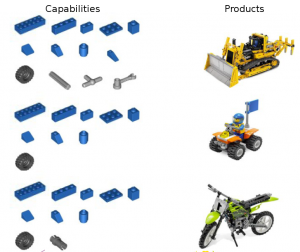
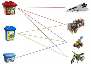
The fundamental assumption of the Product Space is the following: countries are able to have a comparative advantage in exporting a given product because they have the capabilities to export it. In abstract, it means: “I do this, because I can“. Quite reasonable. In pictures, with the awesome “A capability is a piece of LEGO” metaphor created by Hidalgo:

From this assumption, it follows that if a country can export two different products, it is because it has the capabilities to export both. Also this step is quite easy. The conclusion is immediate: a country’s development success is lead by its capabilities. The more capabilities the country has (meaning that its LEGO box is big and it contains a lot of pieces), the more capabilities it will be able to acquire, the faster it will grow.

There is a small problem with this conclusion: we can’t observe the capabilities. Of course, if we could then they would be blatantly obvious, so every country could employ its growth strategy based on them. (There is actually another problem: capabilities are tacit knowledge, as Nonaka and Takeuchi would say, so you really can’t teach them, but we will come to this problem later)

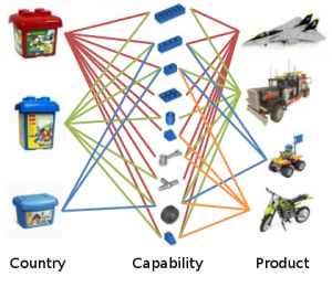
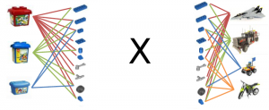
What we can observe is simply which countries export what:

But remember: if two products are exported by the same country, then there may be common capabilities needed for their productions; while if two countries export the same products, then they share at least part of the same capabilities. In mathematical terms, it means that the observed country export picture is actually the multiplication of the two halves of the second picture of the post, or:

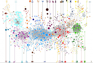
This is nice because it means that we can collapse the country-product relationships into product-product relationships and then mapping which product is related to which other product, because it requires the same capabilities. The advice for countries is then: if you are exporting product x, then you are likely to have most of the capabilities to export all the products that are connected to x. And this is how the Product Space was born, a single picture expressing all these relationships:

(click on the picture for a higher resolution, or just browse the Atlas website, that is also dynamic).

In the picture the nodes are colored according to the community they belong to (for more information about communities, see a previous post). The communities make sense because they group products that intuitively require the same extended set of capabilities: in cyan we have the electronic products, light blue is machinery, green is garments and so on and so forth.

Is the structure of the Product Space telling us something reliable? Yes, countries are way more likely to start export products that are close, in the Product Space, to the products they already export. Also, it is important to know where the export products of a country are in the Product Space. The more present a country is in the denser cores of the Product Space, the more complex it is said to be. This measure of complexity is a better predictor of GDP growth than classical measures used in political economy like average years of schooling.

Is the structure of the Product Space telling us something interesting? Hell yeah, although it’s not nice to hear. The Product Space has communities, so if you export a product belonging to a community then you have a lot of options to expand inside the community. However, many products are outside the communities, and they are very weakly connected with the rest, often through long chains. The meaning? If you are only exporting those products, you are doomed to not grow, because there is no way that you’ll suddenly start exporting products of a community from nothing (because this would require tacit knowledge that you cannot learn and is not close to what you know). And guess what products the poorest countries are currently exporting.

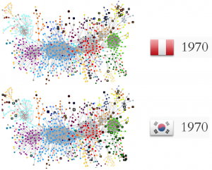
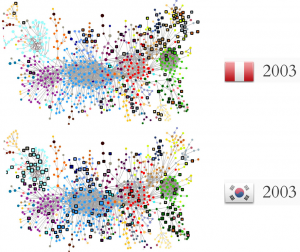
To conclude, a couple of pictures to provide one proof of the reasoning above. In 1970, Peru had more average years of schooling, more land and twice the GDP per capita of South Korea. Traditional political economy would say that Peru was strong and there was no way that South Korea could catch up. Where South Korea is today is evident. What was the difference between the two countries in terms of Product Space?

(again, click for higher resolution. The black square border indicates which products the country is exporting). There is not a lot of difference in quantities (and this explains why South Korea was poorer). However, South Korea had those two or three products in a very valuable position, while Peru had only products in the branches: a long way to the core. In 2003, this was the result:

Peru is still mainly on the edges, South Korea occupies the center. And that’s all.

15 September 2012 ~ 0 Comments

On Social Balance and Link Classification

Imagine being subscribed to a service where you can read other users’ opinions about what interests you. Imagine that, for your convenience, the system allows you to tag other users as “reliable” or “unreliable”, such that the system will not bother you by signaling new opinions from users that you regard as unreliable, while highlighting the reliable ones. Imagine noticing a series of opinions, by a user you haven’t classified yet, regarding stuff you really care about. Imagine also being extremely lazy and unwilling to make up your own mind if her opinions are really worth your time or not. How is it possible to classify the user as reliable or unreliable for you without reading?

What I just described in the previous paragraph is a problem affecting only very lazy people. Computer Science is the science developed for lazy people, so you can bet that this problem definition has been tackled extensively. In fact, it has been. This problem is known as “Edge Sign Classification”, the art of classifying positive/negative relations in social media.

Computer Science is not only a science for lazy people, is also a science carried out by lazy people. For this reason, the edge sign classification problem has been mainly tackled by borrowing the social balance theory for complex networks, an approach that here I’m criticizing (while providing an alternative, I’m not a monster!). Let’s dive for a second into social balance theory, with the warning that we will stay on the surface without oxygen tanks, to get to the minimum depth that is sufficient for our purposes.

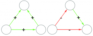
Formally, social balance theory states that in social environments there exist structures that are balanced and structures that are unbalanced. The former should be over-expressed (i.e. we are more likely to find them) while the latter should be rarer than expected. If these sentences are unclear to you, allow me to reformulate them using ancient popular wisdom. Social balance theory states mainly two sentences: “The friend of my friend is usually my friend too” and “The enemy of my enemy is usually my friend”, so social relations following these rules are more common than ones that do not follow them.

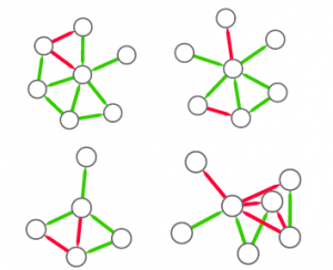
Let’s make two visual examples among the many possible. These structures in a social network are balanced:

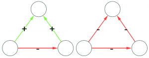
(on the left we have the “friend of my friend” situation, while on the right we have the “enemy of my enemy” rule). On the other hand, these structures are unbalanced:

(the latter on the right is actually a bit more complicated situation, but our dive in social balance is coming to an abrupt end, therefore we have no space to deal with it).

These structures are indeed found, as expected, to be over- or under-expressed in real world social networks (see the work of Szell et al). So the state of the art of link sign classification simply takes an edge, it controls for all the triangles surrounding it and returns the expected edge (here’s the paper – to be honest there are other papers with different proposed techniques, but this one is the most successful).

Now, the critique. This approach in my opinion has two major flaws. First, it is too deterministic. By applying social balance theory we are implying that all social networks obey to the very same mechanics even if they appear in different contexts. My intuition is that this assumption is rather limiting and untrue. Second, it limits itself to simple structures, i.e. triads of three nodes and edges. It does so because triangles are easy to understand for humans, because they are described by the very intuitive sentences presented before. But a computer does not need this oversimplification: a computer is there to do the work we find too tedious to do (remember the introduction: computer scientists are lazy animals).

In the last months, I worked on this problem with a very smart undergraduate student for his master thesis (this is the resulting paper, published this year at SocialCom). Our idea was (1) to use graph mining techniques to count not only triangles but any kind of structures in signed complex networks. Then, (2) we generated graph association rules using the frequencies of the structures extracted and (3) we used the rules with highest confidence and support to classify the edge sign. Allow me to decode in human terms what I just described technically.

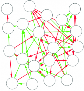
1) Graph mining algorithms are algorithms that, given a set of small graphs, count in how many of the graphs a particular substructure is present. The first problem is that these algorithms are not really well defined if we have a single graph for which we want to count how many times the structure is present*. Unfortunately, what we have is indeed not a collection of small graphs, but a single large graph, like this:

So, the first step is to split this structure in many small graphs. Our idea was to extract the ego network for each node in the network, i.e. the collection of all the neighbors of this node, and the edges among them. The logical explanation is that we count how many users “see” the given structure around them in the network:

(these are only 4 ego networks out of a total of 20 from the above example).

2) Now we can count how many times, for example, a triangle with three green edges is “seen” by the nodes of the network. Now we need to construct the “graph association rule”. Suppose that we “see” the following graph 20 times:

and the following graph, which is the same graph but with one additional negative edge, 16 times:

In this case we can create a rule stating: whenever we see the former graph, then we know with 80% confidence (16 / 20 = 0.8) that this graph is actually part of the latter one. The former graph is called premise and the latter is the consequence. We create rules in such a way that the consequence is an expansion of just one edge of the premise.

3) Whenever we want to know if we can trust the new guy (i.e. we have a mysterious edge without the sign), we can check around what premises match.  The consequences of these premises give us a hunch at the sign of our mysterious edge and the consequence with highest confidence is the one we will use to guess the sign.

In the paper you can find the details of the performance of this approach. Long story short: we are not always better than the approach based on social balance theory (the “triangle theory”, as you will remember). We are better in general, but worse when there are already a lot of friends with an expressed opinion about the new guy**. However, this is something that I give away very happily, as usually they don’t know, because social networks are sparse and there is a high chance that the new person does not share any friends with you. So, here’s the catch. If you want to answer the initial question the first thing you have to do is to calculate how many friends of yours have an opinion. If few do (and that happens most of the time) you use our method, otherwise you just rely on them and you trust the social balance theory.

With our approach we overcome the problems of determinism and oversimplification I stated before, as we generate different sets of rules for different networks and we can generate rules with an arbitrary number of nodes. Well, we could, as for now this is only a proof of principle. We are working very hard to provide some usable code, so you can test yourself the long blabbering present in this post.


* Note for experts in graph mining: I know that there are algorithms defined on the single-graph setting, but I am explicitly choosing an alternative, more intuitive way.

** Another boring formal explanation. The results are provided in function of a measure called “embeddedness” of an edge (E(u,v) for the edge connecting nodes u and v). E(u,v) is a measure returning the number of common neighbors of the two nodes connected by the mysterious edge. For all the edges with minimum embeddedness larger than zero (E(u,v) > 0, i.e. all the edges in the network) we outperform the social balance, with accuracy close to 90%. However, for larger minimum embeddedness (like E(u,v) > 25), social balance wins. This happens because there is a lot of information around the edge. It is important to note that the number of edges with E(u,v) > 25 is usually way lower than half of the network (from 4% to 25%).

17 August 2012 ~ 2 Comments

Democratic Community Discovery

When thinking about our social life, we instinctively recall the reason why we know the people we know. There is my sister, there’s the friend with whom I shared all my experiences – from stealing snacks at the primary school to the bachelor thesis we wrote together – and finally there’s that obscure guy who I don’t really know but he added me on Facebook and I don’t want to reduce my friend counter. A long time ago a very nice app called Nexus allowed Facebook users to visualize this concept. Nexus then died, it was replaced by Social Graph, which died too. Now you can use Touch Graph, but it is not nearly as good and, besides this, it’s a different story from the one I want to tell.

Nexus’ visualizations looked more or less like this:

The grey dots are my friends on Facebook and they are connected if they are friends on Facebook too. It’s clear that people you know for the same reason are densely connected to each other, because they are very likely to know each other too. The structure is pretty spectacular, I have to admit. It also seems to make a lot of sense and these different dense areas (“communities”) do not look too hard to be extracted automatically by an algorithm.

It’s on the shoulders of this gigantic positivist naïvety that countless authors decided to write such algorithm. Soon enough, a new branch of complex network analysis was born, called Community Discovery. The aim of  community discovery is to group nodes that are densely connected to each other. The groups are then called “communities” and nodes are said to be “members” of a community. Community discovery has a long, long history made by initial successes, coups de théâtre, drama and romance, but it is a complicated story and not in the scope of this post. Basically, many authors realized that they were dealing with a larger mess than previously thought. The main reason is that most, if not all, real world networks do not look like the above example. At. All. They look like this:

An ugly and meaningless hairball. Most people scratched their heads and decided to stick with their definition of community. This is the wrong way because it implies that we just give up in analyzing the second case and we consider the two examples as completely different phenomena. Guess what: they are not. The second network, too, is a sample of the Facebook friendship network and it contains the first. The sole difference between the two is the scale: the first only considers the immediate neighborhood of a node (me), the second just samples 15,000 users and the connections between them.

It’s on the basis of these considerations that I wrote a paper on community discovery, together with my co-authors at the KDDLab in Italy. We developed an algorithm that exploits the order at the local level around a node to find a sense of the connective mess at the global scale. It is called DEMON: Democratic Estimate of the Modular Organization of a Network.

The details of the implementation are included in the paper accepted at the SIGKDD 2012 conference on Data Mining. It was recently presented there by my co-author Giulio Rossetti who also happens to have written its implementation, freely available (and Open Source!). In this post, I’ll just give you a quick idea about how DEMON works.

Let’s consider a simple, messy, network:

It looks more like the messy hairball, doesn’t it? Let’s now select a node:

And then all the other nodes that are directly connected to it:

Now, let us ignore all the other nodes of the network, included the first selected. We just create a network only using the green nodes and the connections between them. What does this network look like? Like this:

Surprise! We’ve fallen back into the first, neatly divided, example. Now what we need to do is to just apply a very simple, old-school, community discovery algorithm to this sample and we have an idea about the communities surrounding the yellow node. We apply this operation to all the nodes of the network and then we merge together the communities that share an extensive portion of their members. I won’t bother you with the details and the proofs about how awesome this method is and how it outperforms the current state-of-the-art community discovery algorithms because everything is in the paper and I don’t like to brag (twice).

03 August 2012 ~ 0 Comments

Hello World!

I tried to find a smart title for my first post here, but I found the default WordPress option very suitable for my computer science-ish background.

Why am I starting this blog? Well, I firmly believe that science should be connected to everyday life. I also believe that what I am doing may be interesting and useful to improve the above mentioned everyday life. Finally, I think that to read one of my papers directly will provide little or no contribution to the community, given my total inability to write scientifically (and even non-scientifically) and the obscure link between an algorithm that I have developed and the science that makes your refrigerator or iPad work day after day.

So, here we are: the idea of this blog is to provide, hopefully, some interesting content. The fixed sections of the website are for the people who want to read directly the published paper, or to download the datasets and/or the algorithms I have developed. These posts, instead, will provide quick, dirty and informal descriptions of my papers and of everything I find interesting and worth noticing. If you ever read a scientific paper and, at the end, you found yourself asking “So what?”, the blog is the place to find the answer. At least for my papers.

The updates are meant to be regular, but don’t expect them to be frequent! If I spend all my working hours writing this blog I’ll run out of quality material. Plus I may get fired, and that’s not nice.