Michele Coscia - Connecting Humanities

Michele Coscia I am an associate prof at IT University of Copenhagen. I mainly work on algorithms for the analysis of complex networks, and on applying the extracted knowledge to a variety of problems. My background is in Digital Humanities, i.e. the connection between the unstructured knowledge and the coldness of computer science. I have a PhD in Computer Science, obtained in June 2012 at the University of Pisa. In the past, I visited Barabasi's CCNR at Northeastern University, and worked for 6 years at CID, Harvard University.

06 January 2021 ~ 1 Comment

The Atlas for the Aspiring Network Scientist

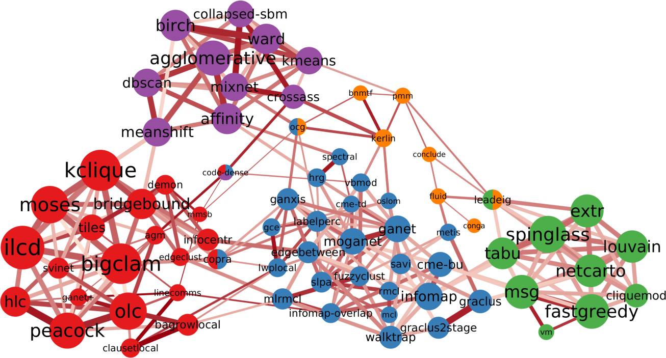
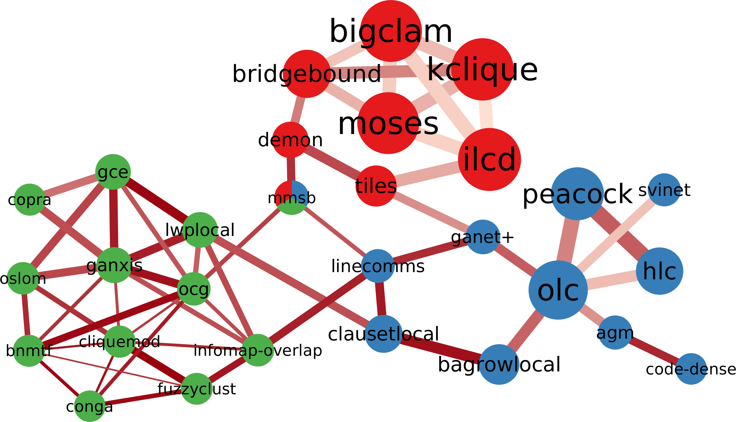
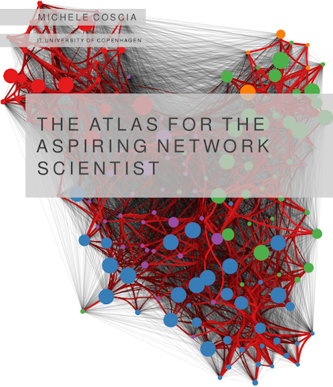
In the past two years, I’ve been working on a textbook for the Network Analysis class I teach at ITU. I’m glad to say that the book is now of passable enough quality to be considered in version 1.0 and so I’m putting it out for anyone to read for free. It appeared on arXiV yesterday. It is available for download on its official website, which contains the solutions to the exercises in the book. Ladies and gentlemen, I present you The Atlas for the Aspiring Network Scientist.

As you might know, there are dozens of awesome network science books. I cannot link them all here, but they are cited in my atlas’ introduction. So why do we need a new one? To explain why the atlas is special, the best way is to talk about the defects of the book, rather than its strengths.

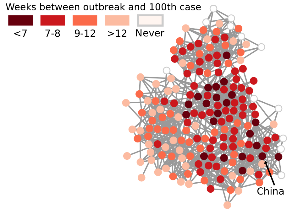
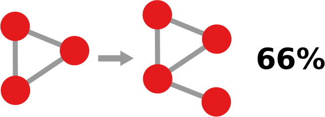
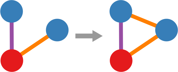
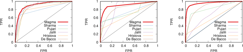
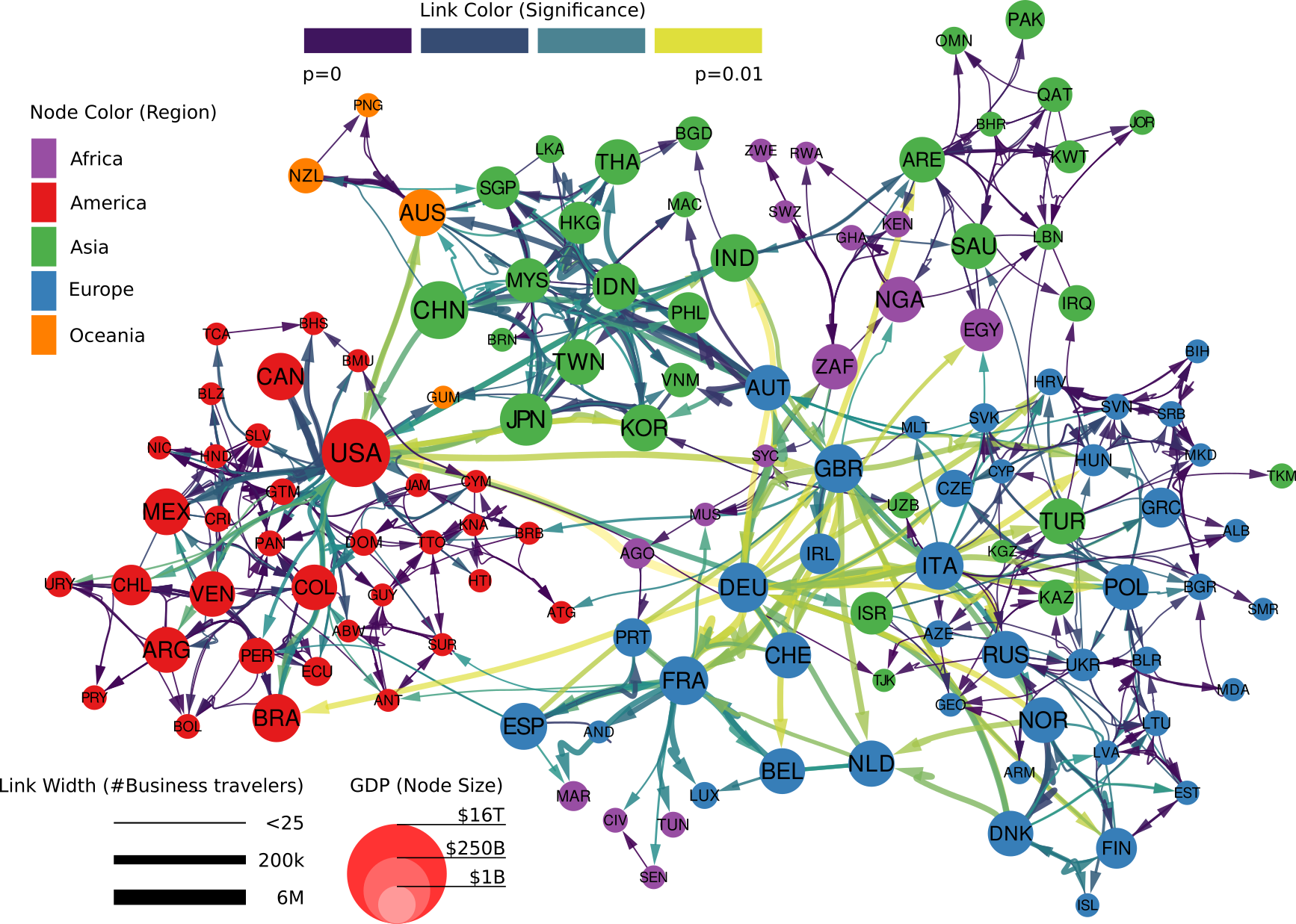
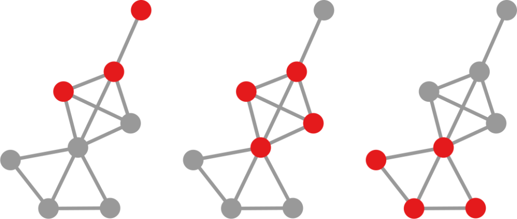
The first distinctive characteristic is that it aims at being broad, not deep. As the title suggests, I wanted this to be an atlas. An atlas is a pointer to the things you need to know, rather than a deep explanation of those things. In the book, I never get tired of pointing out the resources you need to actually understand the nitty-gritty details. When you stumble on a chapter on something you’re familiar with, you’ll probably have the feeling that you know so much more than me — which is true. However, that’s the price to pay if I want to include topics from the Hitting Time Matrix to the Kronecker graph model, from network measurement error to graph embedding techniques. No book I know includes all of these concepts.

The second issue derives from the first: this is a profoundly personal journey of eleven years through network science. No one can, in such a short time, master all the topics I include. Thus there’s an uneven balance: some methods are explained in detail because they’re part of my everyday work. And others are far from my area of expertise. Rather than hiding such a defect, the book wears it on its sleeve. I prefer to include everything I can even if I’m not an expert on it, because the first priority is to let people know that something exists. If I were to wait until I was an expert R programmer before advising you to use iGraph, the book would not exist. If I were to leave out iGraph because I’m not good at it, it would make the book weaker — and give the impression of dishonesty, like the classic Pythonist who ignores R because “it’s the opposing team”.

Finally, the book reads more like a post on this blog than an academic textbook. I use a colorful style and plenty of humor. This is partially as a result of the second point, since the humor is mostly self-deprecating about my limits — for instance, the stabs I take at R are intended as light-hearted jest. In general, I want to avoid being excessively dry and have the readers fall asleep at page 20. This is a risky move, because humor is subjective and heavily culture-dependent. People have been and will be put off by this. If you think I cross the line somewhere in the book, feel free to point that out and ask me to consider your concerns. If, instead, you think that humor in general has no place in academia, then I disagree, but there are plenty alternatives, so you can safely ignore my book.

Given all of the above, it is no surprise that the atlas is imperfect and many things need to be fixed. Trust me that the first draft was significantly worse in all respects. The credit for catching my mistakes goes to my peer reviewers. Every one of their comments was awesome, and every one of the remaining mistakes are only my fault for being unable to address the issues properly. Chief among the reviewers was Aaron Clauset, who read (almost) the entire thing. The others* still donated their time and expertise for free, some of them only asked me to highlight worthwhile charities such as TechWomen and Evidence Action in return.

Given all the errors that remain, consider this a v1.0 of a continuous effort. There are many things to improve: language, concepts, references, figures. Please contact me with any comments. The PDF on the website will reflect changes as soon as is humanely possible. Before I put v1.1 on arXiV, I’ll wait to have a critical mass of changes — I expect to have it maybe for mid to late February.

I also plan to have interactive figures on the website in the future. Version 1.0 was all financed using my research money and time. For the future, I will need some support to do this in my free time. If you feel like encouraging this effort, you can consider becoming a patron on Patreon. A print-on-demand version will be available soon (link will follow), so you could also consider ordering a physical copy — I’ll make 70 juicy cents of profit for every unit sold, because I’m a seasoned capitalist who really knows how to get his money’s worth for two years of labor.

I poured my heart in this. I really hope you’ll enjoy it.


* Special thanks go to Andres Gomez-Lievano. The other peer reviewers are, in alphabetical order: Alexey Medvedev, Andrea Tagarelli, Charlie Brummitt, Ciro Cattuto, Clara Vandeweerdt, Fred Morstatter, Giulio Rossetti, Gourab Ghoshal, Isabel Meirelles, Laura Alessandretti, Luca Rossi, Mariano Beguerisse, Marta Sales-Pardo, Matte Hartog, Petter Holme, Renaud Lambiotte, Roberta Sinatra, Yong-Yeol Ahn, and Yu-Ru Lin.

09 December 2020 ~ 0 Comments

Speed-Check your Diseases on a Social Network

Back in March I wrote a blog post — and a paper — showing a technique to estimate the distance covered by a propagation event on a network between two moments in time. A propagation event could be the failure of a power grid, a word-of-mouth campaign on social media, or — more topically these days — a disease infecting people in a social network. The limitation of that paper was in taking only a single perspective. However, this problem could be solved in at least a dozen different ways. To give justice to such complexity, I recently co-authored the paper “The Node Vector Distance Problem in Complex Networks” with Andres Gomez, James McNerney, and Frank Neffke. The paper was published this month in the ACM Computing Surveys journal and it’s the main focus of this blog post.

Estimating the spreading speed of something in our normal geographical space is important, but relatively trivial. However, networks are complex spaces. You cannot estimate the speed of COVID by looking at the geographical areas it has covered, because what really connects places is not our physical space, but a complex network of relations among regions. In other words, the places closest to China are not necessarily countries like Mongolia or Nepal — both of which share a border with China — but Iran and Italy, because of the many direct flights connecting them.

My paper in March found a way to transform our notion of Euclidean distance — a straight line in physical space — to networks. It basically defined what a “straight line” means when all you have is nodes and edges. In the figure above, I connect countries if they have a significant number of direct flights between their airports. Darker nodes represent countries that were hit earlier, and nodes get progressively lighter the later they were first hit. My generalized Euclidean measure allows you to calculate a number describing how fast this process went. This means you could compare it with other pandemics, or you could use it to estimate the moment when a still-developing pandemic will cover a given fraction of the world.

Was mine the only way to translate the concept of “straight line”? No. For starters, it uses an indirect metaphor to define “straightness”. In my generalized Euclidean, every node is a “dimension” of a multidimensional space and, when COVID infects it, it means that the virus had traveled a certain amount of distance in that dimension. If you’re staring dumbfounded at the previous sentence, yeah, that’s pretty much what I expected. A more intuitive way of defining the distance covered in a network would be simply to count how many edges the disease crossed via the calculation of shortest paths.

However, it’s still not that easy: how far is each newly infected node from the set of previous infected nodes? And how do we combine all those path lengths into one new measure? In the paper, we explain various ways to do so. One option is to apply linking strategies from hierarchical clustering, as I show in the figure above. The distance between the group of red points from the blue points can be the distance of their closest pair — green line, called single linkage –; the distance of their centers of mass — orange line, average linkage –; or the distance between their farthest pair — purple line, complete linkage. Another option is to simulate an agent optimizing the movement of “packets” from the nodes in the origin to the nodes in the destination — the popular Earth Mover’s Distance measure.

And that still doesn’t cover the space of possibilities! Even in our simple geographical world, we can have different perspectives on what “distance” means. For instance, a popular distance measure is cosine distance. In it, it doesn’t matter how far two points are in the space: if they are on the same line from your point of view, you consider them close together. Now, “distance” becomes the angle by which you have to turn to go from looking straight at one point, to looking at the other. In the figure below, the Euclidean (straight line) distance between two red points is in blue. The cosine distance is the thick green line, showing in the point pair below that it could be quite small even for points that Euclid would say are very far away in the plane. Many measures adopt this distance philosophy for networks, for instance the Mean Markov Chain and the Graph Fourier Transform approaches.

That is more or less where we stop in the paper. I think that there are plenty more network distance measures to be discovered, but the work still needs to be done.

As a companion for the paper, I have developed an open source Python library implementing the majority of network distance measures that we discuss. You can use it to calculate network distances in your data, or to better understand how these measures work. Hopefully, you’ll make my job harder by discovering new measures and forcing me to publish an updated paper on the topic.

16 October 2020 ~ 0 Comments

Ruling your Network

When you’re studying complex systems, one of the most important questions you might have is: how will this system evolve in the future? If you’re modeling your system as a network — as I like to do in my spare time — this boils down to predicting the arrival of new nodes and links. This is the realm of link prediction. In this post, I’ll describe one advancement in the field that I developed with fellow NERD Michael Szell in the paper “Multiplex Graph Association Rules for Link Prediction“, to appear next year at the ICWSM conference.

A graph evolving: the green nodes and non-gray links are added over time.

There are many ways to predict new links in a network, but most of these methods have a disadvantage: they can only give you a score for potential future connections between two nodes that are already in the network when you observe it. In other words, they cannot predict new incoming nodes. But with a technique called “graph association rules”, used by the GERM algorithm published in 2009, we can predict new nodes. How is that possible?

In simple terms, a “graph association rule” is a rule that tells you: every time you see in your network a pattern A, it will turn into pattern B, with a certain degree of confidence. The rule is extracted by counting how many times patterns A and B appear. For instance, in the image below, if pattern A (the triangle) appears 9 times and pattern B (the triangle with a dangling node) appears 6 times, the confidence of the rule is 2/3. 66% of the time, a triangle has attracted a dangling node. Note that pattern B must include pattern A, otherwise it’s difficult to hypothesize that A evolved into B.

GERM has a problem of its own, which Michael and I set out to solve: it can predict incoming nodes and links, but it cannot distinguish between different link types. In other words, every predicted link is the same to GERM. However, many real world networks have link types: nodes can connect in different ways. For instance, on social media, you connect to the people you know in different ways: via Facebook, Twitter, Linkedin, etc.

You’d model such system with a multiplex network, which allows for link types. If you have a multiplex network, you need multiplex graph association rules for link prediction. Which is exactly the title of our paper! What a crazy coincidence!

In the paper we re-purpose Moss, a graph pattern miner that can extract multiplex patterns, to build such rules. We created a pre- and post-processor of Moss that can construct the rules based on the patterns it finds. Now we can give colors to the links that are featured in our rules, as the figure below shows. This is a generalization of the signed link predictor I already wrote about a long time ago (the second ever post on this blog. I feel old).

Doing so isn’t painless though. We made sacrifices. For instance, our rule extractor doesn’t really understand the passage of time. It knows that the input network is in the past and spits out the rules to predict its evolution, but it doesn’t know how long a rule will take to complete. Unlike GERM, which can tell you that a rule will take n timesteps to complete.

This downside is minor though. Our link predictor performs well, as witnessed by the ROC curves below (our method in red). The comparisons are other multiplex link predictors. Not only are they worse at predicting links, but they have the added disadvantage of being unable to predict the arrival of new nodes. They also have issues with memory consumption, because they generate a score for each pair of nodes that is not connected in the training data — which, for sparse networks, is a lot of scores. Our predictor, instead, only gives scores to the links that are valid consequences of the rules that we found, usually way fewer than all unconnected node pairs.

If you want to play with our link predictor, you can do so by downloading the code I made public for the replication of the paper’s results. The code is very academic — meaning: badly written, unreasonably fragile, and horribly inefficient. I have in the works an extension with more efficient and robust code, and a generalization from multiplex to fully multilayer networks. Stay tuned!

07 September 2020 ~ 0 Comments

Media, Special Issues, & Personal Growth

A quick and unusual post for this blog to keep you up to date with what happened in my summer.

First, I’m happy to report that my paper on the effect of business travels on economic growth — which I describe here — is generating a fair amount of buzz. You can read the excellent summary written by Ricardo on Project Syndicate, or my own “Behind the paper” version. If podcasts are your thing, we got you covered. And I’ll present it at the Copenhagen Fintech on September 16th.

Second, I’m teaming up with the most excellent prof. Morgan Frank from the University of Pittsburgh to edit a special issue for the journal Frontiers in Big Data Networks. We called the special issue “Complex Networks and Economics” and we intend it to be a safe haven for all of you advancing our understanding of the complex systems that compose our global, regional, and local economy. You can read more at the official page of the journal (linked above), or in this post I wrote for my NERDS research group. Consider submitting!

And, finally, one last bit of shameless self-celebration. Something new happened on the header of this blog:

Yai me! I’m a real associate grownup now! (Actually, effective on October 1st. So I still have time to mess this up)

11 August 2020 ~ 0 Comments

The Effect of Shutting Down International Travels

Face-to-face interactions are a key component of knowledge transfer. Learning-by-doing, imitation, and tutoring are necessary tools for the acquisition of tacit knowledge: everything you need to know that cannot be encoded in a tool or in a manual. If you want to create something, the best way to do so is to be in direct contact with the people who can already do it. The proof is in business travels. Why would businesses spend a fortune — 1 trillion dollars in 2017 — to send their employees around the world ignoring the fact that we’re living in a telecommunication golden era? Because remote meetings don’t work. There are no substitutes for direct interactions. We cannot do without them. Except now we are forced to. So what’s the effect of shutting down international travels?

This is a question I set out to answer together with Frank Neffke and Ricardo Hausmann in the paper “Knowledge Diffusion in the Network of International Business Travel“, which has been published on Nature Human Behaviour. Of course, none of us took the hypothetical “international travel screeching to a halt” scenario seriously: we’re not precogs, it was merely an academic thought experiment. I must have, at some point, accidentally knocked over the lever that switched from simulation to reality. Oops.

We wanted to understand the effect of business travel on the development of new industrial activities in the countries receiving them. We did so by partnering with the MasterCard Center for Inclusive Growth, which provided access to aggregated and anonymized data based on foreign corporate card expenditures. The data allowed us to see how many corporate-issued spending cards were observed making transactions abroad in the 2011-2016 period. If a corporate card issued in Mexico made an expenditure in Colombia we can infer that it was due to a business travel — after some important data cleaning steps.*

Our problem was that we needed to gauge how many travelers from an industry reached a country, but we only had information about the country of origin. We solved this with a simple mathematical trick. We just assumed that the industries of a country were all equally likely to send out business travelers. Thus, if 20% of firms in Japan are car manufacturing plants, then 20% of business travelers from Japan are associated with the car manufacturing industry. This is rather naive and probably wrong — some industries are more likely to send travelers. But — if anything — this would dampen our results: we’re confident that, if we see any signal, that would actually be an underestimation of what’s really going on.

So, are business travels really contributing to the development of new industries in the country of destination? Yes! Our estimates show that, if we were to double the number of business travelers, we would expect a growth in industrial activity of around 6-14%. We have good reasons to believe that this effect is causal: it’s not simply that business travels happen because of a blossoming industrial activity in the destination. We test this by comparing different pairs of countries with different visa regimes between them — full details in the paper.

Click figure for a high resolution version.

Who are the largest contributors to this growth? To answer this question we ran that hypothetical scenario: how much would global GDP shrink if a country would completely cease to send out business travelers forever? We found out that the most impactful country would be Germany, contributing a staggering 4.82% of global GDP with its business travelers (see image above). Canada and the US are in second and third place, both impacting more than 1%. Not great news in light of renewed travel bans that are making this nightmare scenario all too real.

Click figure for a high resolution version.

Who benefits the most from the knowledge flowing with business travelers? This is where our study unveils some uncomfortable truths. To answer our question we should first see how the global network of business travel looks like (figure above). Its most striking feature is how geographically clustered it looks. You can clearly see an Americas cluster. The European cluster includes some countries in the near East and North Africa. Asia is split in middle and far East. This isn’t great news. Current patterns of economic inequality hint at the fact that tacit knowledge is concentrated in some rich countries. If that’s true, such strong geographical clustering of business travel means that tacit knowledge will find a hard time spreading globally.

The map below shows which countries are comparatively receiving more knowledge,. Western Europe and North America are clear winners, because they tap into the large reservoirs of knowhow that are Germany, Canada, the US, the UK. The rest of the world, outside these tightly-knit clusters, is left scrambling for scraps.

Click figure for a high resolution version.

So what are the lessons learned from this exercise? First, we need to solve the pandemic crisis effectively and put in place some solid countermeasures for future ones. We cannot do without business travel. If we could, we would have saved a trillion dollars in 2017, and kept plenty of CO2 from entering the atmosphere. Like it or not, Zoom calls are — for the moment — not substitutes for face-to-face interactions. Second, we need to figure out how to break the geographical compartmentalization of international knowledge transfer. If we want to achieve economic convergence and lift developing countries out of poverty, we need such countries to access what they lack to make the leap to become developed economies: the otherwise immobile tacit knowledge.

You can read more and access to interactive visualizations on the webpage of the paper, and request access to the data for result replication.


* There are countries in which the company doesn’t issue cards, or wasn’t able to grant access to data at the necessary level of granularity due to privacy regulations. Some countries simply are cash societies and thus don’t use cards. Such countries are not represented in our study.

10 June 2020 ~ 0 Comments

News on Social Media: It’s not Real if I don’t Like it

The spread of misinformation — or “fake news” — is an existential threat for online social media like Facebook and Twitter. Since fake news has the power to influence elections, it has attracted legislative attention. And online social media don’t like legislative attention: Zuck wants to continue doing whatever he is doing. Thus, they need to somehow police content on their platforms before somebody else polices it for them. Unfortunately, the way they chose to do so actually backfires, as I show in “Distortions of Political Bias in Crowdsourced Misinformation Flagging“, a paper I just published with Luca Rossi in the Journal of the Royal Society Interface.

The way fact checking (doesn’t) work on online social media at the moment could be summarized as “semi-supervised crowdsourced flagging”. When a news item is shared on the platform, the system allows the readers to flag it for removal. The idea is that the users know when an item is a case of fake reporting, and will flag it when it is. Flags are then fed to a machine learning algorithm. The task of this algorithm is to filter out noise. Since there are millions of users on Facebook, practically every URL shared on the platform will be flagged at least once. After the algorithm pass, a minority of flagged content will be handed to experts, who will fact-check it*.

Sounds great, right? What could possibly go wrong? That’s what I defiantly asked Luca when he prodded me to look at the data of what was being passed to the expert fact checkers. As Buzzfeed would say, the next thing I saw shocked me. He showed me the top ten websites receiving the highest number of expert fact-checks in Italy — meaning that they received so many flags that they passed the algorithmic test. All major national Italian newspapers were there: Repubblica, Corriere, Sole 24 Ore. These ain’t your Infowars or your Breitbarts. They have clear leanings, but they are not extremist and they usually report genuinely, albeit selectively and with a spin. The fact-checkers did their job and duly found them not guilty.

So what gives? Why are most flags attached to mostly mild leaning, genuine reporting? Luca and I developed a model trying to explain this phenomenon. Our starting point was re-examining how the current system works: users see news, flag the ones that don’t pass the smell test, and those get checked. It’s the smell test that doesn’t pass the smell test. There are a few things impairing our noses: confirmation bias and social homophily.

Image from https://fs.blog/2017/05/confirmation-bias/

Confirmation bias means that a user will give an easier pass to a piece of news if the user and the news share the same ideological bias. Strongly red users will be more lenient with red fake news but might flag a more truthful blue news item, and vice versa. Social homophily means that people tend to be friends with people with a similar ideological leaning. Red people have red friends, blue people have blue friends. It’s homophily that gives birth to filter bubbles and echo chambers.

So how do these two things cause flags to go to popular neutral sources? The idea is that extremism is rare — otherwise it wouldn’t be extreme. Thus, most news organizations and users are neutral. Moreover, neutral news items will reach every part of the social network. They are produced by the most popular organizations and, on average, any neutral user reading them has a certain likelihood to reshare them to their friends, which may include more extreme users. On the other hand, extreme content is rare and is limited to its echo chambers.

Image from “MIS2: Misinformation and Misbehavior Mining on the Web”

This means that neutral content can reach the red and blue bubbles, but that extreme red and blue content will not get out of those same bubbles. An extreme red/blue factional person will flag the neutral content: it is too far from their worldview. But they will never flag the content of opposite color, because they will never see it. The fraction of neutral users seeing and flagging the extreme content is far too low to compensate.

Luca and I built two models. The first has the right ingredients: it takes into account homophily and confirmation bias and it is able to exactly reproduce the flagging patterns we see in real world data. The model confirms that it is the most neutral and most truthful news items that get flagged the most (see image below, to the left). The second model, instead, ignores these elements, just like the current flagging systems. This second model tells us that, if we lived in a perfect world where people objectively evaluate truthfulness without considering their own biased worldview, then only the most fake content would be flagged (see image below, to the right). Sadly, we don’t live in such a world, as the model cannot reproduce the patterns we observe. Sorry, the kumbaya choir practice is to be rescheduled to an unspecified date (also, with COVID still around, it wasn’t a great idea to begin with).

From our paper: the number of flags (y axis) per value of news “truthfulness” (x axis) in the model accounting for factionalism (left) and not accounting for factionalism (right). Most flags go to highly truthful news when accounting for factionalism.

Where to go from here is open to different interpretations. One option is to try and engineer a better flagging mechanism that can take this factionalism into account. Another option would be to give up altogether: if it’s true that the real extreme fake content doesn’t get out of the echo chamber, why bother policing it? The people consuming it wouldn’t believe you anyway. Luca and I will continue exploring the consequences of the current flagging mechanisms. Our model isn’t perfect and requires further tuning. So stay tuned for more research!


* Note that users can flag items for multiple reasons (violence, pornography, etc). This sort of outsourcing is done only for fact-checking, as far as I know.

28 April 2020 ~ 0 Comments

A Worried Look at Economic Convergence

A moral imperative that wealthy communities have — in my opinion — is to ensure economic convergence: to help the poorer economies to have a stronger economic growth so that everyone is lifted out of poverty*. There is a lot of debate on whether economic convergence is actually happening (some say yes, others no) — and, if so, at which scale (global, national, regional?). In my little contribution to the question I show that — if convergence happens — it is not via traditional institutional channels, but via participation in the global social network. Which is terrible news in these days, since we’re experiencing an unprecedented collapse in this web of relations due to the COVID-19 pandemic.

An example of economic divergence: some countries like Singapore are now 6X richer than other countries that had a comparable level of income in the late 1800. Image from EconoTimes.

This message comes from a paper I wrote a while ago with Tim Cheston and Ricardo Hausmann: “Institutions vs. Social Interactions in Driving Economic Convergence: Evidence from Colombia“. I never mentioned it because it is just a working paper, so all conclusions should be taken with a boatload of grains of salt. But it is an interesting perspective on the consequences of these troubling times — plus it foreshadows another post I’m planning for the future, so stay tuned 🙂

The idea is simple: we want to know whether economic convergence happens in Colombia. If it does, we want to show that its driving force is the participation in social networks. In other words, economic growth is a matter of connecting skillful people with people possessing capital. We need to make sure we’re not confusing our “social relationships” explanation with the ability of some states to be better at providing public goods and redistributing wealth from the rich municipalities to the poor ones.

The public institutions hypothesis seems natural: if you have good politicians, they would write good laws which will support their population’s prosperity. Bad politicians would just be inept, or even corrupt. In this hypothesis, poor municipalities in rich (= well managed) regions should grow faster than poor municipalities in poor (= badly managed) regions. Our hypothesis, instead, proposes that poor municipalities with strong social connections to rich municipalities should grow faster than poor municipalities without such connections. For this we need to know two things: in which administrative region a municipality is (easy!) and to which social group of municipalities it belongs.

The latter is tricky, but not if you’re a data hoarder like yours truly. I had already worked with phone call records in Colombia, so you might guess where this is going. I can represent Colombia as a network, where nodes are the municipalities. Municipalities are connected to other municipalities if there is a significant number of residents in the two municipalities that call each other. Once I have this network, I can perform community discovery and find groups of municipalities with tightly knit social relations.

Colombia’s social network at the municipality level. Click to enlarge.

Using data on the municipalities’ GDP (from DANE) and average wage (from PILA), we can now test whether convergence happens — i.e. growth is negatively correlated with starting level, the poorer you are the more you grow. This is false for administrative regions but true for social communities: there is a mildly significant (p < 0.05) negative relationship between a social group’s GDP (and average wage) growth and its initial level. Meaning: economic convergence happens at the social but not at the institutional level. I’d love an even lower p-value, but one can’t do much with such a low number of regions/groups (32 in Colombia).

If social communities are converging, what could be driving the effect? We observe a robust (p < 0.01) positive relationship between the growth of per capita wages in a municipality and the average per capita wage in its social group. Meaning: if you talk to rich municipalities, you grow faster. Even the formality rate converges: if you talk with municipalities with low tax evasion, you start tax-evading less! Such relationships are absent for administrative regions, and survive a number of robustness checks — excluding the capital city Bogotá, excluding particularly small municipalities (in inhabitants, employees, or number of phone calls), using admin region fixed effects, etc. To get a sense of scale: suppose baseline growth is 1%. If you talk to a rich social group you’d grow, instead, by 1.02%. If you you talk to rich municipalities and you are also poor, you grow by 1.09% instead. This might not sound much, but it’s better to have it than not, and it stacks over time, as the picture below shows.

The effect of social relationships on average wage (y axis) over time (x axis). Gray = base growth; blue = growth while talking to rich social communities; red = talking to rich social community *and* being poor.

These results would be great in normal times, because they provide a possible roadmap to fostering economic convergence. One would have to identify places which lack the proper connections in the global knowledge network, and try to plug them in. The problem is that we’re not living in normal times. Lockdowns and quarantines due to the global pandemic have created gigantic obstacles to human mobility almost everywhere in the world. And, as I’ve shown previously, social relationships go hand in hand with mobility. For that reason, physical obstacles are also hampering the tightening of the global social network, one of the main highways of global development.

Don’t get me wrong: those are the correct measures and we should see them through. But we also should be mindful of their possible unintended side effects. Perhaps there are already enough people working on research on better medical devices, and on how to track and forecast outbreaks on the global social network. If this post has a moral, it’s to encourage people to find new ways to make the weaving of such global social network more robust to the black swan events that will follow COVID-19. Because they will happen, and our moral imperative of lifting people out of poverty can’t be the price we pay to survive them.


* This needs to be a structural intervention: simple handouts don’t work and may even make the problem worse.

25 March 2020 ~ 0 Comments

How Quickly is COVID Really Spreading?

I don’t need to introduce to you what the corona virus is: COVID-19 has had a tremendous impact on everyone’s life in the past weeks and months. All of a sudden, our social media feeds have been invaded with new terminology: social distancing, R0, infection rate, exponential growth. Overnight, we turned ourselves into avid consumers of epidemics literature. We learned what the key to prevent the infection from becoming a larger problem is: slow the bugger down. That is why knowing how fast corona is actually moving is such a crucial piece of information. You have seen the pictures many times, they look something like this:

Image courtesy of my data science students: Astrid Machholm, Jacob Kristoffer Hessels, Marie-Louise Tommerup, Simon Breum, Zainab Ali Shaker Khudoir. If anything, it warms my heart knowing that, even during a pandemic, many journalists take their weekends off 🙂

What you’re seeing is the evolution in number of infected people — and how much non-infected people like me blabber about them online. Epidemiologists try to estimate the speed of infection by fitting the real data you see on an SI model. In it, people turn from Susceptible to Infected at a certain rate. These models are usually precise at estimating the number of infected over time, but they lack a key component: they assume that each individual is interchangeable and that anyone has a chance to be infected by anyone in their close proximity. In other words, they ignore the fact that we are embedded in a social network: some people are more central than others, and some have more friends than others.

To properly estimate how fast a disease moves, you need to take the network into account. And this is the focus of a paper of mine: “Generalized Euclidean Measure to Estimate Network Distances“. The paper has been accepted for publication at the 2020 ICWSM conference. The idea of the paper is to create a new measure that estimates the distance between the state of the disease at two moments in time, taking the underlying network topology into account.

The question here is deceptively simple. Suppose you have a set of infected individuals. In the picture above, they are the nodes in red in the leftmost social network. After a while, some people recover, while others catch the disease. You might end up with the set of infected from the network in the middle, or the one in the right. In which case did the disease spread more quickly?

We have a clear intuitive answer: the rightmost network experienced a faster spread, because the infected nodes are farther from the original ones. We need to find a measure that matches this intuition. How do we normally estimate distances in the real world? We use a ruler: we draw a straight line between two points and we measure how long that line is. This is the Euclidean distance. Mathematically, that means representing the two points as vectors of coordinates (p and q), calculating their difference, and then using Pythagoras’ theorem to calculate the length of the straight line between them:

We cannot apply this directly to our network problem. This is because, for silly Euclid, every dimension has the same importance in estimating the distance between points. However, in our case, the points are the states of the disease. They do not live on the plane of Euclidean geometry, but on a network. Some moves in this network space are short and easy: moving between two connected nodes. But other moves are long and hard: between two nodes that are far apart. In other words, nodes that are connected to each other contribute less than unconnected nodes to the distance. The simplest example I can make is:

In the figure, each vector — for instance (1,0,0) — is the representation of the state of the disease of the graph beneath it: the entries equal to one identify the currently infected node. Clearly, the infection closer to the left graph is the middle one, not the right one. However, the Euclidean distance between the three vectors is the same: the square root of two. So how do we fix this problem? There is a distance measure that allows you to weigh dimensions differently. It is my favorite distance metric (yes, I am the kind of person who has a favorite distance metric): the Mahalanobis distance. Mahalanobis simply says that correlated variables should count less in estimating the distance: taller people tend to be heavier — because there’s more person to weigh — so we shouldn’t be surprised if someone taller than me is also heavier. But, if they weigh less, we would find it remarkable.

Now we’re just left with the problem of figuring out how to estimate, mathematically, what “correlated” means in a network. The paper has the full details. For here, suffice to say we augment Pythagoras’ theorem with the pseudoinverted graph Laplacian — a sentence I’m writing only to pretend I’m smart (it’s actually not sophisticated at all, and a super easy thing to calculate). The reason we use the graph Laplacian is because it is a standard instrument to estimate how fast things spread in a network.

In the paper I run a bunch of tests to show that this measure matches our intuition. For instance, as shown above, if we have infected people at the endpoints of a chain graph, the longer the chain (x axis) the higher the estimated distance should be (y axis). GE (= Generalized Euclidean, in red) is my measure, and it behaves as it should: a constantly growing function (the actual values don’t really matter as long as they constantly grow as we move left to right). I compare the measure with few alternatives. The Euclidean (gray) obviously fails because it doesn’t know what a network is. EMD (green) is the Earth-Mover Distance, which is as good as my measure, but computationally more expensive. GFT (blue) is the Graph Fourier Transform, which is less sensitive to longer distances.

More topically, I can simulate different diseases with a SI model on a network. I can randomly change their infectiousness: how likely you (S) are to contract the disease if you’re in contact with an infected (I) individual. By looking at the beginning and at the end of an infection event, my measure can recover that infectiousness parameter, meaning it can distinguish between slow- and fast-moving diseases.

I’m obviously not pretending to be smarter than the thousands of epidemiologists that are doing a terrific job in fighting — and spreading awareness about — the disease. Their models at a global, national, and regional level for sure work extremely well and do not need this little paper of mine. However, this tool might find its use, when you have detailed data about a specific social network, for instance by using phone data to reconstruct a network of physical contacts. It also has a wider applicability to anything you can model as a diffusion process on a network, being a marketing campaign, the exploration of the Product Space by a country, or even computer vision. If you want to play with the code, I implemented a few network distance methods in a Python library.

20 September 2019 ~ 0 Comments

Who will Cluster the Cluster Makers?

If you follow this blog, you know that I periodically talk about community discovery. The problem seems so deceptively simple: finding groups of nodes densely connected in a network. If it is so simple, why have I been talking about it since 2012? The reason is that it isn’t so simple, and people have tried to organize the literature explaining how the thousands of different algorithms work, how they perform, what definition of “community” they use. After all that work, I’m still left with one question. Which two algorithms return the same gosh darned communities in a network? That’s what we’re going to discover today.

What I want to do is to take as many community discovery algorithms as I can, test them on a set of networks, and compare their results to estimate how similar they are. This gives me a similarity matrix of algorithms, which I can transform into a network by keeping only similarities that are statistically significant. Once I have the network, I can discovery groups of algorithms returning a coherent set of results, because they’re all significantly related to each other. How do I find these groups? Well, by ehm…. er… performing… community… discovery? on the… network of… community discovery… algorithms… This is exactly the outline of my paper Discovering Communities of Community Discovery, which I presented at ASONAM last month.

“As many community discovery algorithms as I can” turned out to be 73, all implemented in different languages, taking input in different ways, and providing different output formats. I ran them on more than 1,500 networks (real world ones from ICON and synthetic benchmarks). It was a… difficult month for me. I compared their partitions by estimating their mutual information: given that I know the results of algorithm A, how much can I infer about the results of algorithm B? For each network where two algorithms result in a lot of mutual information, I increase their similarity count by one. Once I have all similarity counts, I can extract the backbone of this matrix, controlling for the fact that some algorithms tend to be more peculiar than others, while others tend to be more mainstream.

And this is the result (click to enlarge):

I love this network, because it has well defined groups and they all make sense. There’s the group of modularity maximization algorithms (in green), there’s the ones based on percolation / random walks (in blue), and the ones using neighbor similarity (in purple) as the guiding principle.

Then there’s a lump of algorithms that allow communities to share nodes (in red). The only thing these algorithms have in common is that they allow communities to share nodes, which is not a good enough common characteristics. The ways they find communities are as diverse as the ones you find in the rest of the network. But that’s the beauty of my approach: I can select a subset of nodes — say all overlapping community discovery algorithms — and re-apply the test of statistical significance with a more stringent threshold. This allows me to zoom in and see if there are meaningful structures inside the community. Lo and behold:

Here you can see meaningful groups of overlapping algorithms. There’s the ones achieving overlap by clustering edges instead of nodes (in blue), and the ones applying the percolation / random walk strategy (in green), but allowing for node sharing.

Why is this work significant? First, because it proves that there really are different — and valid — definitions of what communities are in complex networks. If there weren’t, this network would be more homogeneous, without distinct groups.

Second, as I mentioned, some of the networks I tested the algorithms on are standard benchmarks: LFR networks. These benchmarks grow a network with a planted community structure: the real latent structure the algorithm is supposed to find. Yet, this “ground truth” is well embedded in one of the clusters: the percolation/random walk community (in blue). LFR benchmarks follow that specific definition and not others. If you are developing a new community discovery algorithm which has a different community definition, you should not use the LFR benchmark to test it. Moreover, if you are developing a percolation/random walk algorithm and you’re correctly testing it on an LFR benchmark, you cannot test it against algorithms that are not part of the blue community. Otherwise the test would be unfair, because those algorithms are looking for something else: of course they’ll perform poorly on LFR benchmarks!

You can get the full list of algorithms that I tested, with proper references, from the official page of the project. From there, you can also download the network and use it for your purposes. This is necessarily an eternal work in progress: there are more than 73 community discovery algorithms out there. But I am but a man[citation needed] and I cannot spend my entire time scouting for implementations on the web. I got to put bread (or, preferably, pasta) on the table as well. Thus, if you think I really should have included your algorithm in this structure, you can mail me and send me a working implementation of it, and I’ll gladly run it on my benchmarks.

What’s next? I’d be delighted to inaugurate the field of meta-research. So join me, as I develop new projects such as:

  • Predicting links of link predictors: which link prediction algorithms will become more similar in the future?
  • Spreading epidemics of epidemic spreading: which researchers will cave in to peer pressure and publish a paper studying the diffusion of some phenomenon?
  • Modeling the growth of growth models: how has the Barabasi and Albert model evolved over time? Which features were added? What about Watts & Strogatz’s model?

(In case you were wondering, I’m joking. In network science, sometimes that might be hard to tell.)

(Or am I?)

(It’s settled: the best among these papers will receive the hereby instituted Escher prize, awarded by Douglas Hofstadter himself)

22 August 2019 ~ 0 Comments

Deriving Networks isn’t as Easy as it Looks

Networks are cool because they’re a relatively simple model that allows you to understand complex systems. The problem is that they’re too cool: sometimes they make you want to do network analysis on something that isn’t really a network. For instance, consider Netflix. Here you have people watching movies. You want to know which movies are similar to each other so that you can suggest them to similar users. On the wings of Maslow’s Lawwhen you’re holding a hammer everything starts looking like a nail –, the network scientist would want to build a movie-movie network.

Of course XKCD has something about this.

The problem is that there are many different ways to make a movie-movie network from Netflix data. Each of these different ways will alter the shape of your network in dramatic ways, which will affect the results you’re going to get once you use it for your aims. With Luca Rossi, I started exploring this space. This resulted in the paper “The Impact of Projection and Backboning on Network Topologies“, which I will present next week at the ASONAM conference.

In the paper we take some real-world data and we apply all possible combinations of network building techniques on it. We systematically explore the key topological properties of the resulting networks, and see that they dramatically change depending on which strategy you picked. Meaning that you’re going to get completely different results from the same analysis later on.

Good network analysis is like good art: if you gaze long at the hairball, the hairball will gaze back at you. Image property of the Albright-Knox Art Gallery, Buffalo, NY.

The first thing we need to understand is that, to get to the movie-movie network, we need to perform two major steps. Each movie is a vector, containing information about each user. It could simply be a one if the user watched the movie, or a zero if they didn’t. Thus first we need to apply a similarity measure quantifying how similar two movies are to each other (what I call “projection”). Then we’ll realize that all we got is a hairball. Every movie has a non-zero similarity with any other movie. After all, there are millions of users, but just a handful of movies, so the probability that any two movies were watched by at least one user is pretty high. So you need to filter out your movie-movie similarity, otherwise your resulting network will be too dense.

Comparing two vectors is the oldest profession in the world, assuming your world is completely made up of linear algebra — mine, sadly, is. Thus you can pick and choose dozens of similarity metrics — Euclidean, cosine, I have a soft spot for the Mahalanobis distance myself. However, you’d be better served by the measures that were developed with complex networks in mind. You see, the binary movie-user vectors will have typical broad degree distributions: some movies are very popular — everybody watches them –, some people like me are pathological movie buffs and will watch everything — my watchlist has ~6,500 entries. Thus for this paper we focus on a few of those “bipartite projection” techniques: hyperbolic, resource allocation (ProbS), and my beloved YCN method.

Since I already jumped on the XKCD wagon, I see no harm in continuing down this path…

Then, to filter out connections, you have to have an idea of what’s a “strong, significant” connection and what isn’t. If you’re naive and just think that you should only keep connections with higher weights (what I call “naive thresholding”), boy do I have news for you. Also in this case, we’re going to consider a couple of ways to filter out noisy connections: the disparity filter and my noise corrected backbone.

Ok, the stage is set. If you were paying attention, you’ll figure out what’s coming next: a total mess.

Above (click to enlarge) you see the filtering techniques — top to bottom: naive threshold, disparity filter, noise corrected –, for each projection — line color –, on different network properties. From left to right we see: how many nodes survive the filter step, how much clustered the network is, and how well separated its communities are. The threshold levels (x-axis) attempt to preserve a comparable number of edges for each technique combination.

Yeah, it doesn’t look good. Look at the middle column: there are some versions of this network with perfect clustering, meaning that every common neighbor of a movie is connected to every other; while networks have a transitivity of zero; with almost every possible other values in between. The same holds for modularity, which can span from ~0.2 to practically 1. So there’s no way of saying whether these are properties of the system or just properties of the cleaning procedures you used. Keep in mind that the original data is the same. We could conclude anything by stirring our pile of linear algebra. Want to argue that the movie space doesn’t cluster? Project with YCN and filter with noise corrected method. Want to find strong communities instead? No biggie: project with resource allocation and do a simple threshold of the result.

Famous network scientist and two-time “world’s best mustache” winner Nietzsche once said: “He who fights with hairballs should look to it that he himself does not become a hairball.”

I wish I had a wise message to wrap up this blog post. Something about how to choose the best projection-filtering pair best fitting a specific analysis — one that you cannot tune to obtain the results you want. However, that will have to wait for further research. For now, I just want you to grow suspicious about specific results you see out there from networks that really aren’t network. If your nodes aren’t really connecting directly — like physical connections would do, for instance between neurons –, pretending they do so might lead you down a catastrophic over-confident path.