Michele Coscia - Connecting Humanities

Michele Coscia I am an associate prof at IT University of Copenhagen. I mainly work on algorithms for the analysis of complex networks, and on applying the extracted knowledge to a variety of problems. My background is in Digital Humanities, i.e. the connection between the unstructured knowledge and the coldness of computer science. I have a PhD in Computer Science, obtained in June 2012 at the University of Pisa. In the past, I visited Barabasi's CCNR at Northeastern University, and worked for 6 years at CID, Harvard University.

23 July 2019 ~ 0 Comments

Lipari 2019 Report

Last week I answered the call of duty and attended the complex network workshop in the gorgeous Mediterranean island of Lipari (I know, I’m a selfless hero). I thank the organizers for the invitation, particularly Giancarlo Ruffo, fellow nerd Roberta Sinatra, and Alfredo Ferro. This is my usual report, highlighting the things that most impressed me during the visit. Well, excluding the granitas, the beaches, and the walks, because this is not a blog about tourism, however difficult it might be to tell the difference.

Differently from NetSci, there weren’t parallel sessions, so I was able to attend everything. But I cannot report on everything: I don’t have the space nor the skill. So, to keep this post from overflowing and taking over the entire blog, I need to establish some rules. I will only write about a single talk per session, excluding the session in which I presented — I was too tense mentally preparing for my talk to give justice to the session.

Any overrepresentation of Italian speakers in the following line-up is — quite obviously — part of your imagination.

Get ready for a bunch of sunset pictures. Did you know Lipari is a net exporter of sunsets?

Session 1: Ronaldo Menezes talked about spatial concentration and temporal regularities in crime. Turns out, you can use network and data science to fight the mob. One of Ronaldo’s take-home messages was that police should try to nudge criminals to operate outside the areas where they’re used to work in. The more you can push them to unfamiliar territory, the more mistakes they’ll make.

Session 2: The theme of the workshop was brain research, and Giulia Bassignana‘s talk on multiple sclerosis was the first that caught my eye. Giulia presented some models to study the degeneration of physical connections in the brain. While I love all that is related to the brain, seeing people working on the actual physical connections tickles me more than looking at correlation networks from fMRI data, and Giulia was really spot on.

Session 3: Daniela Paolotti presented a wide array of applications of data science for the greater good. Her talk was so amazing it deserves an entire blog post by itself. So I’ll selfishly only mention a slice of it: a project in which Daniela is able to predict the spread of Zika by analyzing human mobility patterns from cellphone data. Why selfishly? Because I humbly played a small role in it by providing the cellphone data from Colombia.

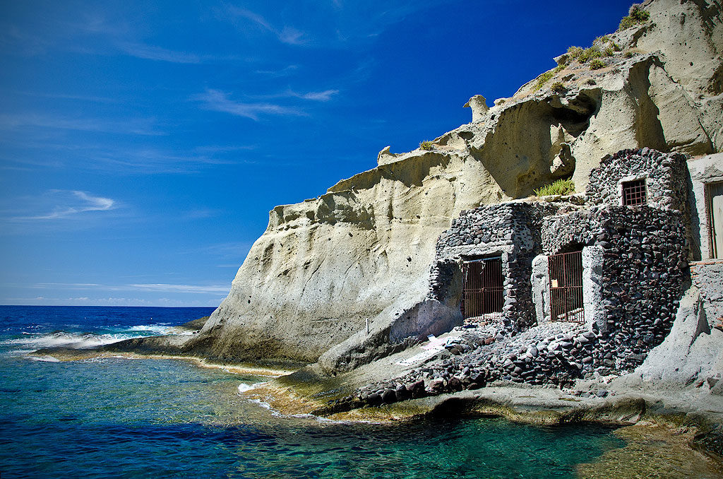
That on the background is Stromboli. With my proverbial bravery, I did not get any closer than this to that lava-spewing monster.

Session 4: If some of you are looking for an academic job this year, I suggest you to talk with Alessandra Urbinati, who presented some intriguing analysis on scientific migration networks. Alessandra showed which countries are emitters and attractors — or both. My move to Denmark seemed to be spot on, as it ranks highly as an attractor. Among countries of comparable size, only Switzerland does a bit better — that’s probably why my sister works there (always one-upping me!).

Session 6: As her custom, Tina Eliassi-Rad proved yet again she is completely unable to give an uninteresting talk. This time she talked about some extremely smart way to count occurrences of graph motifs without going through the notoriously expensive graph isomorphism problem. Her trick was to use the spectrum of non-backtracking matrices. Tina specializes in finding excellent solutions to complex problems by discovering hidden pathways through apparently unrelated techniques. (Seriously, Tina rocks.)

Session 7: Ciro Cattuto‘s talk on graph embeddings really had it all. Not only did Ciro present an extremely smart way to create graph embeddings for time-evolving networks, but he also schooled everybody on the basics of the embedding technique. Basically graph embeddings boil down to representing nodes as vectors via random walks, which can then be used as input for machine learning. I always love when a talk not only introduces a new technique, but also has pedagogical elements that make you a better researcher.

To be fair, we tried to apply some natural selection and get rid of the weakest network scientists by climbing Vulcano. Turns out, we are all pretty fit, so we’re back to evaluating ourselves via the quality of our work, I guess. *shrugging emoticon*

Session 8: Philipp Hövel spoke about accelerating dynamics of collective attention. Have you ever felt that memes and fads seem to pop in and out of existence faster and faster? Philipp showed it’s not your imagination: we’re getting better and faster at producing popular content on social media. This causes a more rapid exhaustion of humanity’s limited attention and results in faster and faster meme cycles.

Session 9: Only tangentially related to networks, Daniel Fraiman talked about some intriguing auction models. The question is: how do you price a product with zero marginal cost — meaning that, once you have the infrastructure, producing the next item is essentially free? The answer is that you don’t: you have an auction where people state their price freely, and at each new bid the current highest bidder gets the next item. This model works surprisingly well in making the full system converge to the actual value of the product.

Session 10: Andrea Tacchella‘s was another talk that was close to my heart. He taught us a new and better way to build the Product Space. I am the author of the current incarnation of it in the Atlas of Economic Complexity, so I ought to hate Andrea. However, my Product Space is from 2011 and I think it is high time to have a better version. And Andrea’s is that version.

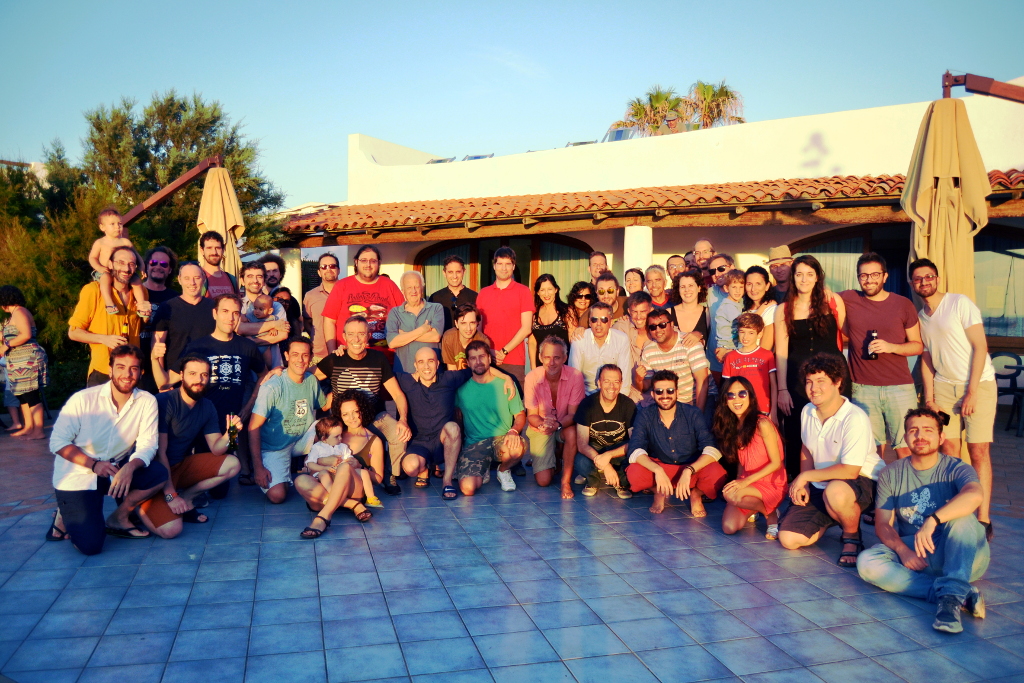
Is this group photo a possible contestant with 1927’s 5th Solvay for the best conference group picture? … No, it isn’t, not even close. Why would anyone even bring that up?

Session 11: Did I mention graph isomorphism before? Did I also mention how fiendishly complex of a problem that is? Good. If you can avoid dealing with it, you’ll be happier. But, when life throws graph isomorphism problems at you, first you make isomorphism lemonade, then you can hardly do better than calling Alfredo Pulvirenti. Alfredo showed a very efficient way to solve the problem for labeled multigraphs.

Session 12: The friendship paradox is a well-known counter-intuitive aspect of social networks: on average your friends are more popular than you. Johan Bollen noticed that there is also a correlation between the number of friends you have and how happy you are. Thus, he discovered that there is a happiness paradox: on average your friends are happier than you. Since we evaluate our happiness by comparison, the consequence is that seeing all these happy people on social media make us miserable. The solution? Unplug from Facebook, for instance. If you don’t want to do that, Johan suggests that verbalizing what makes you unhappy is a great way to feel better almost instantly.

And now I have to go back to Copenhagen? Really?

Now, was this the kind of conference where you find yourself on a boat at 1AM in the morning singing the Italian theme of Daitarn 3 on a guitar with two broken strings? I’m not saying it was, but I am saying that that is an oddly specific mental image. Where was I going with this concluding paragraph? I’m not sure, so maybe I should call it quits. Invite me again, pls.

21 June 2019 ~ 0 Comments

NetSci 2019 Report

NetSci is a conference bringing together everybody interested in network science every year. As usual, I showcase the things that most impressed me during my visit. The usual disclaimer applies: I am but a man[citation needed] and NetSci has so many parallel sessions. If I didn’t mention your talk, chances are that’s because I couldn’t duplicate myself to attend!

Starting from the keynote/plenary talks, I think the one standing our for me this year was Eleanor Power. She presented her field work on the cohesive role played by religion in India. By means of network analysis, she showed that indeed there are some strong effects in the social wiring associated with attending or not attending monthly and seasonal celebrations. This is absolutely superb research not only because it is a great application of network analysis to the real world, nor because it goes beyond the study of WEIRD (Western Educated Industrialized Rich Democratic) culture. It also speaks to me deeply, given my interest in the powerful role memes and culture play in shaping the astounding success — and, possibly, the future apocalyptic failure — of human beings as a species. Think about the best of Joe Henrich, Slate Star Codex, and The Elephant in the Brain all wrapped up in the neat package of a 40 minutes talk.

The Erdös-Rényi prize, awarded to a prominent network scientist under 40, went to Tiago Peixoto. It’s difficult to choose the best among all the great contributions Tiago gave to the field. Since I have a soft spot for practical advances — I’m a computer scientist at heart, after all –, I’m going to mention that Tiago is the engine behind the graph-tool library. graph-tool includes a variety of network algorithms and it’s wicked fast.

Rather than crowning career achievements as the Erdös-Rényi prize, the Euler award goes to a specific discovery. The first awardee was Raissa D’Souza for her discovery of the properties of explosive percolation. This is a big deal, because it shows that a certain class of transitions in network can be abrupt. Think about the collapse of a power grid: you certainly don’t want that to happen at the failure of a single link. Yet, Raissa proved that there are scenarios in which that can happen: failures can propagate without noticeable effects for a while until BAM!: you’re screwed.

And, since we’re talking about prestigious prizes, I shouldn’t forget the Zachary Karate Club Trophy, going to the first researcher including the Zachary Karate Club network in their presentation. The competition gets hotter and hotter at every conference. The new trophy holder is Emma Towlson.

The dinner banquet was special and touching. Emily Bernard shared her experience and inquiry into American culture. You should really check out her book Black is the Body. Sometimes we need a reminder that, when we perform social network analysis, our nodes are actual people. They have dreams, fears and hopes, they’re alive and active human beings. Emily did well in reminding us about that.

Concluding the part about plenary events: lighting talks. It’s getting tiring every year mentioning Max Schich, but the format really suits him like a glove. He’s truly a Herzog in a sea of Al Gores. Al Gore is great, but sometimes your really need something that stands out. Max talked about the origin of network science, reconnecting it not to Euler, but to Leibniz.  Far from being nitpicking, this is just the starting point of the broader adventure into the creation myths of different branches of science and culture. The talk was a sample of the first chapter of his “Cultural Interaction” book and, in case you were wondering, yes: I think you should read it (once it gets out).

Yours truly was at NetSci with the mission of spreading the word about his paper Functional Structures of US State Governments, a collaboration with Laszlo Barabasi, Steve Kosack, Ricardo Hausmann, Kim Albrecht and Evann Smith. If you want to read more about it, you can check my previous post.

As for the contributed talks that caught my eye? Here is a brief summary:

“The hidden constraints on worker mobility” by Morgan Frank. Morgan analyzed data from O-Net, connecting occupations with the skills they require. He showed there are topological constraints that make it hard for people to retrain out of their occupations. (Why would they want to? Oh, I don’t know, maybe because we’re automating and delegating everything to our new AI overlords?)

“Finding Over- and Under-represented Pathways in Higher Order Networks” by Tim Larock. This was only one of a series of talks about higher order networks. Higher order dynamics means dynamics “with memory”: the next state of your system doesn’t depend only on the current state, but also on an arbitrarily long window into the past. Think about passengers in a flight network: the abundance of connecting flights makes it unlikely for paths like A -> B -> A to happen. Tim showed some neat ways to deal with these situations.

“Scale-free Networks Well Done” by Ivan Voitalov. Just like Petter Holme, I’m a sucker for well-executed steak puns in paper titles. Ivan presented a new chapter over the controversy on how to fit power law degree distributions and whether scale free networks are truly as ubiquitous as some of us believe. Ivan provided some evidence leaning on the “yes” side. I’m eager to see what’s next from the other camp.

“Quantifying Data Bias in the U.S. Justice System” by Xindi Wang. Xindi presented an analysis of predictive errors you can get when applying machine learning algorithms to support decision tasks such as predicting recidivism, estimating the risk of child abuse, and more. This was a nice extension to Tina Eliassi-Rad‘s excellent plenary talk about machine learning ethical issues.

With this, I bid you farewell. See you soon in Rome, home of NetSci 2020!

11 December 2018 ~ 0 Comments

How to Sample Networks Using Social Media APIs

If you were a social network analyst in the 1920s, 90% of your work would be to go around bugging people so that they could tell you whom they were friends with — we were, and still are, no fun at parties. Today, instead, we live in the land of plenty: 400 million new Instagram stories per day, 330 million monthly active users on Twitter, a gazillion Facebook profiles! What is there not to love? Well, to start, the fact that you do not have a download button, for very good and real reasons. That means that now 90% of your work is trying to figure out how to interface with these online media to sample the best possible representation of their social networks. So today I’m talking about how to sample a network via a social media API.

Let’s define our terms here. “Sampling a network” means to extract a part of it whose characteristics are as similar as possible to the entire structure. “API” is short for “Application Programming Interface.” It is the program in the server which interacts with the one you wrote to collect data. If you want to know the connections of user X, you ask the API and it will tell you. Most of the time. After a bit of nagging.

A good sample would look like the original network. A good sample like they wanted :’)

There are many approaches to sample networks, and many people have studied them to understand which one works best. But none of these studies actually made an experiment simulating their relationship with the actual API systems they have to work on. The comparisons made so far assume you can know all the connections of a user in one go, and that you can move to the other users as soon as you’re done exploring the current one. Sadly, the real world doesn’t remotely work that way. Thus we need to know how different API systems will influence different sampling methods. With Luca Rossi I wrote a paper about that, “Benchmarking API Costs of Network Sampling Strategies“, which I’ll present this month at the International Conference on Big Data.

An API system will put itself in the way of your noble sampling quest in three ways: (i) by returning only a maximum of n connections per request (i.e. by paginating the results), (ii) by making you wait a certain amount of time between requests, and (iii) by taking some time to respond (i.e. by having latency). The reason why considering the API hurdles is important is that they have a non-trivial relationship with your sampling method.

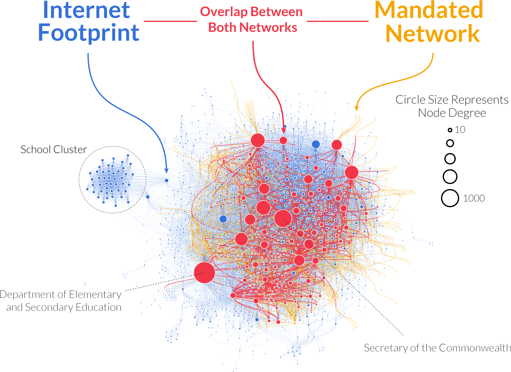
To illustrate my point consider two API systems. The first system, A1, gives you 100 connections per request, but imposes you to wait two seconds between requests. The second system, A2, gives you only 10 connections per request, but allows you a request per second. A2 is a better system to get all users with fewer than 10 connections — because you are done with only one request and you get one user per second –, and A1 is a better system in all other cases — because you make far fewer requests, for instance only one for a node with 50 connections, while in A2 you’d need five requests.

It seems trivial that A1 is a better system than A2, because it gives you 50 connections per second instead of 10 (we’re ignoring latency here). However, that’s not necessarily the case. Real world networks are far from equal: there are a few superstars with millions of followers, while your average user only has a handful (but I’m catching up with you, Katy!). This means that there are way way way way way way way way more users with 10 or fewer connections than there are with more than 10. In the case represented by the figure, sampling the full network via A2 will actually take half as much time as via A1, even if theoretically we thought we were going to be five times slower.

How many users (y-axis) have this many connections (x-axis). The blue area is where A2 works best — one user per second — while the purple area is where A1 works best. But there are 492.5k users in the blue area (the Michele Coscias), and only 7.5k in the purple (the Katy Perrys)!

With Luca, I created a benchmarking system — which you can freely use — that allows you to simulate network sampling by letting you define:

So now we get to the point of the post where I tell you which sampling method is the very best and you should always use it and it will solve world peace and stuff. And that method is…

…none of them. Unfortunately we realized that, in the world of network sampling, there is no free lunch. The space of possible characteristics of interest, API systems, networks on which you work, and budget constraints is so vast that each sampling method is the best — or worst — in some combinations of these factors. We ran a bazillion tests, but none of them summarizes the results better than these two plots.

On the left you see how badly we get the degree distribution wrong (y-axis, lower is better) at different budget levels (x-axis, from left to right we increase the amount of time we spend sampling the network). If we don’t have much time, the best methods are a variant of Random Walks (MHRW) or Snowball sampling, while the worst method is DFS. But surprise surprise, if we have tons of time, DFS is the best method, and MHRW and Snowball are the worst. By a long margin. No free lunch. On the right we have another instance of the same problem: here we want to know how well we identify central nodes in the network (y-axis, higher is better). The difference at increasing budget levels is ridiculous: the rankings you get when you have a lot of time to sample are practically the opposite of the one you get when you’re in a hurry!

This means that you really need to be careful when you extract networks from social media. You cannot barge in and grab whatever you can, however you can. You need to know which characteristics of the network are important to you. You need to know what the underlying network might look like. You need to know how much time you have to sample the network, compared to its size. You need to know how their APIs work. Otherwise you’re going to run in circles in a very very mad world. And you thought that they had it worse in the 1920s.

08 November 2018 ~ 0 Comments

Using Web Crawling to Map US State Governments

What do governments do? These days, you can answer this question in many ways: the desire for accountability has pushed many governments to publish more and more data online. These efforts are fantastic, but they seem to have a blind spot. The data is flat. By that, I mean that they usually contain tables, budgets, pieces of information that cannot be really connected to each other. As a network scientist, I think inter-actions contain as much information as actions. Where is the dataset that tells me how public agencies interact with each other? Now the answer is simple: we built it!

The US state governments in all their gory tangledness. Click to enjoy it fully.

The question is: how do we map interactions between agencies if they do not publish data about what they do with whom? And, once we’ve done that, how do we know we’re representing the interactions correctly? This is the result of an effort started by Stephen Kosack, which then gathered to accompany me a fantastic team with a diverse set of skills: Evann Smith, Kim Albrecht, Albert-Laszlo Barabasi, and Ricardo Hausmann. It resulted in the paper “Functional structures of US state governments,” recently published (Open Access!) in PNAS.

We realized that there is a place where agencies say what they are doing: their website. And because websites are built around the idea of interconnecting documents, they are a natural place to scout for links. Our fundamental assumption is that, when a school’s website links to its school district, they’re implicitly or explicitly saying: “What that agency says is relevant for what I do, so you should check them out.” In other words, we can and should link them in a network of agencies.

Crawling the web is notoriously complicated. Besides the technical challenges, there’s also the fact that it’s difficult to build a complete index of government websites. We did our best to follow the agency directories published by central state governments, and integrated that with data from Wikipedia and other websites specializing in listing public schools, libraries, city, and county governments.

Obviously, the picture is incomplete and it changes constantly: we did the crawl in 2014 and the web presence of governments ought to look a bit different today. However, we managed to estimate websites’ ages using the Wayback Machine (consider donating!) and we see signs of saturation: the growth of government presence online is significantly slowing down. A hint that the big picture we’re seeing shouldn’t have changed that much. So what’s this big picture? Allow me to introduce you to what we affectionately call “The Cathedral”:

Click to enlarge and cathedralize yourself!

We collapsed each government agency in a two-level classification of activities into government functions. The top level is a generic activity area and the second level is a specialization inside the area. For instance, a top-level function is education. Then “primary/secondary education” and “public libraries” are two possible second level functions inside education. We built this classification by looking at the textual content of each website. Mechanical Turkers validated it. In the cathedral, each node is a function. We connected nodes if agencies, classified under one function, linked themselves to agencies classified under the other. The position of the node is determined by its centrality both horizontally — most central in the middle — and vertically — from top, most central, to bottom. The cathedral confirms our intuition of hierarchicalness: central state and local governments oversee everything and connect to everything.

We could test how much our picture overlaps with actual agency interactions, because the government of Massachusetts mandates some collaborations in its constitution. So we forced Evann to dedicate one year of her life going through the constitution of Massachusetts and noting down when two agencies were mentioned in the same article as in need of interacting. Then it took me a whole five minutes to swoop in to take the credit by testing how much the web network fared compared to the constitutional network (thanks Evann!).

Red is web-constitution overlap, yellow is what the constitution sees and we don’t, blue is what we see and the constitution doesn’t. Click to enlarge.

The answer is “a lot, with a twist.” Agencies that are mandated to collaborate connect to each other on the web much more strongly than we expected — almost eight times as much. The majority of mandated connections are represented in the web. But the overall measure of alignment returned rather low values. How come? Because the internet reveals many more agencies than are mentioned in the constitution. And it reveals many more links too. Although some of that ought to be noise, there are ways to filter it out to end up with a network that is actually more complete than the one you’d get by looking only at the constitution.

One question we wanted to answer with our data was: how can we explain differences in how states decide to implement their functions? We had a few hypotheses. Maybe it’s ideology: red and blue have… different ideas on how to do things — to put it mildly. Or maybe it’s how rich the states are: more $$$ = more complexity. Maybe it’s just their geographical position. It could be a bit of all of that, but there is one thing dominating everything else: economic structure. It’s not the amount of dollars you earn, but how you do it. Hi-tech states look like hi-tech states, agricultural states look like agricultural states, whether they are red, blue, purple, ocher, indigo, rich, or poor.

Each circle here is a state, and we look at three dimensions on how they implement each function: how many agencies they created to serve it, how big they are, how much they talk to each other. Some functions, like education, are consistently implemented the same across states — we can tell because the states’ circles are very clustered –. Others are all over the place, like administrative law. Click to enlarge.

Everything I said can be visualized in all its glory in the official website of the project: http://govmaps.cid.hks.harvard.edu/ (by Kim Albrecht). You have a few interactive visualizations, the paper, and the data. We strongly believe in open data and reproducibility: our data release includes not only the US state government networks, but also a collection of scripts to reproduce the main results of the paper.

I hope this could be a significant step forward in how we understand government actions and effects on society. Nowadays, it feels that there is a gargantuan ideological divide between sides: handing over your state to “the other side” feels like a tragedy. Our results seem to suggest that, actually, it doesn’t make that much of a difference.

11 September 2018 ~ 0 Comments

The Struggle for Existence in the World Market Ecosystem

The global trade market definitely seems red in tooth and claw. Competition is fierce and some claim it has to be that way: only the fittest should survive because the fittest, at least in theory, are the ones satisfying the customers’ needs the best. In a paper with Viviana Viña-Cervantes and Renaud Lambiotte, we explored this metaphor to see if we can say something about how world trade will evolve. The paper will soon appear in PLoS One and it is titled “The Struggle for Existence in the World Market Ecosystem“. In it we create competition networks and we show that positions in these networks are a predictor of future growth: a strong position in a product means that the country will increase its export share in that product in the medium term.

How do we create competition networks? In our view, each slice of the market is an ecological niche. For instance, the car market in the United States or the computer market in Germany. If you can sell a lot of cars in the US, it means you’re fit to occupy that niche. You’re meeting the needs of that set of customers, and thus you can make a profit there, cutting out other exporters who would oh so much like to make a buck there.

An example of data generating one edge in the competition network: Japan emerges beyond 1% of the car market in the US at the same time that Italy plunges below the 1% mark. With this data, we create an edge from Japan to Italy in the US-car 1960 competition network.


Niches are not stable: they change over time. As a consequence of evolution, animals can become fitter to fill their current niche — or a new one. Out of this observation, we create our competition networks. Suppose that you were doing well at selling cars to Americans, like Italy was in the 60s — who doesn’t love a vintage Alfa Romeo?  Then something happens: a mutation, an evolution. Japan’s cars start gaining appeal in North America. All of a sudden, the market share of Italy declines once Japan appears on the scene. In this case, we can create a directed edge going from Japan to Italy, because Japanese firms happened to be successful at the same time that Italian ones lost their, um, edge.* That’s our competition network. We built one per decade: 1960, 1970, 1980, 1990, and 2000.

In the vast majority of cases, when you study a network, the edges have a positive meaning: they imply connections, social relations, friendship. Competition networks tell a fundamentally negative story. The originator of the edge is displacing the receiver of the edge in a market, something definitely not nice. The out-degree tells us something about a country’s fitness: how many competitors it displaced. The in-degree is the other side of the coin: how many times the country’s entrepreneurs were just not good enough. So these two measures should tell us what we want, right? A high out-degree is a sign of strength and growth, a high in-degree a sign of weakness.

The correlation between in- and out-degree is pretty darn high.

Not really. The problem is that big countries produce a lot of stuff and export it everywhere. So they are constantly fighting a lot of battles. Winning some and losing some. The in- and out-degree are highly correlated, and thus they do not give much information. We decided to look at a generalization of in- and out-degree. When displacing a country from a market, quantity is not as important as quality. Displacing a fierce exporter like the US is not the same as tripping up a weaker economy. So we weight the out-degree by counting each displaced country as much as their out-degree. This is a higher-order degree, because it looks at a second hop beyond the displaced. The more this country was a displacer, the more it counts that we were able to displace it. Displacing the displacers is the way to go.

At this point interesting stuff starts emerging. We can use this normalized in- and out-degree to classify countries into three buckets: out-competing (high out-degree), displaced (high in-degree), and transitioning (roughly equivalent in- and out-degree). We do so per decade and per product. Then, we check whether belonging to one cluster has any relationship with how the country will evolve its market share in the decade following the one we used for the classification. If you were a strong out-competitor in the 60s in the car market, your position in the car market in the 70s will get stronger and stronger.

The growth rate the decade after the observation window used for classifying countries. Here: 1 = Displaced, 2 = Transitioning, and 3 = Out-competing countries.

We see these strong relationships for all products and for all decades, with a couple of exceptions. For instance, our method does not work for natural resources. Which is expected: we cannot use this system to predict whether you’re going to find oil in your territory or not. It also does not work in the last decade, the 2000s, because we have very little data for making the prediction: our data runs only until 2013. Thus, it means this method cannot work for short term predictions: it works well when looking at decade-long transitions, not year-long ones. The effect gets a bit weaker if we look at what happens two, three and even four decades after our classification, but it’s still significant.

We also checked the robustness of our results by creating a synthetic trade world. We broke all relationships between countries by generating random trade, maintaining the sparseness — most exporter-importer-product relationships never happen — and the skewed nature of our data — a few high-throughput links constitute most of world trade, and the vast majority of links are low-value ones. In this world with random competition, we see far fewer links in our networks. Using the ratio between in- and out-degree also doesn’t work: as predictor, it returns a much lower result quality.

The average growth rate for out-competing countries when the prediction period is one, two, three or four decades away from the observation one.

So, to wrap up, in the paper we show how to build competition networks, by connecting strong emerging economies to the ones they are out-competing for specific products. Analyzing the higher-order relationships in this networks — i.e. going beyond the simple degree — uncovered a way to estimate the real strength of these emerging countries. A lot of questions remain unanswered. Chief among them: what if we ensured that each edge in the competition networks is truly causal? This will be a quest for another time.


* We’re extremely aware of the fiendish operation we did: these competition networks are absolutely correlational and will never imply causation. However we believe there’s also value in looking at these serendipitous events. If nothing else, at least some econometrician might have had a stroke reading the original sentence.

09 July 2018 ~ 0 Comments

Small Changes, Big Changes

A very quick note to point out a tiny change in my website. The top banner that always welcomes you to the home page of this blog has been changed. It is an insignificant text difference, which hides a slightly larger one in my life. I’ve changed jobs! After six years of postdoc fellowship, I decided I had enough of it and made the big jump: I’m now an assistant professor. I’ve also decided to hop to a different side of the Atlantic pond. I left the United States and decided to make a home of Denmark. My new affiliation is the IT University of Copenhagen.

There are a few more things changing in the next weeks/months. The most important one is that I’ll start teaching the class on Network Analysis. This is a class for the first semester of the second year in the Bachelor program of Data Science. This Data Science ship is captained by the amazing Natalie Schluter. I’m not alone in this adventure: my friend Luca Rossi will be co-teaching with me this year. I look forward to give my contribution to the data science and network science development of the Copenhagen area.

This means that you’ll see soon a new tab in the top menu of the blog: “Teaching”. I’ll use it to host the materials from the classes I’ll be teaching: slides, additional texts, etc. This should allow you to get a hint of my lecturing style and — why not? — see if you can learn something new.

If you are in the Copenhagen area and you think you’d like to talk a bit of network business, you can probably find me at my new shiny office, while I try to hide behind the largest monitors I could find. The office number is 4E04, meaning that I’m at the 4th floor, wing E, office 4 (on the right).

Interesting times ahead!

28 May 2018 ~ 0 Comments

Mapping the International Aid Community

A few years ago (2013, God I’m old), I was talking to you on how to give a “2.0” flavor to international aid: at CID we created an Aid Explorer to better coordinate the provision of humanitarian work. I’m happy to report that “Aid Explorer” has been adopted — directly or indirectly —  by multiple international organizations, for instance USAID and the European Union. The World Bank’s Independent Evaluation Group contacted me to make an updated version, focused on estimating the World Bank’s position in the global health arena. The result is a paper, “Mapping the international health aid community using web data“, recently published in EPJ Data Science, and the product of a great collaboration with Katsumasa Hamaguchi, Maria Elena Pinglo, and Antonio Giuffrida.

The idea is to collect all the webpages of a hundred international aid organizations, looking for specific keywords and for hyperlinks to the other organizations — differently from the old Aid Explorer in which we relied on the index from Google. The aim is to create different networks of co-occurrences connecting:

  • Aid organizations co-mentioned in the same page;
  • Aid organizations mentioned or linked by another;
  • Issues co-mentioned in the same page;
  • Countries co-mentioned in the same page.

We then analyze these structures to learn something about the community as a whole.

One thing I didn’t expect was that organizations cluster by type. The “type” here is the force behind the organization — private philanthropy, UN system, bilateral (a single country’s aid extension of the foreign ministry), multilateral (international co-operations acting globally), etc. In the picture above (click on the image to enlarge), we encode the agency type in the node color. Organizations are overwhelmingly co-mentioned with organizations of the same type, which is curious because bilaterals often have nothing in common with each other besides the fact they are bilaterals: they work on different issues, with different developed and developing partners.

We can make a similar map connecting issues if they are co-mentioned in a web page. The map is useful as validation because it connects some “synonyms”, for instance “TB” and “Tubercolosis”. However, you can do much more with it. For instance, you can use color to show where an organization is most often cited. Below (click on the image to enlarge) you see the issue map for the World Bank, with the red nodes showing the issues strongly co-mentioned with the World Bank. Basically, the node color is the edge weight in a organization-issue bipartite network, where the organization is the World Bank. To give you an idea, the tiny “Infant Survival” node on the right saw the World Bank mentioned in 9% of the pages in which it was discussed. The World Bank was mentioned in 3.8% of web pages discussing AIDS.

This can lead to interesting discussions. While the World Bank does indeed discuss a lot about some of the red issues above — for instance about “Health Market” and “Health Reform” — its doesn’t say much about “Infant Survival”, relatively speaking at least. It’s intriguing that other organizations mention this particular issue so often in conjunction with the World Bank.

This difference between the global speech about issues and the one specific to another organization allows us to calculate two measures we call “Alignment” and “Impact”. By analyzing how similar the issue co-occurrence network of an organization is with the global one — a simple correlation of edge weights — we can estimate how “Aligned” it is with the global community. On the other hand, an “Impactful” organization is one that, were it to disappear, would dramatically change the global issue network: issues would not be co-mentioned that much.

In the plot above, we have Alignment and Impact on the x and y axis, respectively. The horizontal and vertical lines cutting through the plot above show the median of each measure. The top-right quadrant are organization both impactful and aligned: the organizations that have probably been setting the discourse of the international aid community. No wonder the World Health Organization is there. On the top left we have interesting mavericks, the ones which are not aligned to the community at large, and yet have an impact on it. They are trying to shape the international aid community into something different than what it is now.

A final fun — if a bit loose — analysis regards the potential for an organization to spread a message through the international aid network. What would be the reach of a message if it originated from a specific organization? We can use the Susceptible-Infected model from epidemiology. A message is a “virus” and it is more likely to infect an agency if more than a x% of the agency’s incoming links come from other infected agencies.

This depends on the issue, as shown above. In the figures we see the fraction of “infected” agencies (on the y-axis) given an original “patient zero” organization which starts spreading the message. To the left we see the result of the simulation aggregating all issues. The World Bank reaches saturation faster than UNICEF, and USAID is only heard by a tiny fraction of the network. However, if we only consider web pages talking about “Nurses” (right), then USAID is on par with the top international aid organizations — and UNICEF beats the World Bank. This happens because the discourse on the topic is relatively speaking more concentrated in USAID than average.

As with the Aid Explorer, this is a small step forward improving the provision of international aid. We do not have an interactive website this time, but you can download both the data and the code to create your own maps. Ideally, what we did only for international aid keywords can be extended for all other topics of interest in the humanitarian community: economic development, justice, or disaster relief.

19 April 2018 ~ 0 Comments

Birds of a Feather Scam Together

In Italy we have a saying:

He who walks with the lame learns how to limp

It means that the company you keep will influence your behavior, more often than not in a negative way — never mind the fact that Judas had impeccable friends. Setting my mind on how to verify this tidbit of ancient wisdom, I decided to investigate how the fraudulent behavior of some businesses might correlate with that of the other companies they work with. Does doing business with a crook say something about you? Will Mexican drug cartels ever recoup the damage to their reputation when it turns out they do business with European banks?

The result is the paper “Birds of a feather scam together: Trustworthiness homophily in a business network” published last month in the Social Networks journal. I wrote this paper with Mauro Barone at the Agenzia delle Entrate, the Italian equivalent of the IRS in the US. The idea is simple. We want to answer the question: is the level of fraud committed by a business correlated with the level of fraud committed by its customer/supplier businesses?

I bet none of these birdbrains filled in their 1040 this year.

To answer the question we analyze a business-to-business (B2B) network. Each node in the network is a company, and it connects to other companies with directed edges. The edge goes from a provider to a customer, it follows the flow of goods and services. These connections are weighted according to the monetary value of the total transaction value during the year. The network contains all the relationships of a few thousands audited Italian businesses, centered on one Italian region: Tuscany.

The peculiarity of the data structure that allow us to speak about tax fraud is that each connection is registered twice. Say we have business A and business B. The “A sold to B” connection should be reported by both A and B: A says how much it sold, and B says how much it purchased. See the example below: the blue edges are A’s declarations, and the orange edges are B’s. The two businesses agree on how much B sold to A (75 Euros), but they disagree on how much A sold to B.

Finding who’s trustworthy and who’s not seems, at first sight, an easy problem. If a business constantly misreports its transactions with its customer/supplier network, then we have good ground to suspect something fishy is going on. However, it’s not that easy. Say we decide a mismatch of 5 Euros is divided into 2.5 blamed on A and 2.5 blamed on B. We might think we’re doing a neutral operation, but we aren’t. What appears to be fair — shifting the blame equally to both actors involved in a disagreement — is already a heavy judgment. Maybe the fault lays completely on B, and A is a blameless victim. We all know how the story ends if we simply wash our hands of the problem like Pontius Pilate: with brigands freed and prophets on the cross.

Paradoxically, if you simply average mismatches, the larger you are, the more you can con. The vast majority of businesses are honest thus, if you have a lot of relationships, they will mostly check out and bring your average match value up. At that point, you can tactically limit your misreports to a few connections and thus evade your taxes. The network also has a broad degree distribution, meaning that most businesses have few connections. This means that your victims will not have enough honest links to make up for the curveball you just threw at them. You can see an example below: the number on the node is their average edge weight, which is the match level of the connection — the total amount of Euros accounted for over the total transaction value (in the A-B example above, we have 75+75+100+95=345 total edge value, but only 340 accounted for given the mismatch of 5, thus the edge weight would be 340/345= 0.9855). Even though the hub has the most fraudulent connections — edges with low match values — its average is higher than that of its victims.

We solve this problem by taking these average mismatches only as a starting condition. At each iteration, we recalculate the average by re-weighting connections according to the trustworthiness equilibrium. The trick is to do it in an asymmetric way. If the previous iteration’s trustworthiness of A was larger than B’s, then in this iteration the mismatch for A is reduced, thus more of the blame will end on B. In practice, if on average we trusted A more, then we’re going to keep doing so in its other cases of mismatch. We don’t let a speck in A’s eye to make us miss the plank in B’s. (Man, my Biblical references today are on point!)

The exact mathematical formulation of this trick is in the paper. In practice, in our example above, the honest businesses below the hub siphon out all its trustworthiness — as they should. They leave it dealing with the businesses at the top, which are corroborating each other honesty with their own high-match links. After a few iterations, the hub ends up being the only business we should not trust — see below (note that I changed the node’s trust value, but I kept the edges constant, as showing the asymmetric correction would make the picture more confusing). In the paper we show that now we break the relationship between the trustworthiness score and the topological characteristics of the nodes: they are now being judged not by their position, but by their actions.

So: is it true that the friends of lame businesses are picking up limps? Yes it is: the difference in trustworthiness levels is a significant indicator whether a connection between two businesses is there or not. In practice, you can use it to predict future links in the B2B network. A strong match on trustworthiness doubles the chances that two businesses are connected to each other when compared to businesses with very different trustworthiness levels.

Making a point about Italian popular wisdom is all good and well, but this paper has a few more things to say. The trustworthiness score as we defined it has some interesting practical applications when it comes to predict which businesses to audit. If a low-trust business is audited, its probability of being fined — meaning something was indeed fishy — is ten percentage points higher than a high-trust business. Since our sample comes from audited businesses, it is not randomly selected: we’re observing businesses that were already suspect. So, if anything, this is an underestimation of the power of our measure: if we’re able to weed out the small crooks from the big ones, we’re probably going to do an even better job distinguishing innocents and culprits.

I think that this paper can do good for honest businesses. To be audited is a long and painful process: if you can skip it because the Agenzia delle Entrate knows how to find the bad guys, you can save time, energy, and peace of mind. And the crooks? Well, the crooks will have to render unto Caesar the things which are Caesar’s.

13 March 2018 ~ 0 Comments

Complenet 2018 Report

It’s been a while since I wrote a report for a conference I attended and I think it is high time to fix this now. Last week I had the pleasure to be at Complenet, which was hosted by the Network Science Institute at Northeastern University, Boston. I was there to present my work on the meme evolutionary arms race after popularity spikes. Then I had two posters, on my network backboning algorithm — arguably the best way to filter out noise in your network connections, at least according to me 🙂 — and how to detect the degree of hierarchy of your directed networks.

Complenet was a great occasion to reconnect with fun and impossibly smart people like Laszlo, Aaron, Isabel and Gourab. I also had the occasion to talk with new people and learn about the amazing things they are doing. A particular shout out to Ieke De Vries — who works on networks of criminal activities — and Carolina Mattsson — who tracks down money flows in complex networks.

One advantage of small conferences like Complenet over humongous Goliaths like NetSci is that they only have a plenary session, and so you can actually see everything instead of living in the constant fear of missing out on something. I am particularly enthusiastic about the plenary talk by David Lazer. He had put together a very interesting study, connecting Twitter accounts to voting records to show the typical characteristics of accounts spreading fake news on Twitter. I’m not going to talk about Fernanda Viégas & Martin Wattenberg‘s talk on visualizing deep learning here. As usual it was absurdly good, but I already sung their praise in the past and I feel I have to start diversifying.

For the rest of the first day, the two talks that caught my attention were the ones of Megha Padi and Alessio Cardillo (in collaboration with Jesus Gomez-Gardeñes). Megha showed us a way to use networks for the difficult problem of genetic mutations causing diseases in humans. As you probably know, multiple genes are involved in each of our traits, and they interact with each other. It follows that, often, diseases are caused by an ensemble of perturbations in the genetic code. With her ALPACA method, one can create communities of interacting genes to shed some light on these interactions.

Alessio described a network model, where agents have to decide whether to vaccinate or not. It is important to understand how the no-vax movement works and why it can arise. Alessio shows that there are scenarios in which an individual can dodge the cost of vaccination and still reap its benefits, if you were covered by herd immunity anyway. So, if we want to root out this behavior, we have to stop treating it like a completely irrational thing to do. (By the way, Alessio’s collaborator, Jesus, had another talk on hunter-gatherer social networks and it was also pretty fantastic)

For me, Emma Towlson‘s talk dominated the second day. One of the big theoretical results of the past few years is about network controllability. This is a method to figure out which nodes to influence in a network to get the entire system into the state we desire. Emma et al. showed us that this is theory no more. They took the C. Elegans worm, an organism for which we have a complete neural map, and showed how they can predict which neurons are necessary for its signature sine wave movements and which ones are redundant. Acting on the control neurons will significantly change the worm’s movement patterns.

J.-P. Onnela did double duty: besides his plenary talk on inferring parameters for network models, he also presented a great work on social networks in rural India. This talk is tied for best talk of the third day together with the already mentioned one about hunter-gatherer social networks by Jesus. It also shares some similarities, in that it maps social systems in domains that we rarely study — admittedly we’re a bit too focused on Twitter and Facebook and we overlook actual social networks. JP’s results show that a few factors have a great influence whether a social tie will be created or not, chief among them caste membership.

Two students from Tina Eliassi-Rad‘s group — Tim Larock and Xindi Wang — wrapped up the last day perfectly. Tina and her people are doing great work in the conjunction between network and computer science, and I particularly like their approach to the problem of network completion. When you want to use a network somebody else gathered, you often have the problem that: (i) the network is not complete, and (ii) you don’t know how the sample was collected. Tina’s work helps you complete the network, while being completely agnostic about how the network was created in the first place.

To conclude I want to mention William Grant‘s poster. I had to miss it because I was defending my own posters in the same session, but I had the pleasure to see him present during the poster slam and he was brilliant. He won a Poster Slam award, and deservedly so. But then again, he works with Sebastian Ahnert, so of course he must be good.

See you at the next Complenet!

27 February 2018 ~ 0 Comments

Network Hierarchies and the Michelangelo Principle

The Michelangelo Principle — almost certainly apocryphal — states that:

If you want to transform a marble block into David, just chip away the stone that doesn’t look like David.

This seems to be a great idea to solve literally every problem in the world: if you want to fix evil, just remove from the world everything that is evil. But I don’t want to solve every problem in the world. I want to publish papers on network analysis. And so I apply it to network analysis. In this case, I use it to answer the question whether a directed network has a hierarchical structure or not. The result has been published in the paper “Using arborescences to estimate hierarchicalness in directed complex networks“, which appeared last month in PLoS One.

To determine whether a network is hierarchical is useful in a number of applications. Maybe you want to know how resilient your organization is to the removal of key elements in the team. Or you want to prove that a system you mapped does indeed have a head, instead of being a messy blob. Or you want to know whether it is wise to attempt a takedown on the structure. In all these scenarios, you really desire a number between 0 and 1 that tells you how hierarchical the network is. This is the aim of the paper.

Following the Michelangelo Principle, I decide to take the directed network and chip away from it everything that does not look like a perfect hierarchy. Whatever I’m left with is, by definition, a perfect hierarchy. If I’m left with a significant portion of the original network, then it was a pretty darn good hierarchy to begin with. If I’m left with nothing, well, then it wasn’t a hierarchy at all. Easy. Let’s translate this into an algorithm. To do so, we need to answer a couple of questions:

  1. What’s a “perfect hierarchy”?
  2. How do we do the chipping?
  3. How do we quantify the amount we chipped?

The first question is the one where we have most wiggle room. People might agree or disagree with the definition of perfect hierarchy that I came up with. Which is: a perfect hierarchy is a system where everybody answers to a single boss, except the boss of them all, who answers to no one. I like this definition because it solves a few problems.

Consider the picture above. In the leftmost example, if we assume nodes 1 and 2 give contradictory orders, node 5 doesn’t really know what to do, and the idea of a hierarchy breaks down. In the example in the middle, we don’t even know who’s the boss of them all: is it node 0 or node 3? The rightmost example leaves us no doubt about who’s boss, and there’s no tension. For those curious, network scientists call that particular topology an “arborescence“, and that’s the reason this exotic word is in the paper title. Since this is a well defined concept, we know exactly what to remove from an arbitrary directed network to make it into an arborescence.

Time to chip! Arbitrary directed networks contain strongly connected components: they have paths that can lead you back to your origin if you follow the edge directions. An arborescence is a directed acyclic graph, meaning that it cannot have such components. So our first step is to collapse them (highlighted in yellow above) into a single node. Think of strongly connected components as headless teams where all the collaborators are at the same level. They are a node in the hierarchy. We don’t care how a node organizes itself internally. As long as it answers to a boss and gives direction to its underlings, it can do it in whichever way it wants.

Second chipping step: in an arborescence, all nodes have at most one incoming connection, and only one node has zero. So we need to remove all offending remaining edges (highlighted in orange above). Once we complete both steps, we end up with an arborescence, and we’re done. (There are edge cases in which you’ll end up with multiple weakly connected components. That’s fine. If you follow the procedure, each of these components is an arborescence. Technically speaking, this is an “arborescence forest”, and it is an acceptable output)

We can now answer the final question: quantifying how much we chipped. I decide to focus on the number of edges removed. Above, you see that the original graph (left) had twenty edges, and that (right) nine edges survived. So the “hierarchicalness” of the original graph is 9 / 20 = .45.

Now the question is: why would someone use this method to estimate a network’s degree of hierarchicalness and not one of the many already proposed in the literature? The other methods all have small downsides. I build some toy examples where I can show that arborescence is the way to go. For instance, you can’t find a more perfect hierarchy than a balanced tree (leftmost example above). However, Global Reach Centrality would fail to give it a perfect score — since it thinks only a star graph is a perfect hierarchy. Agony and Flow Hierarchy aren’t fooled in this case, but give perfect scores in many other scenarios: a wheel graph with a single flipped edge (example in the middle), or a case where there are more bosses than underlings (rightmost example). Those who have been in a team with more bosses than workers know that the arrangement could be described in many ways, but “perfect” ain’t one of them.

Arborescence is also able to better distinguish between purely random graphs and graphs with a hierarchy — such as a preferential attachment with edges going from the older to the newer nodes (details in the paper). Before you start despairing, it’s not that I’m saying we’ve been doing hierarchy detection wrong for all these years. In most real world scenarios, these measures agree. But, when they disagree, arborescence is the one that most often sides with the domain experts, who have well informed opinions whether the system represented by the network should be a hierarchy or not.

To conclude, this method has several advantages over the competitors. It’s intuitive: it doesn’t give perfect ratings to imperfect hierarchies and vice versa. It’s graphic: you can easily picture what’s going on in it, as I did in this blog post. It’s conservative: it doesn’t make the outlandish claim that “everyone before me was a fool”. It’s rich: it gives you not only a score, but also a picture of the hierarchy itself. So… Give it a try! The code is freely available, and it plays nicely with networkx.